Why we touched the VRS.
Infiniti came to us wanting a research experience that felt faster and read cleaner. Shoppers needed to compare trims and dig into features without drowning in detail, and they needed shopping tools to be there when they were ready. I led UX. What we landed on was a modular system that lets people go as deep as they want and keeps the next action one click away.
Research and architecture lead.
- Owned the research end to end: heuristic review, journey mapping, competitive benchmarking, and formative usability testing
- Pressure-tested the core interaction patterns with prototype testing and analytics before they got built
- Sat with content, design, and engineering through the build so the thing actually shipped the way it was designed
What we set out to do.
- Build a clear path from "I'm just looking" to "okay, I'm ready"
- Keep Build & Price, Request a Brochure, and Estimate Payments within reach on every screen
- Support deep linking, SEO, and modularity across regions and trims
- Make comparisons actually useful, without dumping every spec on the page at once
The three kinds of shoppers we kept seeing.
- Walked the existing VRS with a heuristic review to pinpoint where shoppers were falling out and why
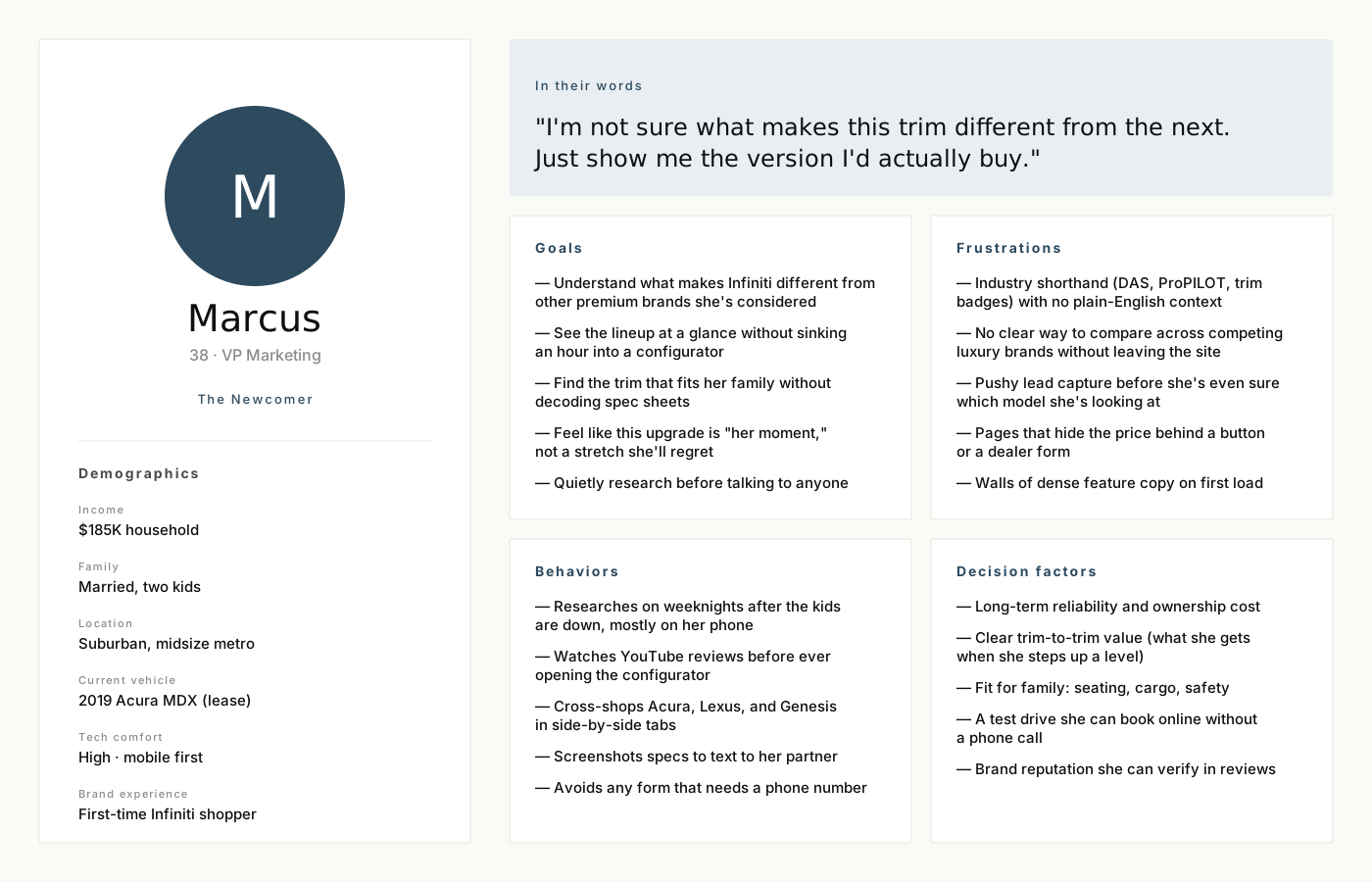
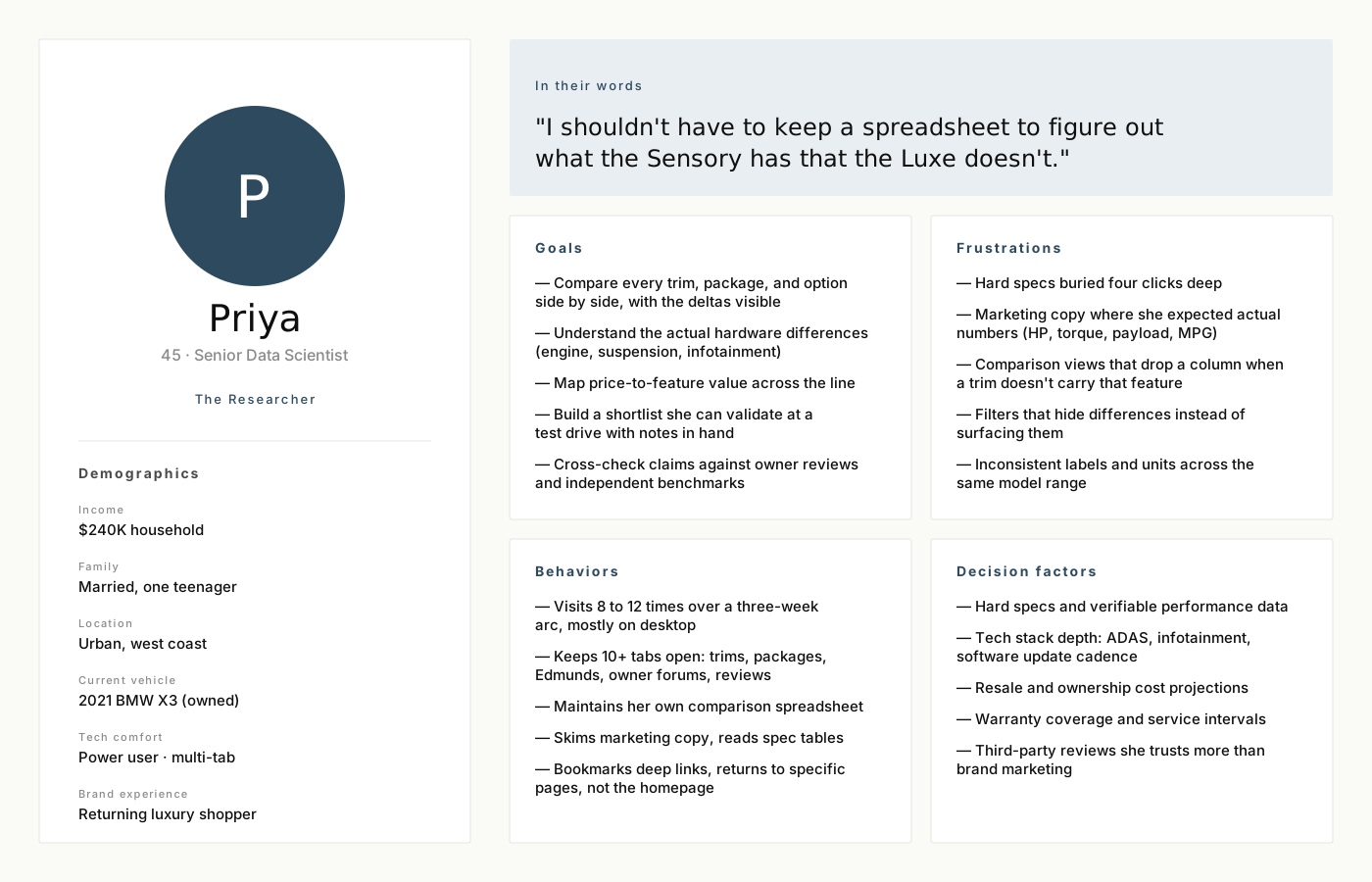
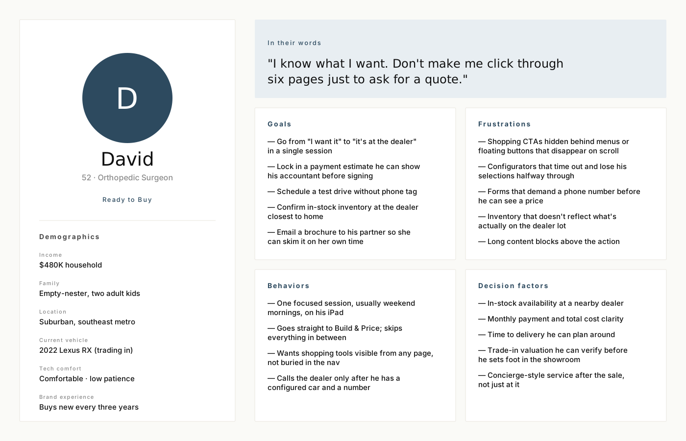
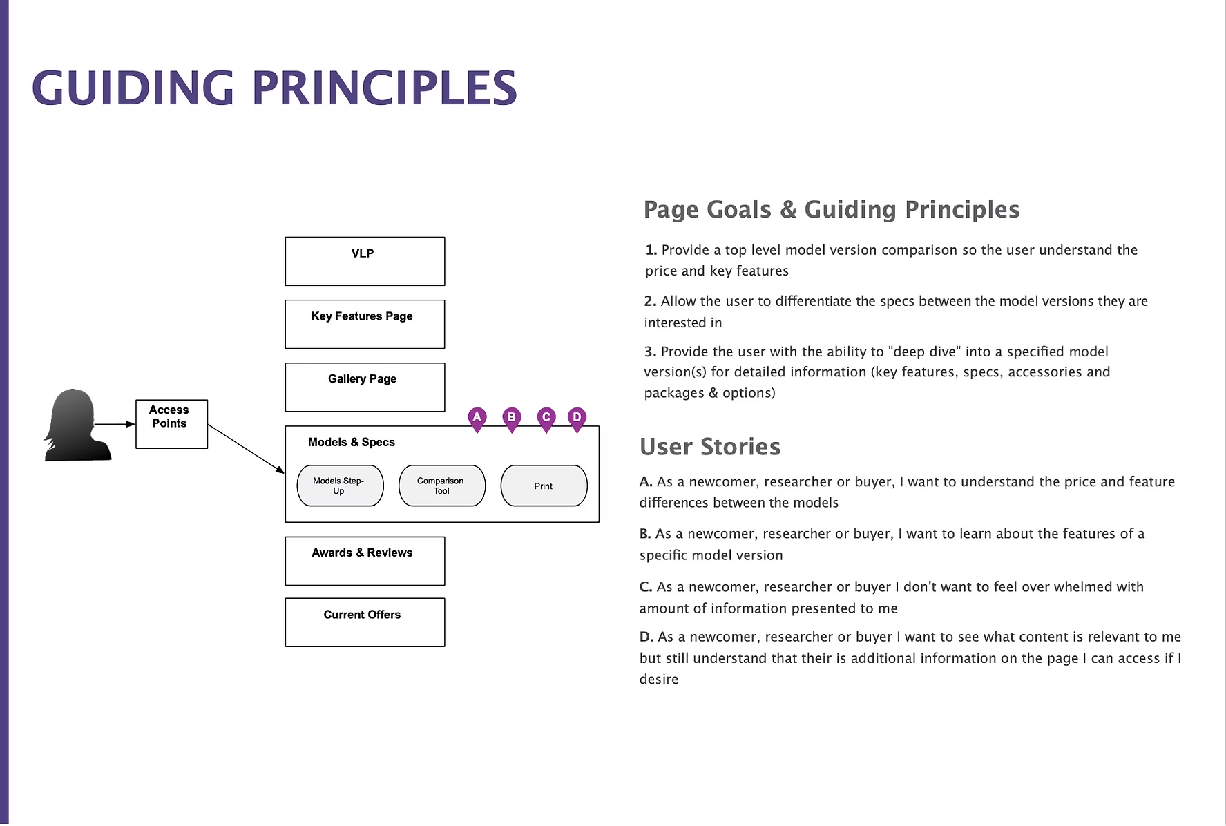
- Mapped flows around the three primary shopper modes that kept showing up in the data: Newcomers, Researchers, and Ready-to-Buy
- Pulled SEO, shopping tools, and marketing into the same room early, so we weren't trading off priorities at the eleventh hour
Three shoppers, three jobs to be done.
These personas came out of analytics segments, support tickets, and a few weeks of user interviews. They're not stand-ins for everyone who lands on the VRS, but they cover the patterns we kept building around: the first-timer who needed orientation, the deep researcher who wanted real numbers, and the buyer who showed up ready to act and didn't want to be slowed down.
A modular system, opened up only as needed.
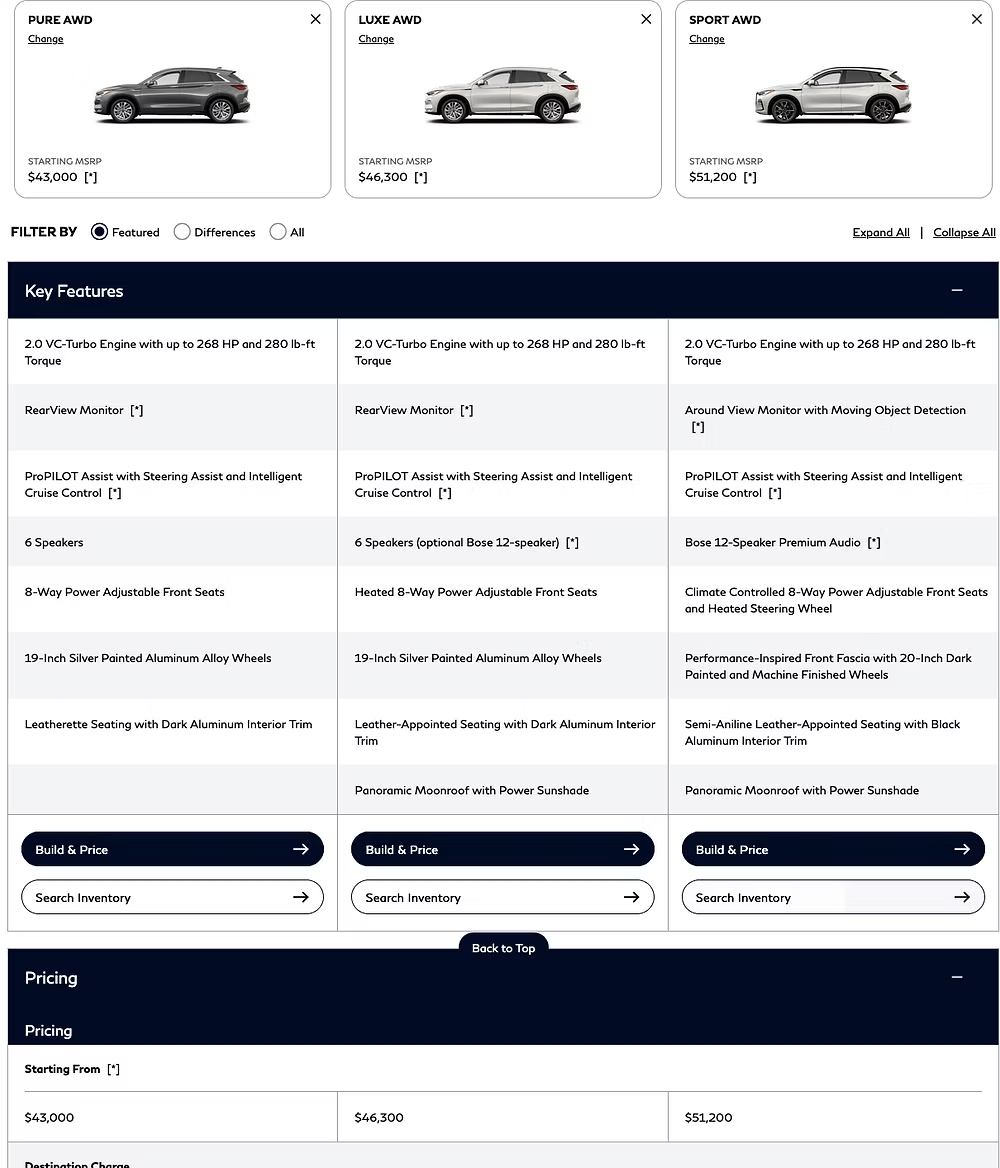
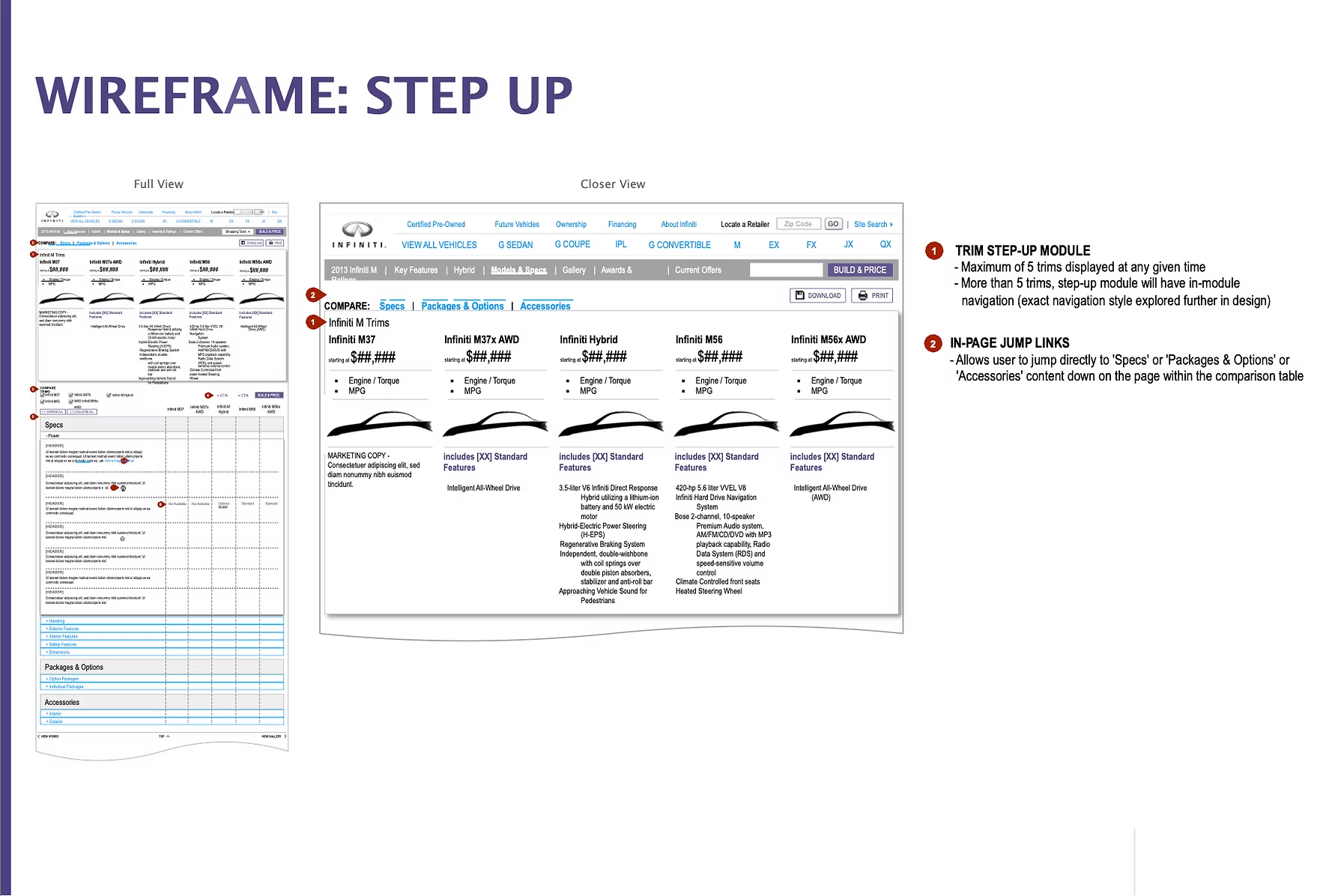
- Added a Step-Up module that puts trims and pricing right at the top, where shoppers were already trying to look
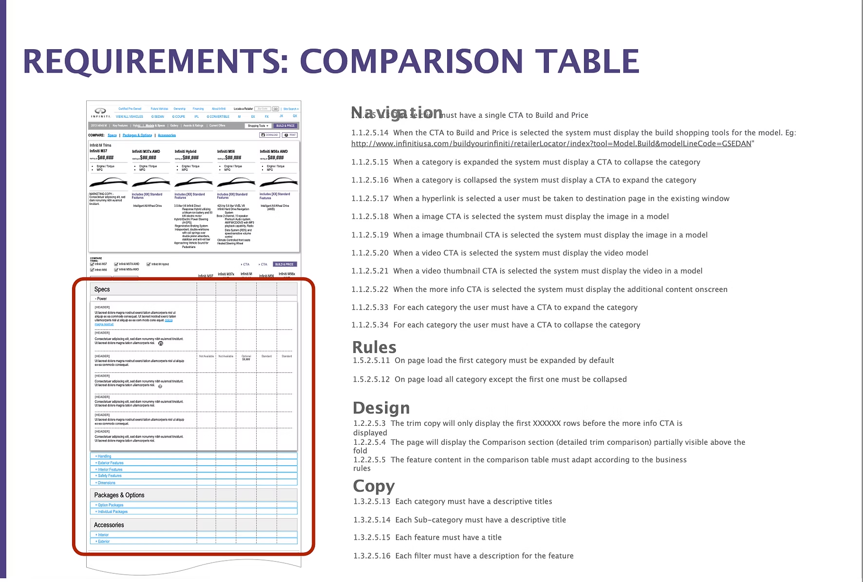
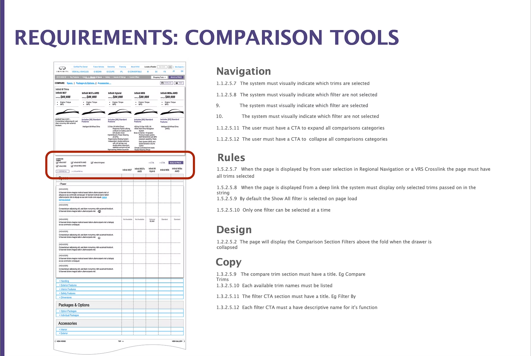
- Designed feature and spec comparisons that stay collapsed until a shopper asks to see them
- Expandable feature tables, plus overlay views for rich media so the page doesn't have to swap context
- Tight cross-links between Key Features, Gallery, Awards & Reviews, and Offers, so each module reinforces the others
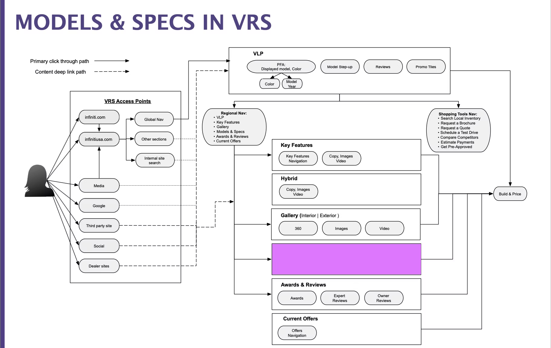
Wires that had to work on mobile, in screen readers, and for SEO.
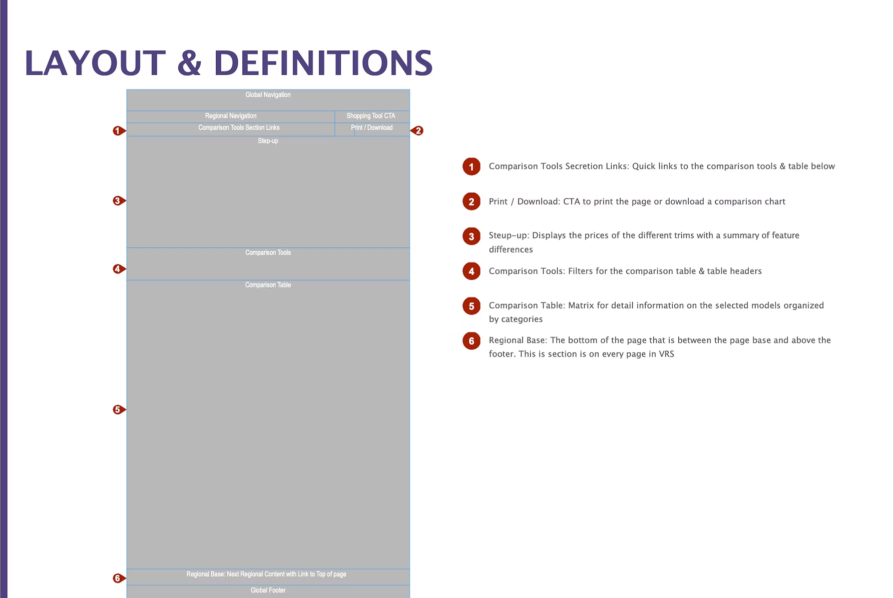
- Wireframed Step Up, trim comparison, regional base navigation, and the accessory galleries
- Baked accessibility, responsive behavior, and semantic structure in at the wire stage. We didn't want to retrofit any of it later, and we didn't have to
What shipped.
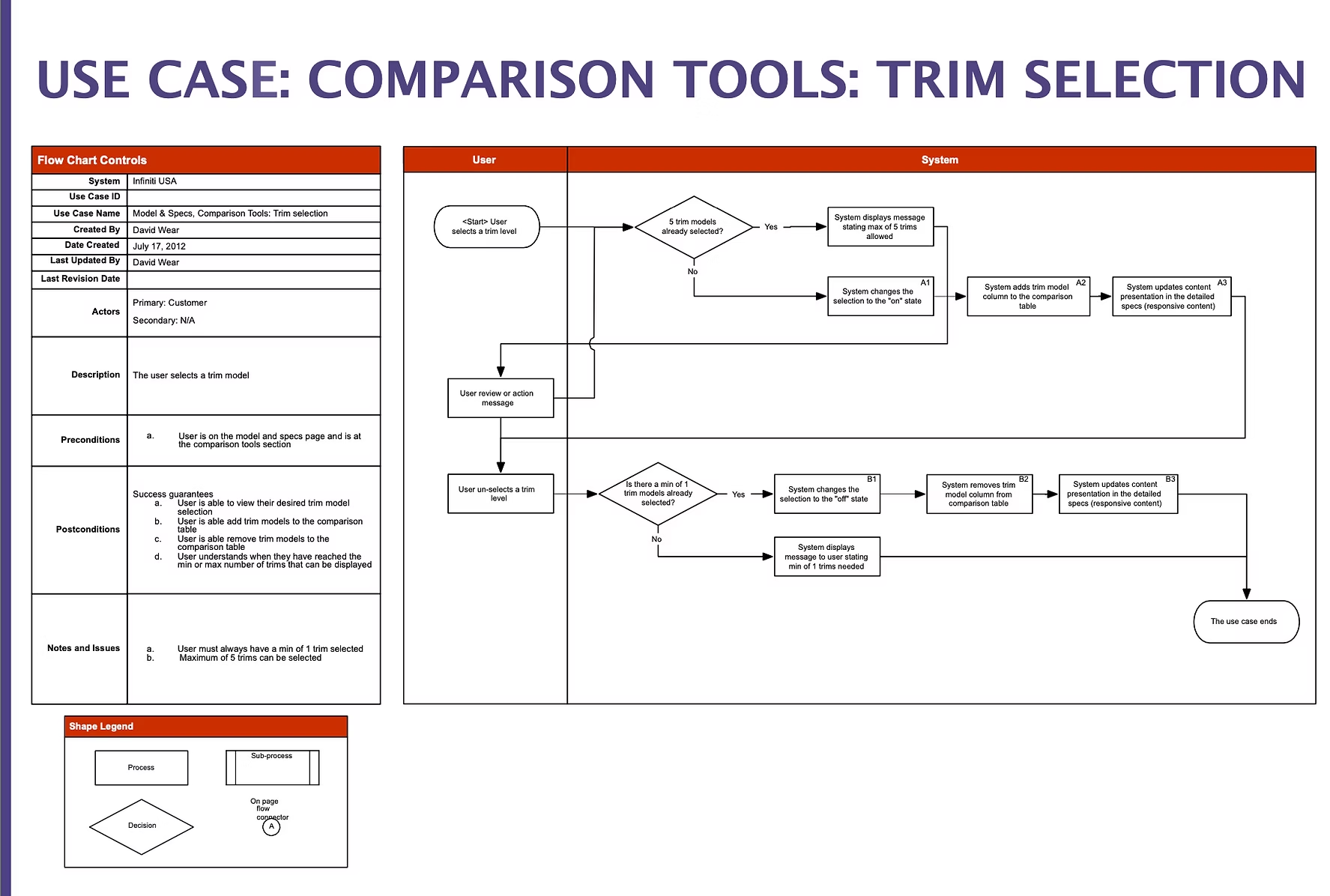
- Step Up trim comparison, so a shopper can see exactly what they pick up by moving to the next tier
- Spec comparison tables with "Show Differences" and "Show Similarities" filters baked in
- Build & Price, Request Brochure, and Schedule Test Drive present throughout the flow instead of waiting for the last page
- Expandable sections, so the page doesn't open as a wall of text
- Carousel navigation for trim lineups that go past five
- Galleries and awards content tied to whichever trim and offer the shopper is currently on
60 days after launch.
From shoppers in testing.
"It's easier to see what you're getting when you move up trims. I don't feel like I'm guessing anymore."
"I love how I can open and close what I care about. It doesn't show everything at me at once."
"The Build & Price button is always there when I'm ready. I don't have to hunt for it."
What I took away.
Luxury car shoppers want a lot of information. They just don't want all of it on screen at the same time. The thing I kept noticing in testing was how often someone would lean in once we let them control the pacing. People stopped scanning for an escape hatch and started reading. Modular wasn't a stylistic call. It was the only way to give serious shoppers room to actually study the car.
The next round of work is heading into personalization and predictive paths, focused on the shoppers who are already most of the way to a decision and shouldn't have to start from scratch every visit.