What was getting in the way.
NissanUSA.com is the brand's main digital storefront. Millions of shoppers a month land there to research vehicles, compare pricing, and find dealers. By the time we got involved, the site had drifted. The architecture was fragmented, the design system felt about five years behind, and the customer data the team had on hand wasn't really shaping the decisions getting made.
I led research and strategy on the redesign. Mobile was the priority. So was moving decisions out of the conference room and back into evidence, and making the thing easier to use end-to-end.
Research, IA, and strategy lead.
I owned the research plan and ran the foundational studies myself, then translated the findings into a strategy the rest of the team could build against. That meant annotated wireframes, a content framework, and a phased rollout the business could actually execute on without grinding the roadmap to a halt.
- Ran research across discovery, validation, and post-launch
- Kept Marketing, IT, Dealer Support, and Digital Innovation pointed in the same direction
Day to day, I worked most closely with the PM, the BAs, and the lead engineer. The BAs held the business requirements and had the clearest view of what was actually in scope, so I made it a priority to bring research findings directly into those conversations rather than filtering them through a deck. The PM kept the schedule honest and helped me flag when a UX ask was going to blow a deadline before it actually did. With engineering, I worked in the same tools and joined planning sessions so the wires I was handing over matched what was actually buildable in the timeframe we had.
What we did first.
Discovery looked like what discovery usually looks like: stakeholder interviews, analytics, competitor benchmarking, a heuristic review. We paired all of it with moderated usability sessions, half first-time shoppers, half returning ones, so we could see where the experience broke for each.
The site didn't have an information problem. It had a too-much-information problem. Shoppers were giving up on pages where the answer was technically right there, because nothing on the page told them where to look first.
How the work was structured.
The engagement ran thirteen months across six phases. Research stayed open the entire time rather than closing out before design started, which meant each phase could shape the next as findings came in.
Mapping how people actually move through it.
Journey mapping and a couple of co-design sessions with stakeholders helped us land on the five flows that actually mattered: Vehicle Discovery, Build & Price, Dealer Locator, Financing, and Offers. Everything else either fed into those or could wait.
Nobody shops a car in a straight line. People bounce between pricing, incentives, dealer details, and financing, sometimes circling back two or three times before they're ready. The new IA had to support that kind of weaving instead of punishing it.
Three Nissan shoppers, three paths through the redesign.
The Comparison Shopper weighs Nissan against Honda and Toyota. The First-Time Buyer is trying to figure out what a trim level even is. The Returning Loyalist already knows the lineup and just wants a fast lane. Toggle through each journey to see how the redesign shaped itself to whoever's on it.
-
01 SparkCuriousDoing
Triggered by a life change, an ad, or a friend's new car. Opens a tab to start looking.
Thinking"Maybe it's time. Let me see what's out there."
TouchpointsHomepage, search results, social, third-party reviews
How the redesign helpsA calm homepage that orients without flooding, with clear pathways to discovery, build, and offers.
-
02 ExploreOverwhelmedDoing
Browses categories. Sedan? SUV? EV? Watches walkthroughs and reads buyer reviews.
Thinking"There's a lot here. Which one actually fits my life?"
TouchpointsModels index, category filters, vehicle pages, video
How the redesign helpsIA built around real shopper mental models, not internal taxonomy. Filters that match how people describe their needs.
-
03 CompareFocusedDoing
Stacks two or three candidates side-by-side. Checks MPG, cargo, safety, tech.
Thinking"Which one wins on the stuff I actually use day to day?"
TouchpointsCompare tool, model detail pages, spec tables
How the redesign helpsSpecs ranked by what shoppers care about, not by engineering order. Comparison that surfaces real tradeoffs.
-
04 ConfigureInvestedDoing
Picks a trim, color, and packages. Watches the price climb. Models a monthly payment.
Thinking"What's the real out-the-door number? Can I actually afford this?"
TouchpointsBuild & Price, payment estimator, offers panel
How the redesign helpsMobile-first Build & Price with total, payment, and live incentives always in view. No surprise jumps.
-
05 CommitCautiousDoing
Saves the build, finds the nearest dealer, checks live inventory and offers.
Thinking"Is this exact car actually nearby? Who do I talk to first?"
TouchpointsDealer locator, inventory listings, contact dealer
How the redesign helpsDealer pages surface real inventory and live offers tied to the saved build. No dead ends, no restart.
-
01SparkUncertainDoing
A life event triggers the need. Asks family and friends what they should look at.
Thinking"I don't even know what I'm supposed to be looking at. Is Nissan a smart choice for someone like me?"
TouchpointsSearch, social media, family recommendations, third-party reviews
How the redesign helpsA welcoming homepage that introduces the lineup by lifestyle fit instead of model number. First-time-buyer-friendly entry points up front.
-
02ExploreLostDoing
Looks at SUVs because everyone has one. Can't tell if a Rogue is too big or too small. Doesn't know what trim levels mean.
Thinking"What's the difference between an S, SV, and SL? Is one of them going to get me in trouble?"
TouchpointsModels index, model overview pages, trim explainer
How the redesign helpsPlain-language explanations of trim levels and what each one actually includes. No insider jargon.
-
03CompareCarefulDoing
Cross-shops Nissan against Toyota Corolla and Honda Civic. Reads reliability ratings closely.
Thinking"I cannot afford to buy the wrong car. What's reliable? What holds its value?"
TouchpointsCompare tool, third-party reviews, owner forums
How the redesign helpsSpec comparisons grounded in everyday use cases. Reliability and awards data baked into the comparison view.
-
04ConfigureAnxiousDoing
Opens Build & Price. Watches the price climb. Considers a used vehicle instead.
Thinking"The base price was reasonable, but everything I want pushes this way past my budget."
TouchpointsBuild & Price, payment estimator, financing tools
How the redesign helpsPayment estimator with realistic financing assumptions. Lease options surfaced alongside purchase. No hidden cost reveals at the end.
-
05CommitApprehensiveDoing
Schedules a test drive. Wants to ask the dealer about everything before signing anything.
Thinking"Am I about to make a mistake I'll regret for five years?"
TouchpointsDealer locator, test drive scheduler, dealer chat
How the redesign helpsEducational "what to expect at the dealership" content sits right next to the booking flow, so first-time buyers walk in prepared.
-
01SparkDecidedDoing
Current Nissan is approaching trade-in. Comes straight to the Nissan site.
Thinking"I'm getting another Nissan. Question is which one and when."
TouchpointsDirect entry, owner email, current vehicle page
How the redesign helpsLoyalty offers and trade-in tools surface for returning visitors. Recognized session state where possible.
-
02ExploreCuriousDoing
Checks what's new on the model they currently own. Eyes a couple of adjacent models.
Thinking"What's changed since my last Rogue? Should I step up to a Murano this round?"
TouchpointsModel overview, "what's new" content, model comparison
How the redesign helps"What's new" callouts tied to each model. Easy step-up to adjacent trims and models without losing context.
-
03CompareTargetedDoing
Compares the new model year against their current vehicle, not against other brands.
Thinking"Is the upgrade actually worth it? Trade in now, or hold another year?"
TouchpointsTrim comparison, trade-in estimator, financing tools
How the redesign helpsTrade-in estimator pulls real numbers. Comparison views frame the year-over-year delta clearly.
-
04ConfigureMethodicalDoing
Builds the new car. Adds the packages that matter, skips the ones that don't.
Thinking"Same trim as last time, but the new tech package is worth a look this round."
TouchpointsBuild & Price, saved builds, dealer inventory
How the redesign helpsSaved-build state persists across sessions. The build cross-references live local inventory.
-
05CommitReadyDoing
Sends the saved build to the dealer with a request to schedule the trade-in and pickup.
Thinking"Get me a date. I know the drill."
TouchpointsContact dealer, schedule appointment, trade-in handoff
How the redesign helpsDealer contact carries the build and trade-in info forward. The loyalist doesn't get asked to start over.
The three curves told different stories: the First-Time Buyer never quite breaks through to confidence, the Returning Loyalist barely wavers, the Comparison Shopper bounces between the two. Once leadership could see all three in the same frame, the priority order on the roadmap stopped being a debate. We invested where the emotional risk was highest across the most shoppers, not where the loudest stakeholder was pointing.
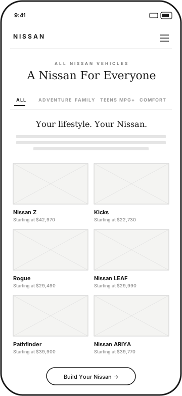
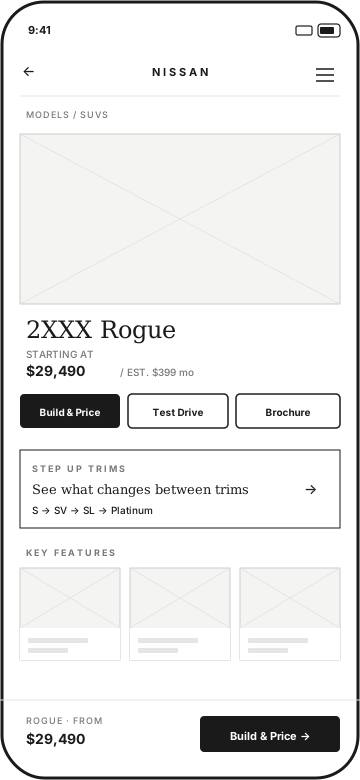
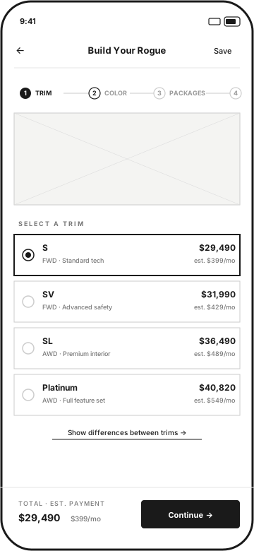
The Rogue® Build & Price flow on mobile.
Build & Price was the hardest screen on the legacy site for small displays. It asked shoppers to compare trims side by side, track a running price, evaluate packages, and make financial decisions, all on a surface where horizontal space collapses and dense tables become unreadable. The legacy implementation stacked everything vertically without priority, buried the estimated total below the fold, and gave no persistent anchor for the price as shoppers scrolled. People were making configuration choices without being able to see what those choices cost in real time. The redesign kept the estimated MSRP locked to the bottom of the screen throughout, collapsed package details behind expandable rows, and simplified trim comparison to a single selectable card per option. These are the final mobile screens that came out of that work: trim selection with live pricing, a build summary before dealer handoff, and the quote request that closes the loop.
Three rounds of testing.
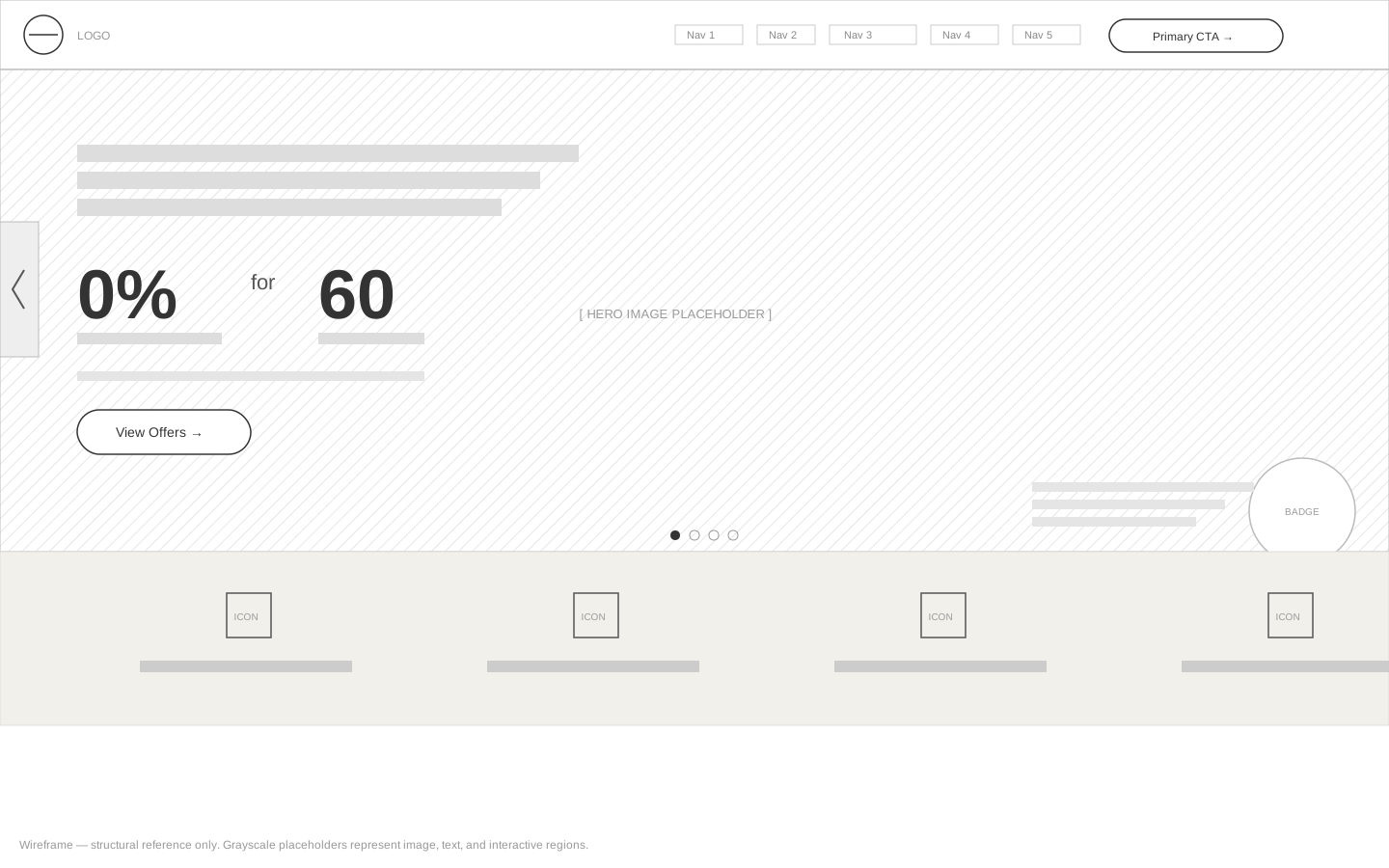
The first round used wireframes on purpose. We wanted to know whether the structure and the content hierarchy were working before anyone spent time on visual design. When you put a polished prototype in front of a participant, they react to the surface: the colors, the type, the overall aesthetic. You end up with feedback about whether something looks trustworthy instead of whether they can actually find what they came for. Wireframes strip that away. Participants have nothing to grab onto except the layout and the content, which is exactly what we needed to stress-test. They also tend to speak more freely. A polished design carries an implicit signal that the decisions are finished, and people are more likely to hedge their criticism or talk themselves out of a concern. A wireframe reads as a work in progress, and participants treat it that way. We got blunter, more useful feedback. If a shopper couldn't locate the trim comparison at that fidelity, a coat of paint wasn't going to fix it. It also let us run more iterations cheaply. We could pull a frame apart and reroute it between sessions without waiting on a design review cycle.
We benchmarked against the legacy site, then tested mid-fi prototypes and the pre-launch build. A/B tests covered CTA wording and mobile-first layouts. Here's what each round taught us:
- Round 1 (wireframes): Navigation wasn't the problem. Shoppers found models without much friction. The real failure was trim comparison: participants kept looking for a dedicated compare button that didn't exist, and when they couldn't find one, they gave up instead of reading the spec tables we'd already built. We restructured the entry point before moving to visual design.
- Round 2 (mid-fi): The persistent MSRP bar on Build & Price made an immediate difference. When the price scrolled out of view, participants stopped making configuration decisions and started second-guessing whether they were even on the right page. Keeping the total anchored to the bottom reduced that hesitation significantly. CTA wording also mattered more than expected: "Build Your Rogue" drove noticeably higher task completion than "Get Started."
- Round 3 (pre-launch): The mobile scroll depth improvements held under realistic conditions, and the new IA reduced the number of participants who bounced from key pages without clicking anything. The one thing that didn't fully land: the offers panel was still being missed by first-time buyers who didn't know incentives were available. We flagged it for a post-launch iteration.
- Across all three rounds: Participants in wireframe sessions gave feedback that held up through launch. Structural decisions we validated in round one didn't get reversed in round three. Running research at the earliest possible fidelity wasn't just cheaper. It was more predictive.
Here's what moved in the metrics:
- Homepage engagement: +40% scroll-through, measured via scroll depth analytics
- Build & Price on mobile: more shoppers finishing the full configurator flow instead of dropping off mid-way
- Bounce rate: fewer people leaving without clicking anything on the key pages
What stuck.
The site didn't win on flash. People came back because it was clear, and because the answers they wanted showed up where they expected them.
What I took away.
The biggest lesson from this one: research works best when it stays open the whole time, not when it's a phase you finish before design starts. Every decision that held up post-launch was one we could trace back to something a real shopper did. The other thing I didn't expect to matter as much as it did was the UX framework we left behind. Nissan reused it on later campaigns, and that long tail of value is the kind of thing that's easy to underestimate when you're scoping the work.
The broader takeaway, and the one I carry into every automotive engagement now: a visually strong site is not the same as a usable one. The previous NissanUSA.com was not an ugly site. It had production-quality photography, a consistent visual language, and real craft in the art direction. What it lacked was a UX layer that helped shoppers orient, prioritize, and move forward. Pages that looked right still stopped people cold because nothing told them where to go next.
That distinction matters more than it sounds. In automotive, the design bar is high across the board. Most OEM sites look polished. Most of them also have the same core problems: too much information competing for attention at once, navigation that reflects internal org structure instead of how shoppers think, and key tasks buried behind visual storytelling that's compelling but not useful. The visual quality can actually mask the usability problems for a while, which is why the problems persist. You have to watch real shoppers use the thing before you know where it's actually breaking down.
Closing that gap requires research that runs alongside design, not before it as a phase you check off and move past. Every round of testing we ran changed something about the direction we were headed. That kind of ongoing feedback loop is what separates a site that looks good in a screenshot from one that actually moves people through a decision. Good design gets someone to stop. Good UX gets them to stay.
What's next.
- Save-and-return shopping across devices
- Dealer inventory pulled into Build & Price and Offers
- More mobile work on IA and content density
- Quarterly usability testing as a standing rhythm
- Better KPI tracking down at the micro-interaction level