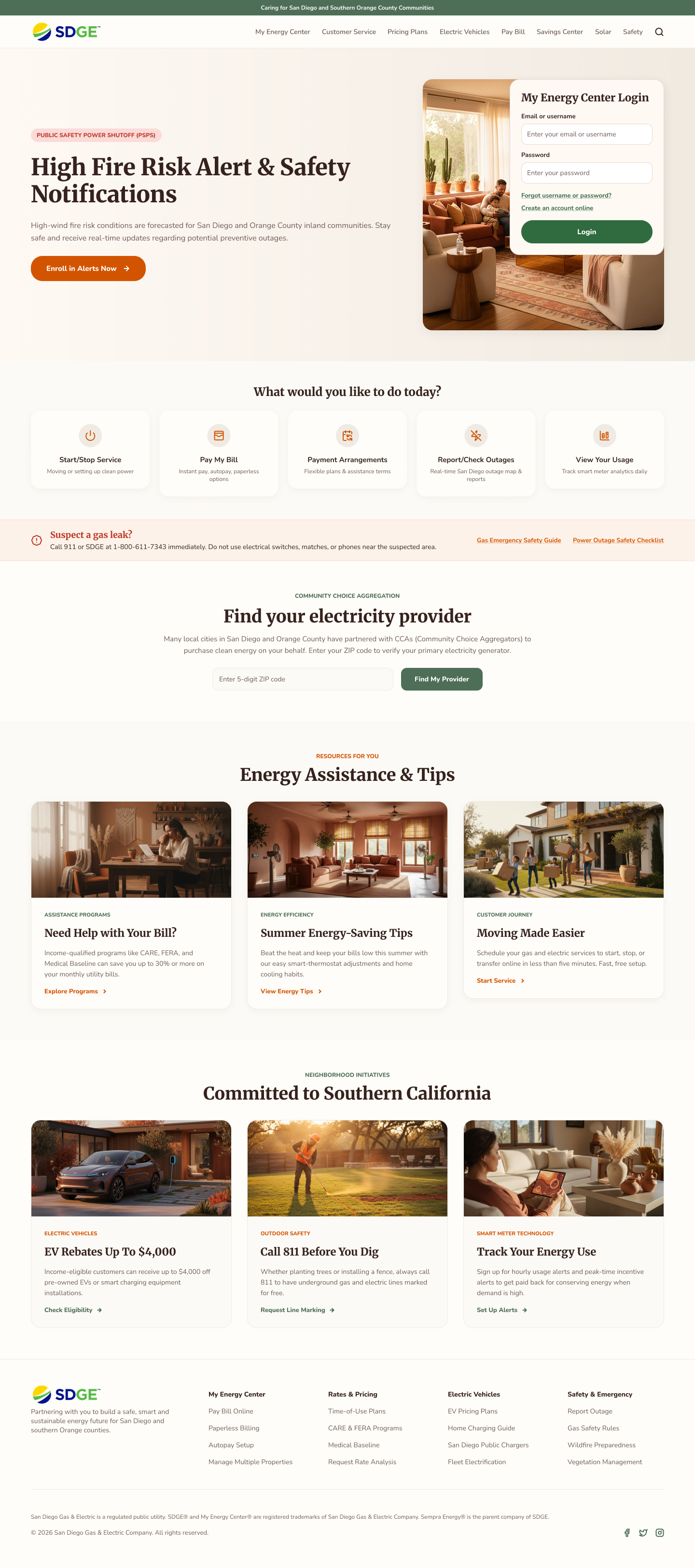
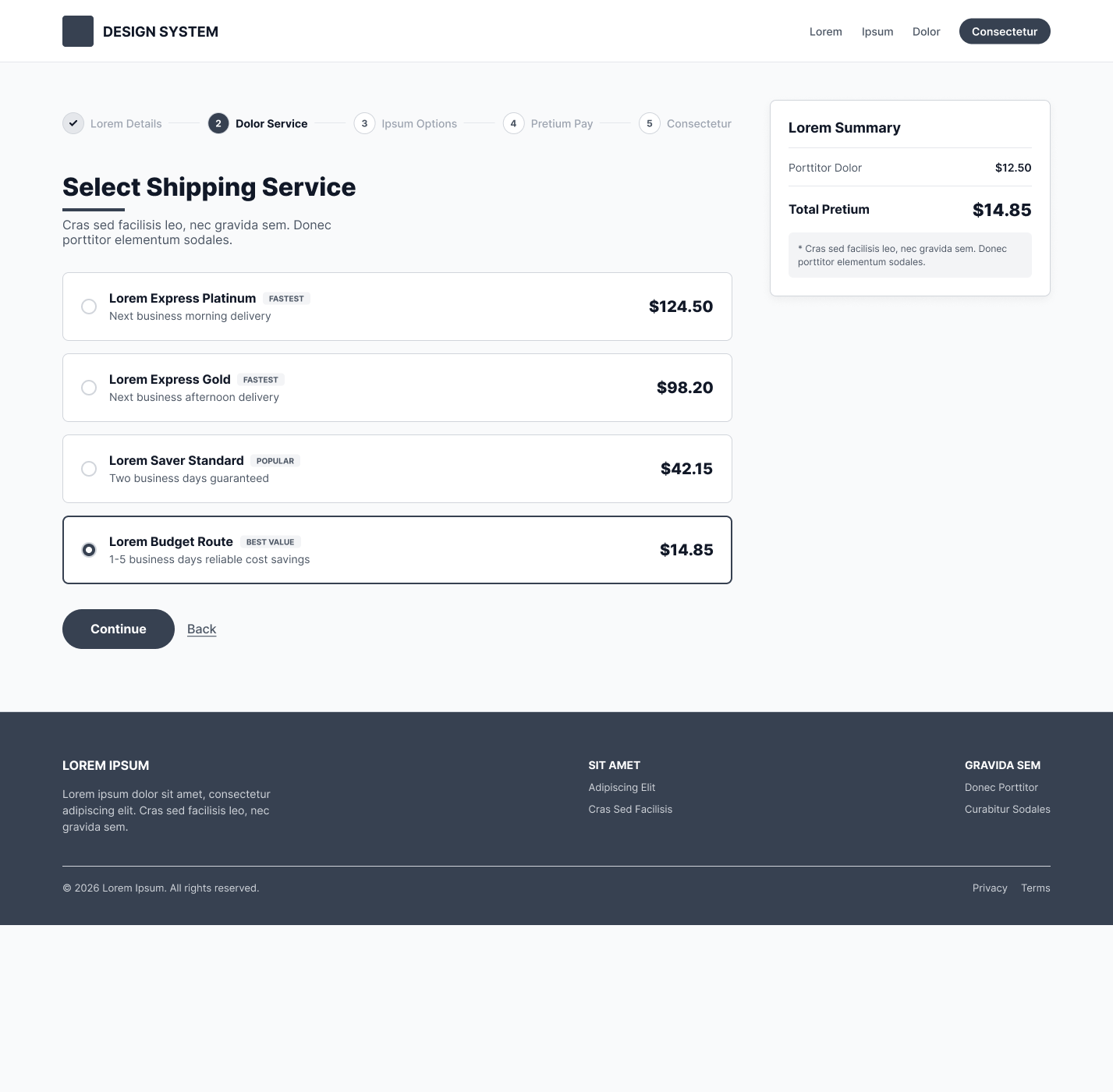
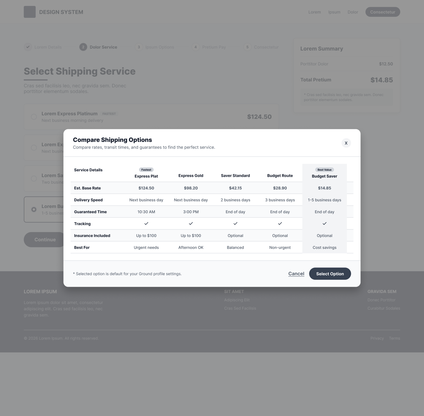
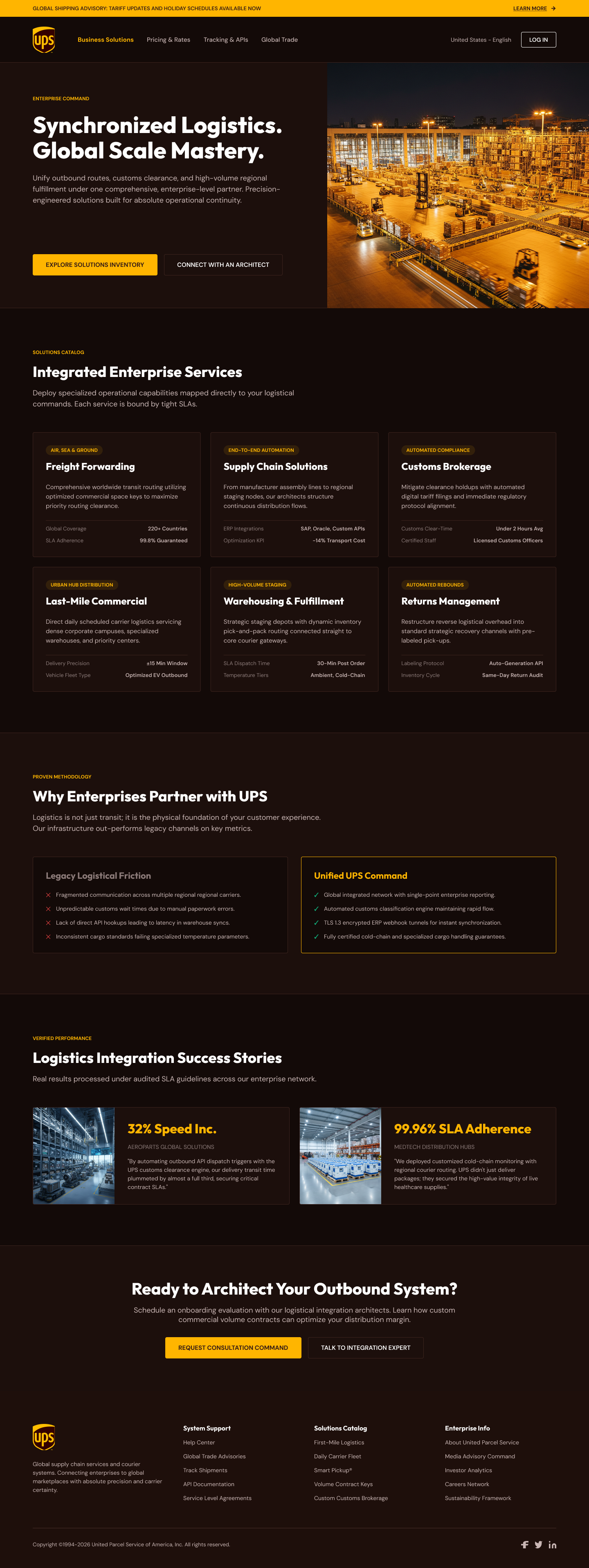
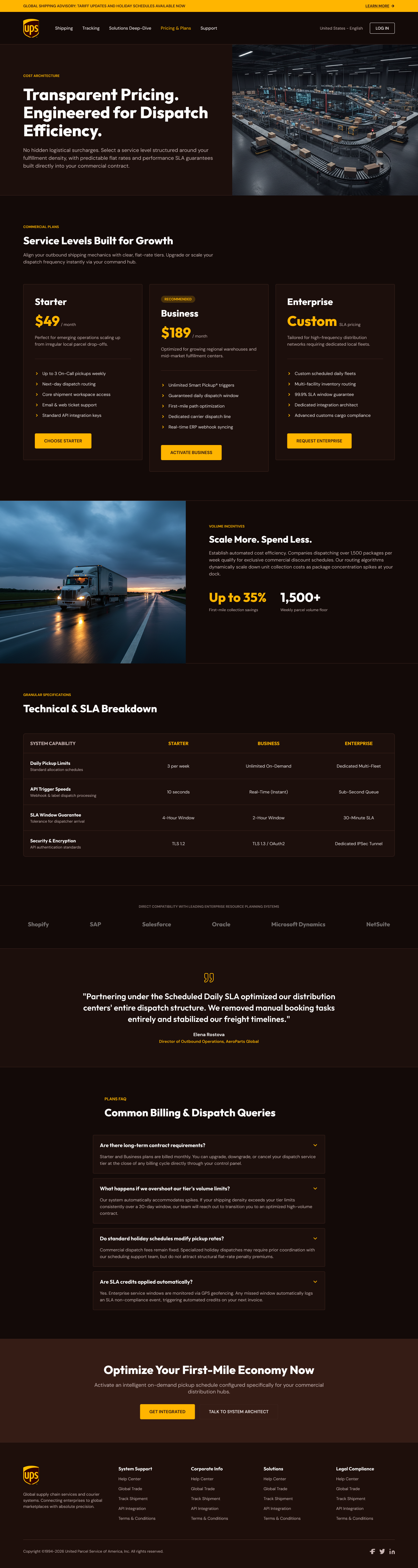
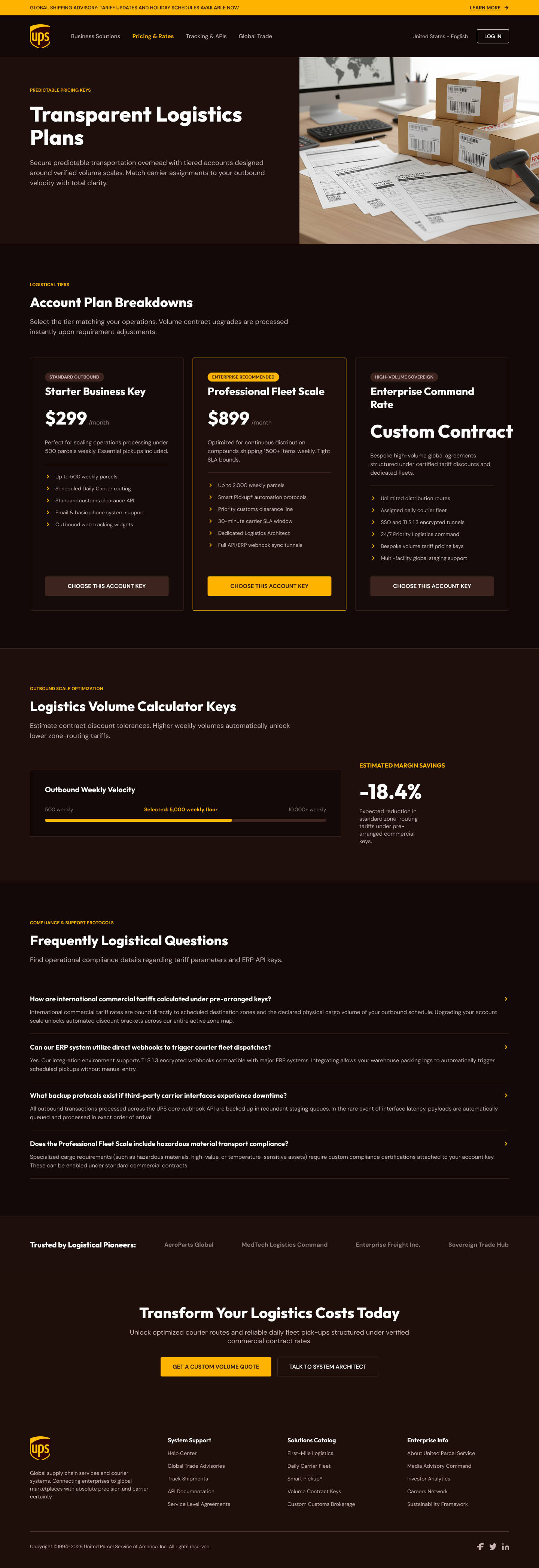
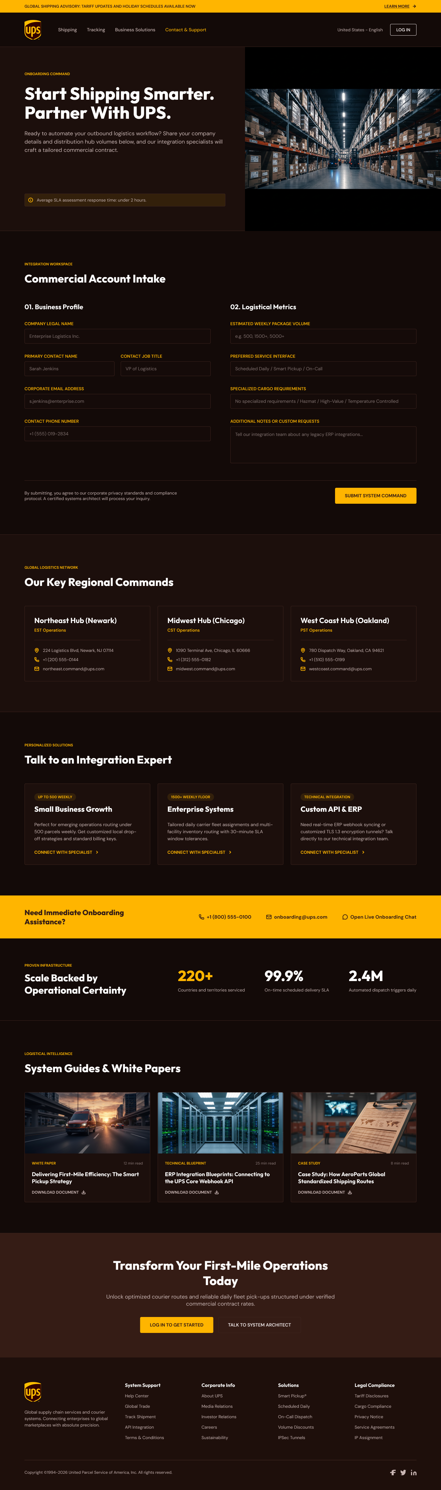
A collection of UI designs, wireframes, and prototypes across client engagements. Click any image to view full size and zoom in for detail.
Project
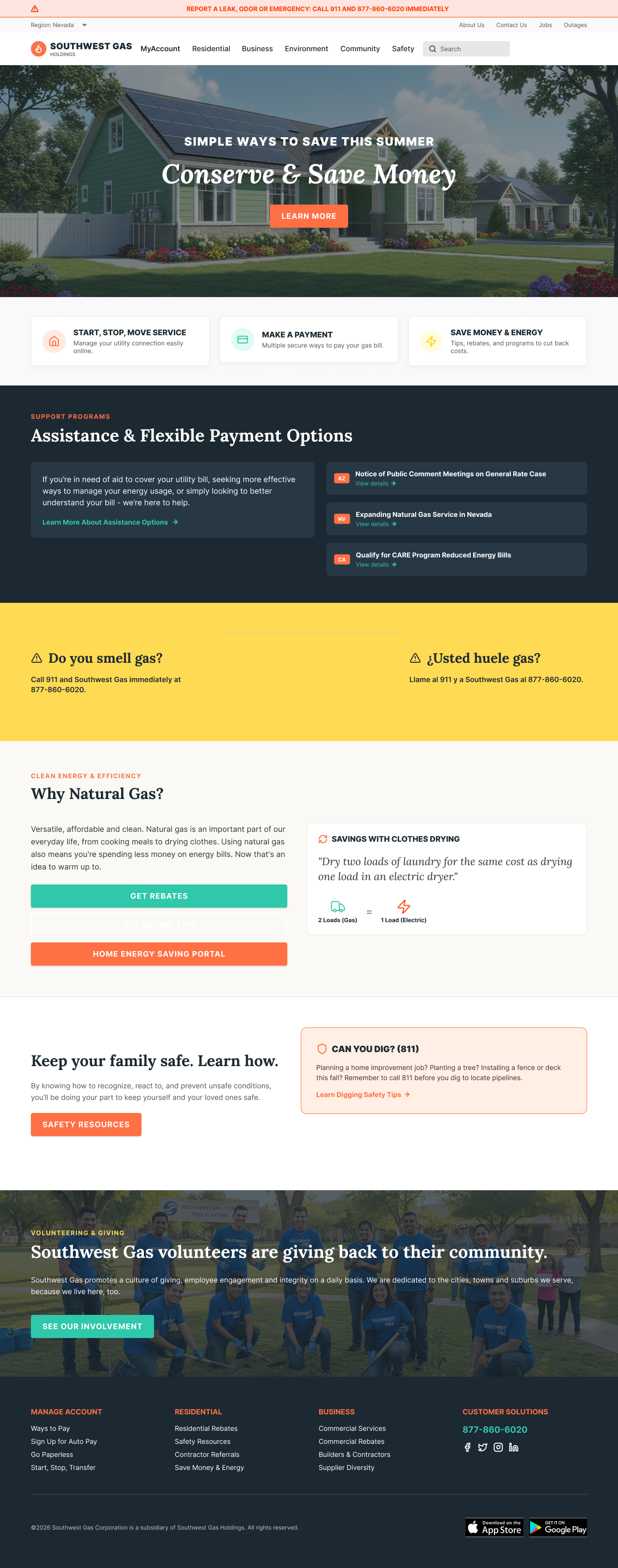
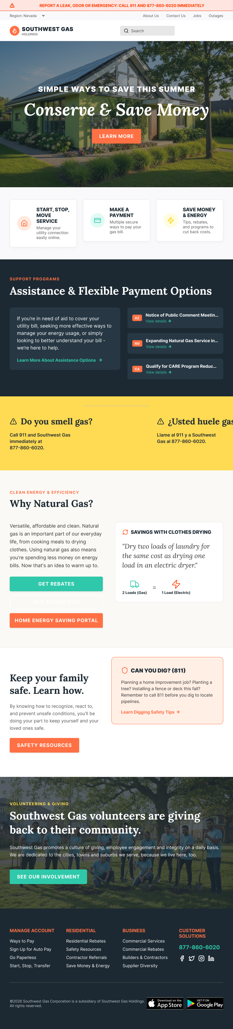
A 15-month engagement to redesign swgas.com alongside a CMS migration to Oracle WebCenter Sites. I led UX strategy, research, and art direction end-to-end, and designed and built approximately 85% of the final site after establishing the design system and coding the page templates.
The site was running on a legacy CMS that had become a bottleneck for everything: editorial work crawled, content was duplicated across pages, and UX improvements kept dying in the backlog. I started with an audit of the existing experience to understand what the site was actually doing for customers versus what the business assumed it was doing. That audit shaped the IA, content, and research strategy for the whole program.
I built personas grounded in real customer behavior across Southwest Gas's three-state service territory: Arizona, Nevada, and California. Each persona was paired with an end-to-end journey covering the tasks that mattered most: starting service, paying a bill, reporting a leak, applying for energy assistance. Those journeys became the shared reference for everything that followed. IA decisions, content priorities, and visual hierarchy all traced back to them.
The existing navigation was organized around the company's org chart, not around what customers came to do. I restructured it around the top customer tasks: bill pay, service requests, account management, and emergency information. Energy savings programs and rebate content got promoted into the navigation rather than buried in marketing pages, because customers were making decisions about equipment and usage that affected their bills every month.
Rather than running strategy, design, and content in sequence, I structured the program as three concurrent tracks: UX strategy and research, design and prototyping, and content and art direction. Each track cycled through a Think-Make-Check loop every sprint. Findings from usability testing fed iterative changes to templates and IA in the same week, not at the end of the project. I ran four rounds of moderated testing with real customers before any designs were considered final.
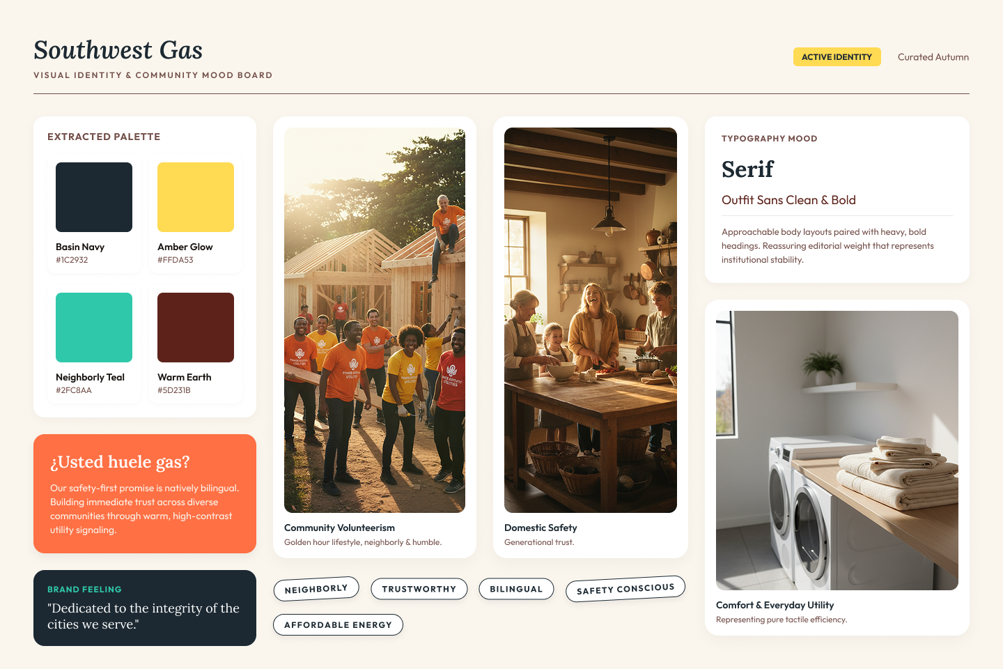
Before settling on a tone, I ran a brand perception study to understand how customers actually felt about the product they were buying. The study used an experimental design: respondents were randomly assigned to one of four conditions and asked to rate their feelings about one of the following terms: "natural gas," "natural methane gas," "methane," or "methane gas." The goal was to measure how much the name itself shaped perception, independent of any site content.
The finding was clear. "Natural gas" produced strongly positive emotional responses, 76% favorable, higher than oil (51%) or coal (39%). The term "methane" produced the opposite: negative associations with pollution and environmental harm. Respondents connected "natural gas" with words like clean, efficient, and reliable. "Methane gas" connected to pollution and risk. Same product, opposite reactions depending on what you called it.
This told me that the language Southwest Gas used across the site was not a copy decision, it was a design decision. Every label, heading, and CTA either reinforced or worked against a perception the company had already earned. The redesign needed to treat the words as part of the experience, not an afterthought.
The research also surfaced a second, more specific concern: consumers associate natural gas with explosion risk. Not as a daily anxiety, but as a latent safety concern that sits just below the surface. Decades of public safety campaigns have trained people to connect the smell of mercaptan, the sulfur-like additive in natural gas, directly with a leak and immediate danger. When customers smell it, their first thought is evacuation, not appliance trouble.
That finding had direct IA and design implications. Emergency content needed to be in the navigation and findable in seconds, not buried. Safety pages needed to be scannable and action-oriented, with clear instructions that matched the mental model customers already had. And the overall tone of the site needed to be reassuring without being dismissive: warm and credible, not corporate or evasive. You cannot use a soft marketing voice on a page someone lands on at midnight because they smell rotten eggs.
With the perception data in hand, the tone direction became concrete: warm, reassuring, and grounded in the language customers already responded well to. The site needed to feel like a trustworthy neighbor, not a corporate utility. I developed a mood board to align the team on that direction before any screens were designed. Once the team committed to the tone, it governed every copy and design decision that followed, from headline structure to the way error messages were written.
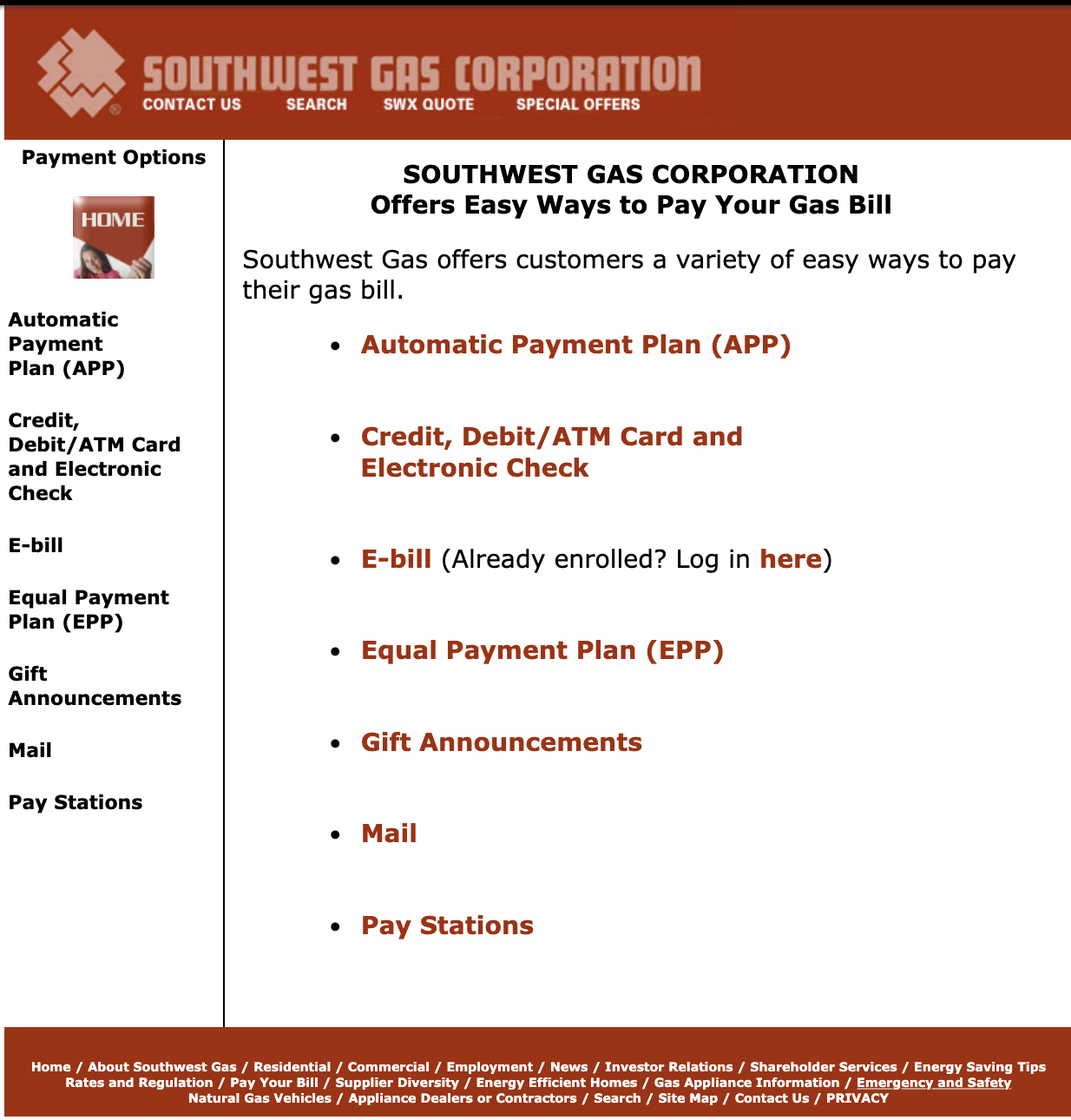
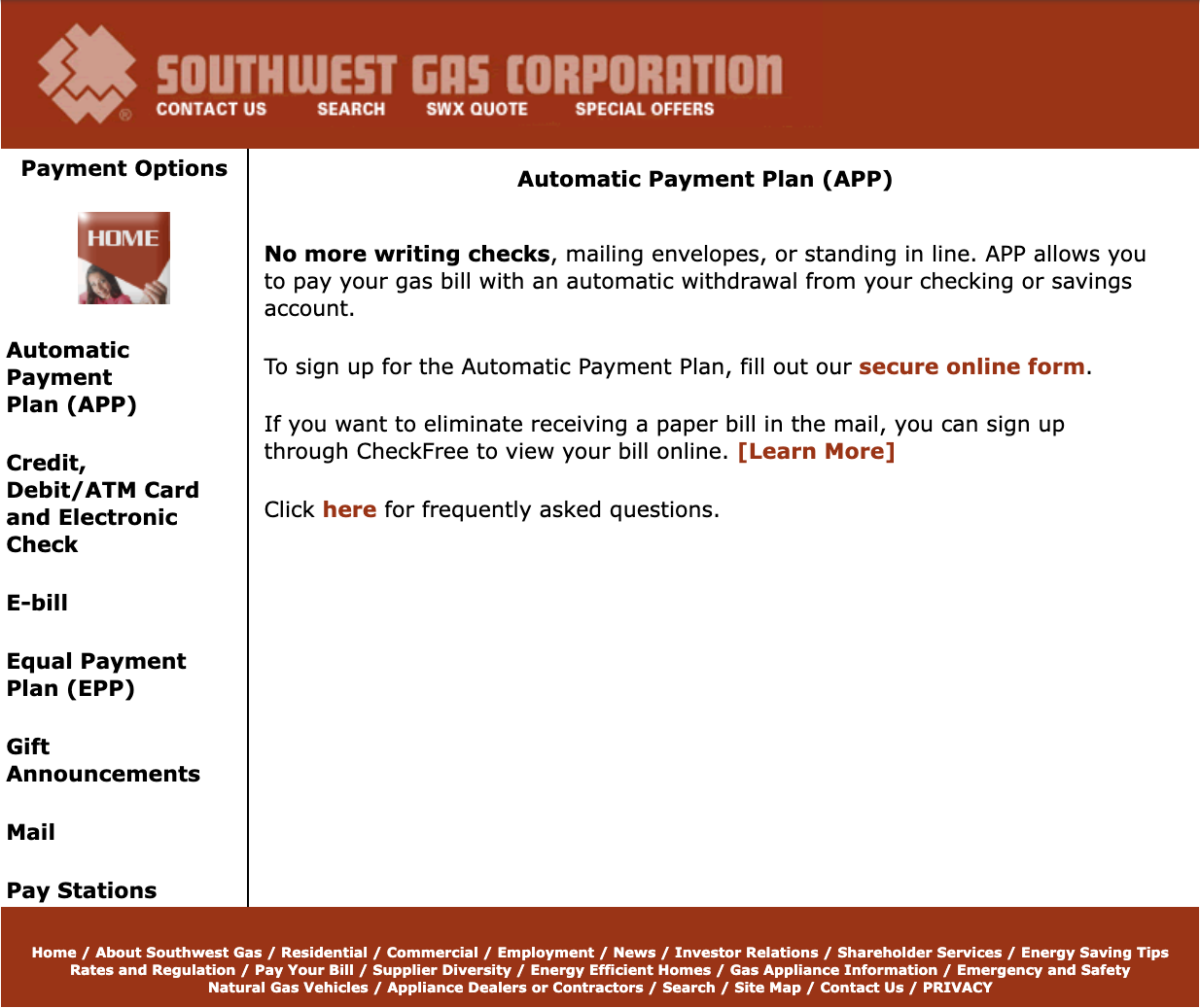
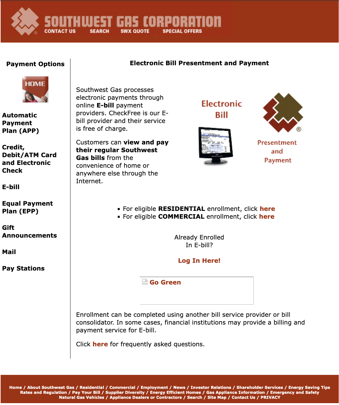
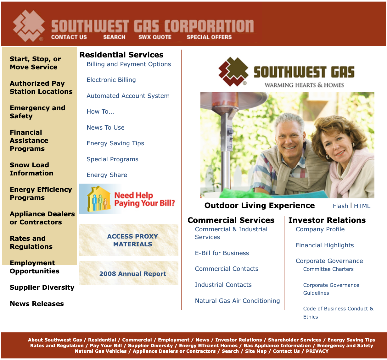
Before · Original Site
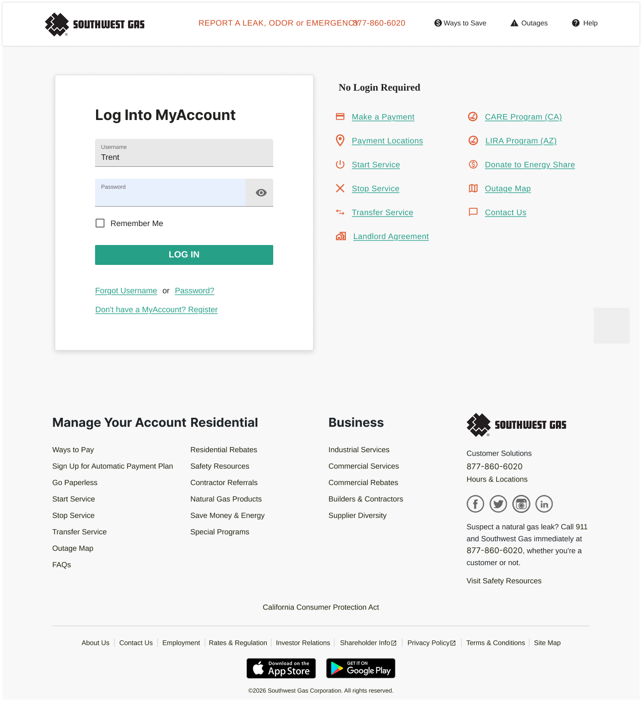
The original swgas.com was built on a legacy CMS with no coherent design system and navigation organized around the company's internal org chart rather than what customers came to do. Utility jargon dominated headings, "Click here" links were the standard pattern, and critical tasks like bill pay and emergency contacts were buried several levels deep. The homepage mixed residential services, commercial services, investor relations, and a Flash-based outdoor living feature in a single cluttered layout with no clear hierarchy.
Research · Customer Personas
Personas are composite profiles built from real user research. They give a design team a shared, concrete picture of who they are solving for, moving decisions away from assumptions and toward documented human behavior. For the Southwest Gas redesign, I led discovery research that included stakeholder interviews, customer intercepts, call center analysis, and a review of support ticket themes. From that data, seven distinct user types surfaced spanning residential customers, small and large commercial accounts, and Spanish-speaking households — each with meaningful differences in goals, digital confidence, and context of use.
These personas were used throughout the project as a design filter. When evaluating navigation structures, bill payment flows, and the Move2Zero energy program, the team would pressure-test decisions against each persona: would Maria be able to do this on her phone during a break? Would Robert find the data he needs without calling support? Would Alexandra get consolidated invoices across all 18 properties? Would Sofía be able to complete the task without switching to English? Having named, grounded profiles kept the conversation about user needs rather than stakeholder preferences.

Visual Direction · Mood Board
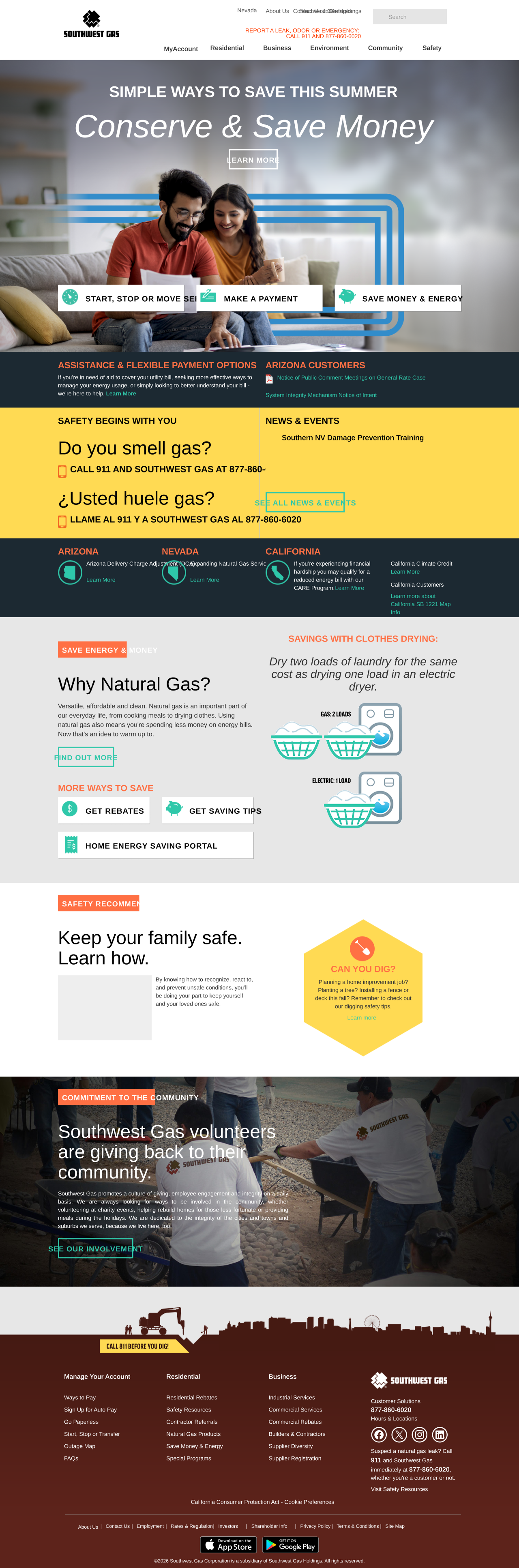
High-Fidelity · Desktop
Responsive · Tablet & Mobile
Card Sorting · Navigation Research
One of the most consequential decisions in the redesign was how to organize the navigation. The original site was structured around Southwest Gas's internal departments, not around what customers came to do. Before designing a new IA, I needed to understand how customers actually thought about their relationship with the utility.
I ran a two-phase card sorting study: an open sort to discover how customers naturally grouped and named content, followed by a closed sort to validate the proposed navigation structure against real user mental models. The two phases together gave me both the structure and the confidence that it would hold under real-world use.
Participants were given a set of content items with no predefined categories and asked to group them in whatever way made sense to them, then name each group. The goal was to surface the mental models and language customers actually used — not what the business assumed they used. This phase drove the initial IA structure and revealed which tasks customers treated as related that the original site had separated.
With a proposed navigation structure in hand, I ran a closed sort to validate it. Participants were given the same content items and asked to place each one into the predefined categories. High agreement rates confirmed which groupings were intuitive. Items with low agreement or consistent misplacement flagged areas where the labels or structure needed adjustment before development.
Key Outcomes
Customer tasks, not org chart sections. The open sort confirmed that customers grouped tasks by what they needed to accomplish (pay my bill, start or stop service, report a problem) rather than by the internal division that owned the content. The new navigation reflected that directly.
Safety content needed its own top-level home. Participants consistently separated leak reporting, emergency contacts, and safety guidelines from general service tasks. Burying them under "Customer Service" was not working. Safety became its own primary navigation item.
Energy efficiency lived in two different mental models. Some participants grouped efficiency programs with billing (saving money), others with home appliances (equipment). The closed sort validated splitting the content across both sections with appropriate cross-linking rather than forcing it into one location.
The closed sort caught two label failures. Two proposed category names produced low agreement and frequent misplacement in the closed sort. Both were renamed before the navigation went to development, preventing findability problems that would have required a post-launch fix.
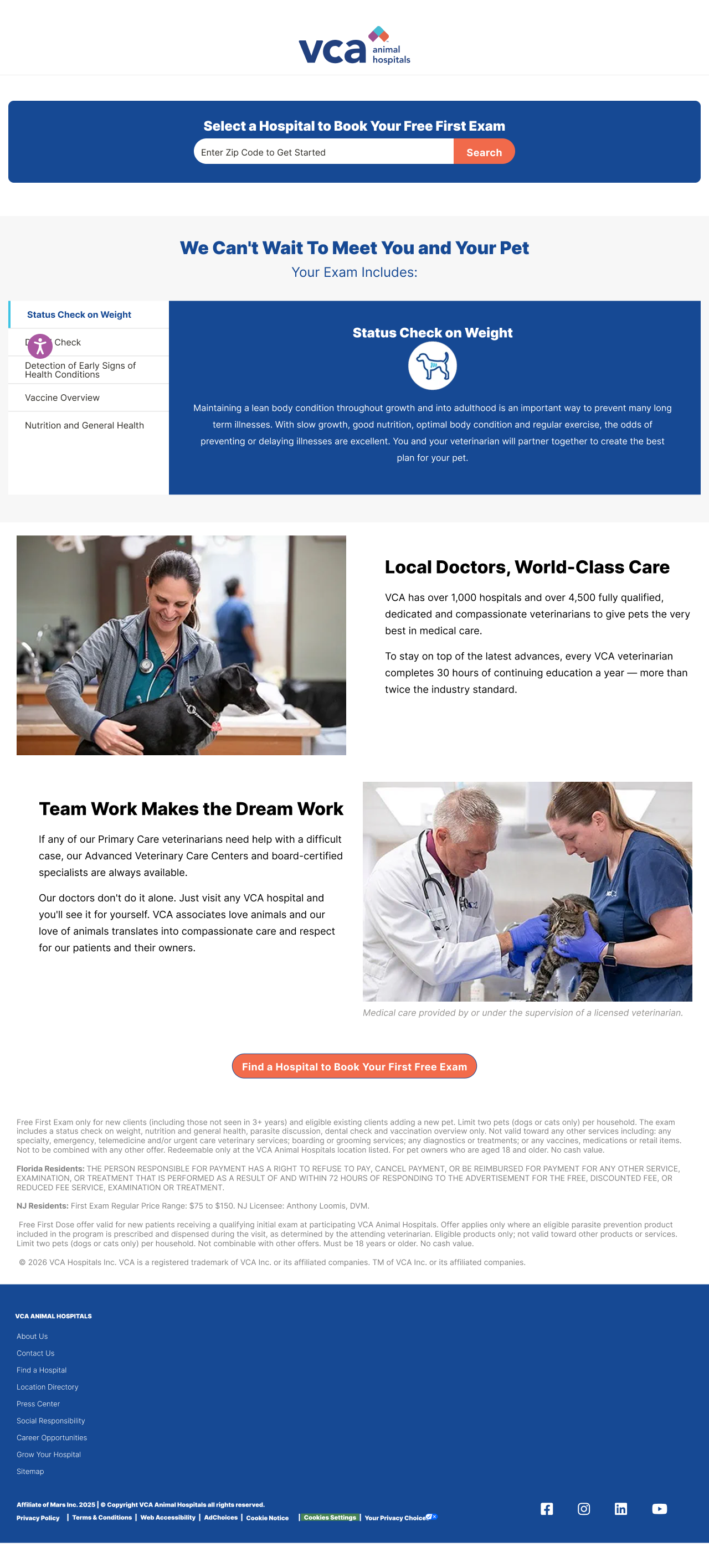
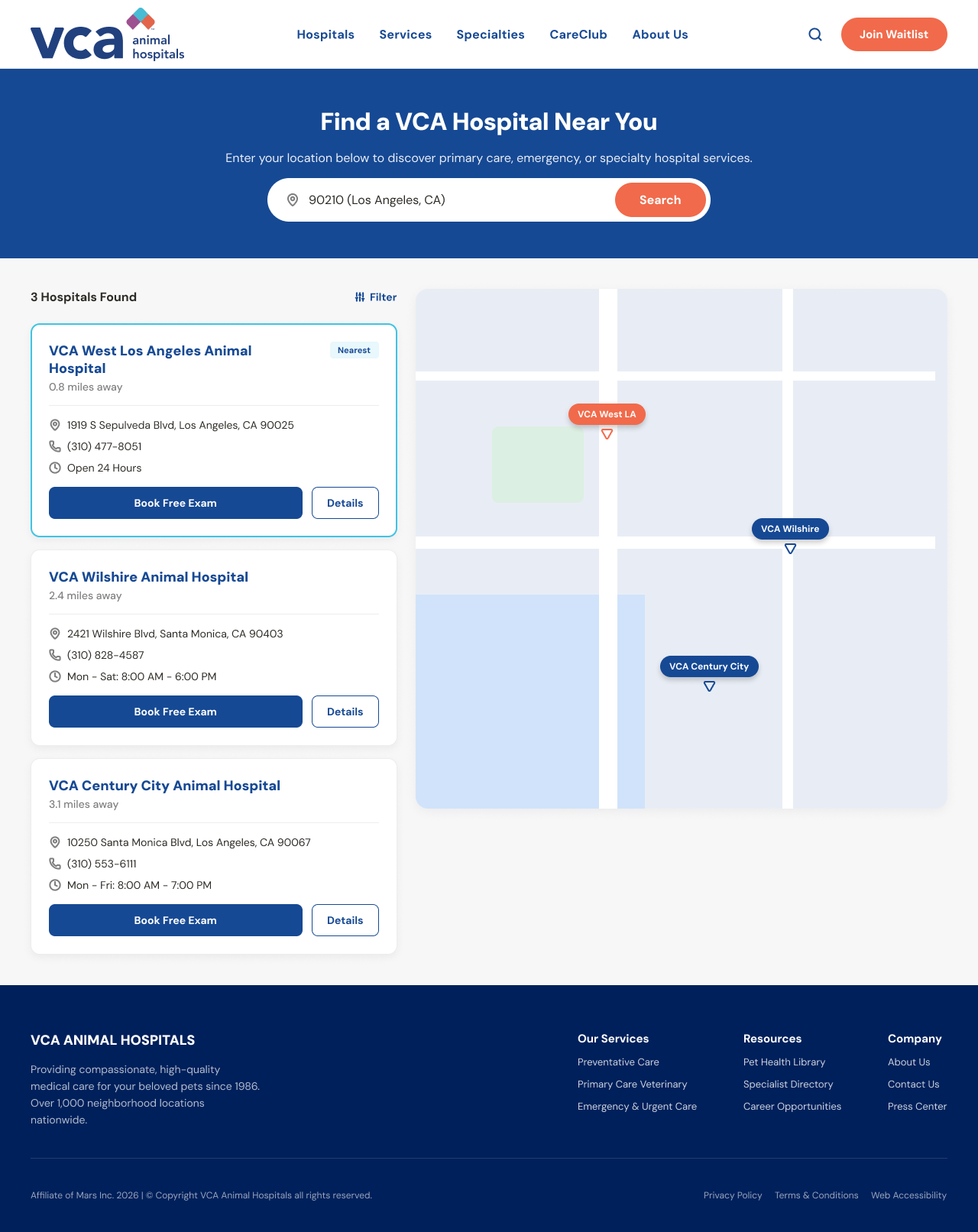
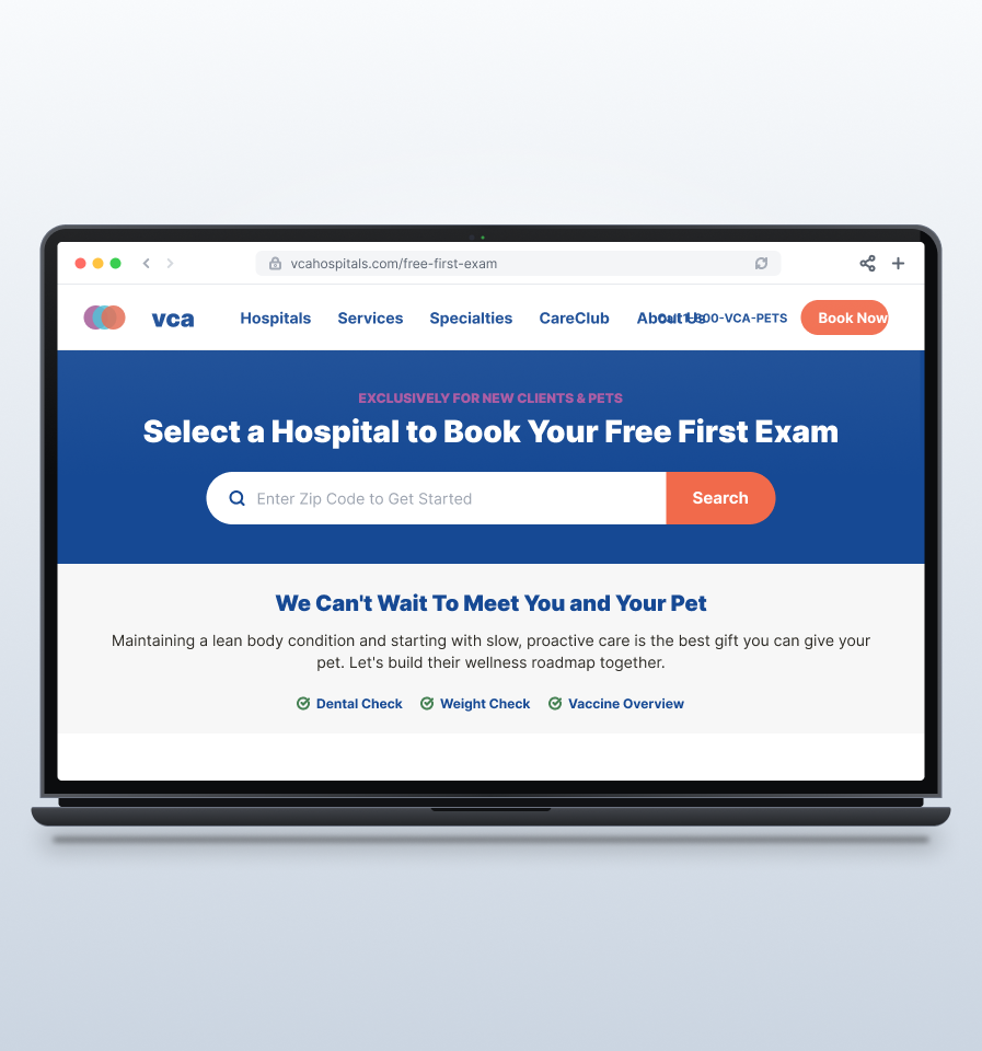
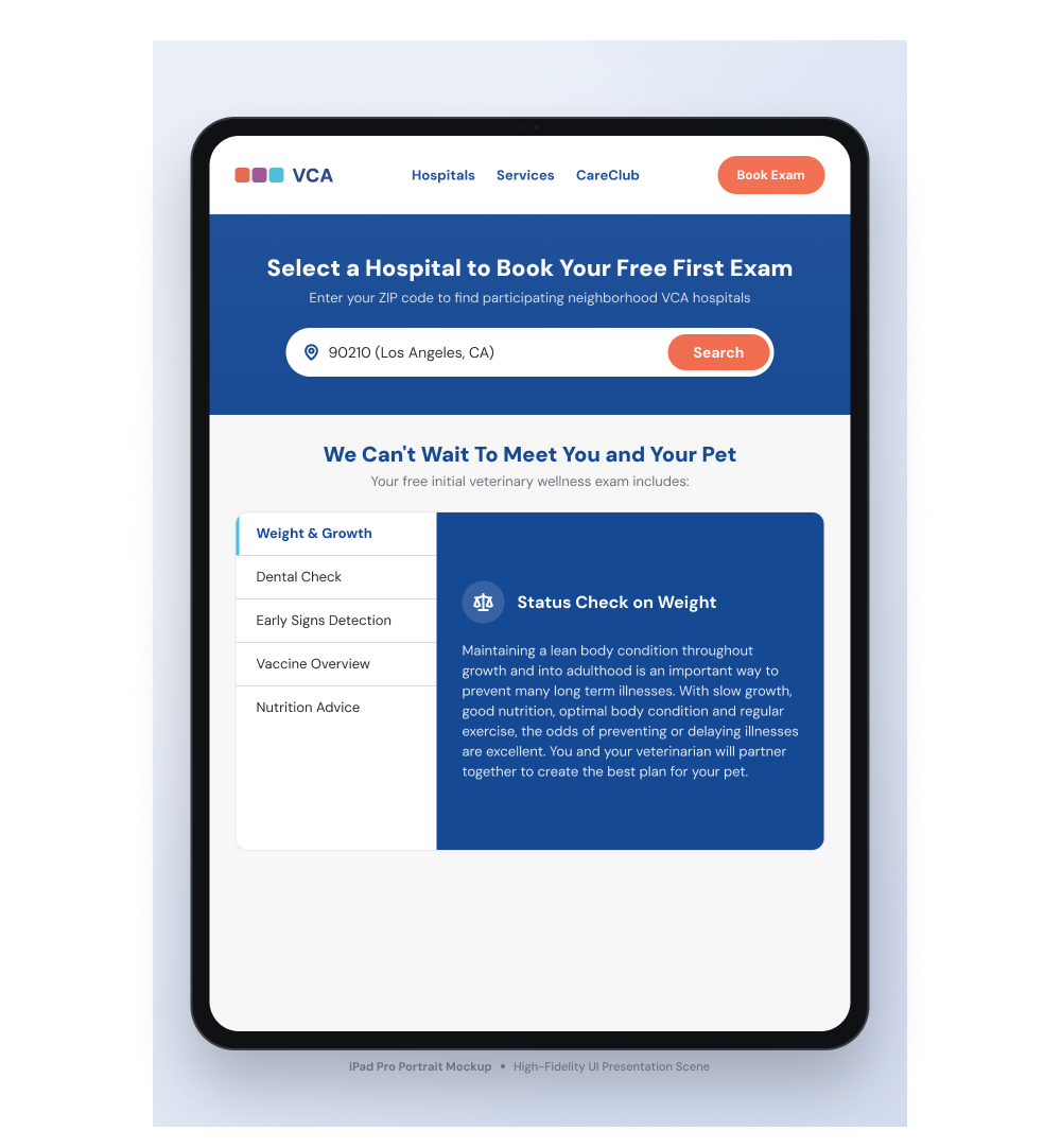
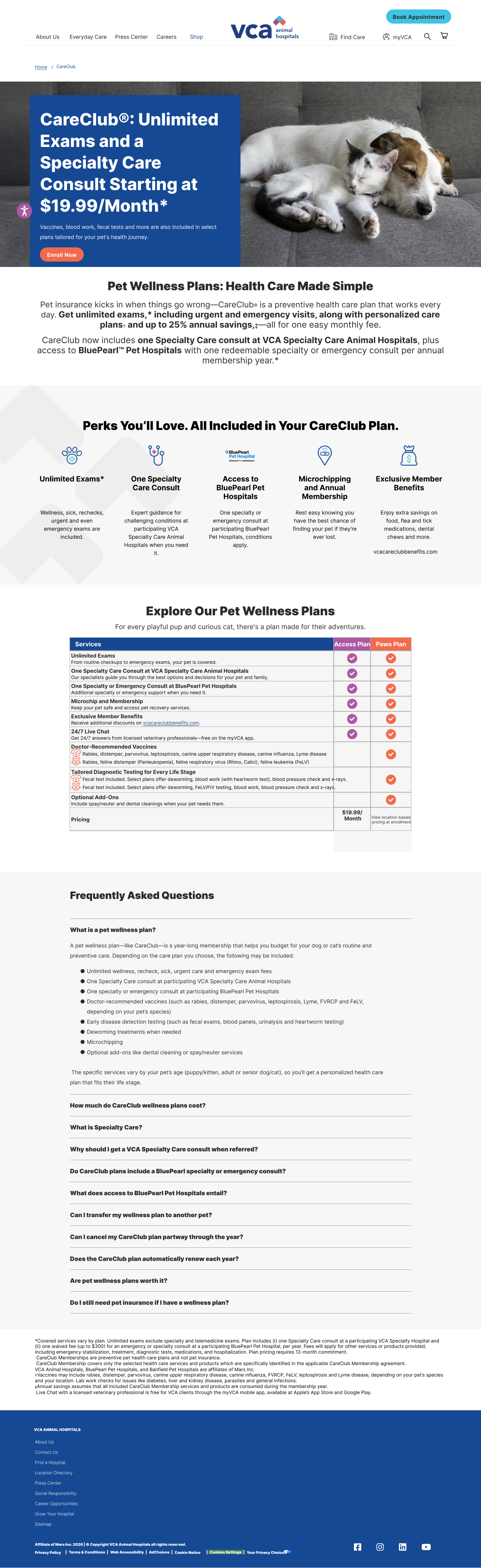
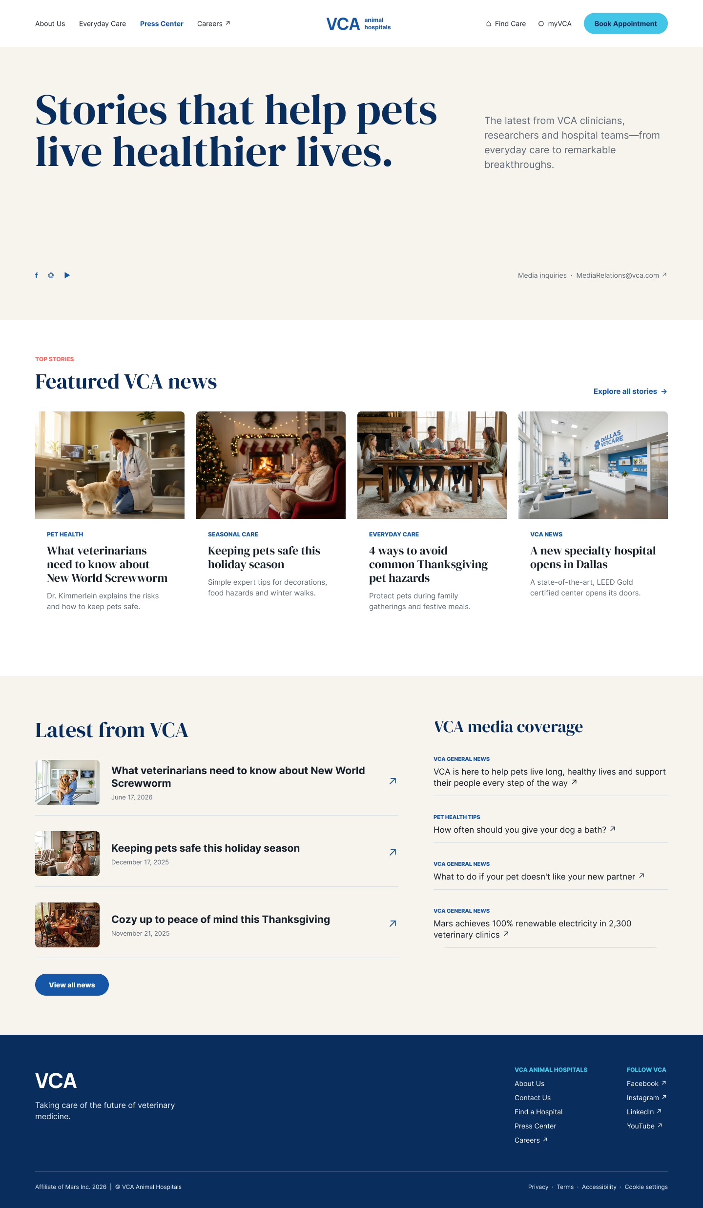
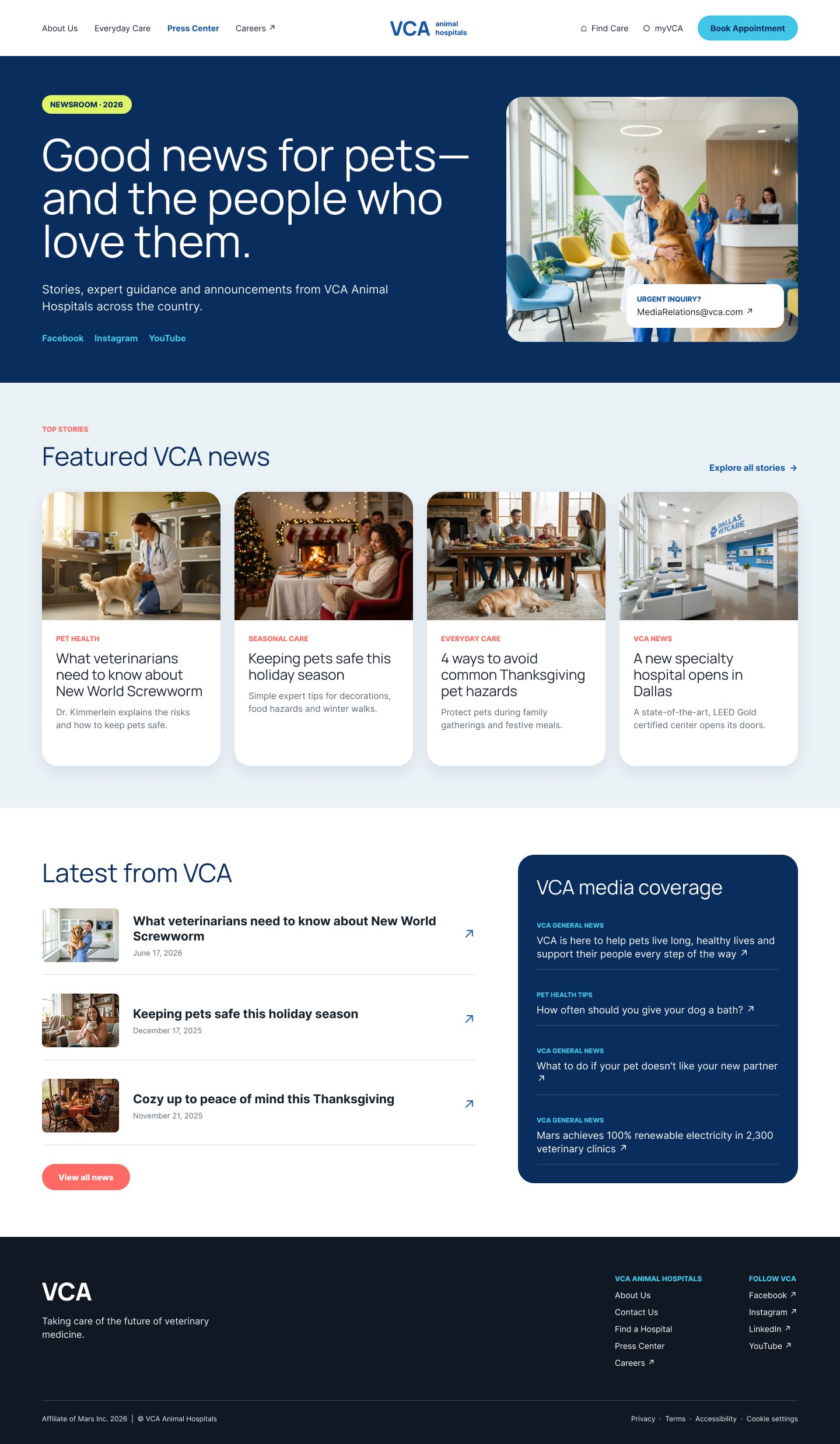
UI design work for VCA Animal Hospitals focused on two high-stakes pages: a Free First Exam acquisition landing page and a hospital finder experience. Both pages had to serve pet owners who are often anxious, time-pressed, and making emotionally-charged decisions.
Lead UI designer on both pages. I owned the end-to-end design from wireframe through high-fidelity, collaborated with the product and marketing teams on content hierarchy, and presented design rationale to the VCA stakeholders. The work shown here reflects my individual contribution.
VCA operates hundreds of animal hospitals across the country. Their website needed to serve two distinct moments: someone who has never been to VCA and is deciding whether to try them, and someone who already trusts the brand and just needs to find their nearest location quickly. Those are different jobs with different emotional states, and the design had to reflect that. I started each page with low-fidelity wireframes to settle structure and hierarchy before any visual decisions were made, then moved to high-fidelity once stakeholders aligned on the layout.
The Free First Exam offer is VCA's primary acquisition tool for new pet owners. The people most likely to convert are also the most uncertain: new pet owners who haven't established a vet relationship yet. The design needed to reduce friction, answer the questions that create hesitation (what's included, what to expect, is this the right hospital for my pet), and make the call to action feel like the obvious next step rather than a commitment. I structured the page so that trust signals and FAQs appeared before the form, not after it, based on what we knew caused drop-off on the original page.
The hospital finder had to do more than show locations on a map. Pet owners searching for a vet are often filtering by more than distance: specialties, hours, whether the hospital handles emergencies, and whether they've seen reviews. The design surfaced those filters without burying the list, and kept the map and the results in view together so users could orient spatially while comparing options side by side. The biggest structural decision was keeping both panels visible simultaneously rather than toggling between map and list views, which testing on similar healthcare finder patterns had consistently shown reduces task completion time.
Stakeholder review confirmed that the redesigned Free First Exam page addressed the primary friction points the team had identified in the original: unclear offer scope and a form that appeared before the user had enough context to feel confident filling it out. The hospital finder's dual-panel layout was validated as a structural improvement over the original single-view experience. Both designs moved into development handoff.
High-Fidelity · Desktop
Designs in Context
Additional Pages · Desktop
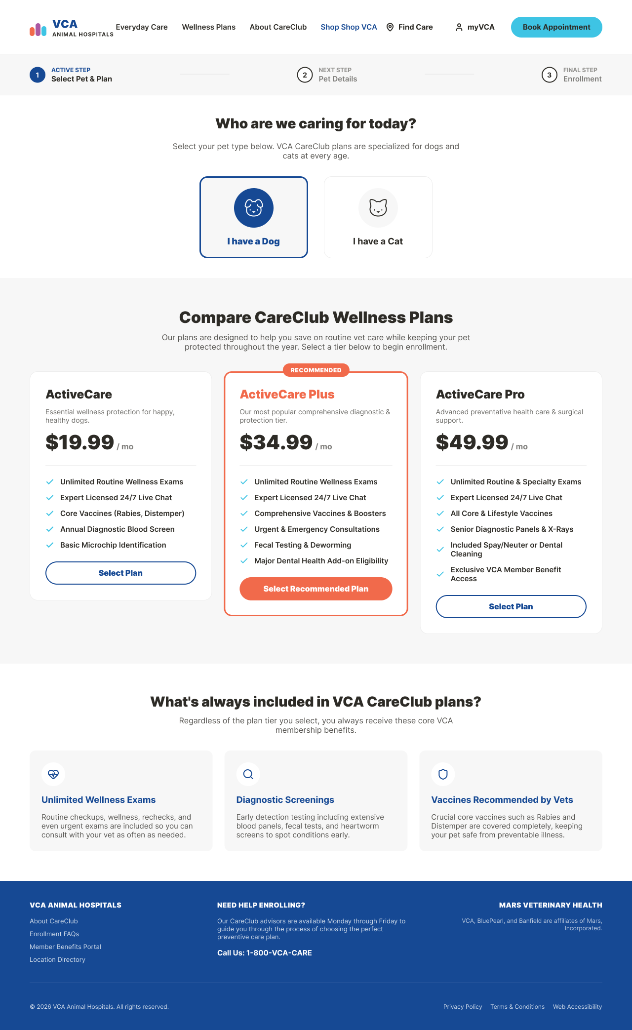
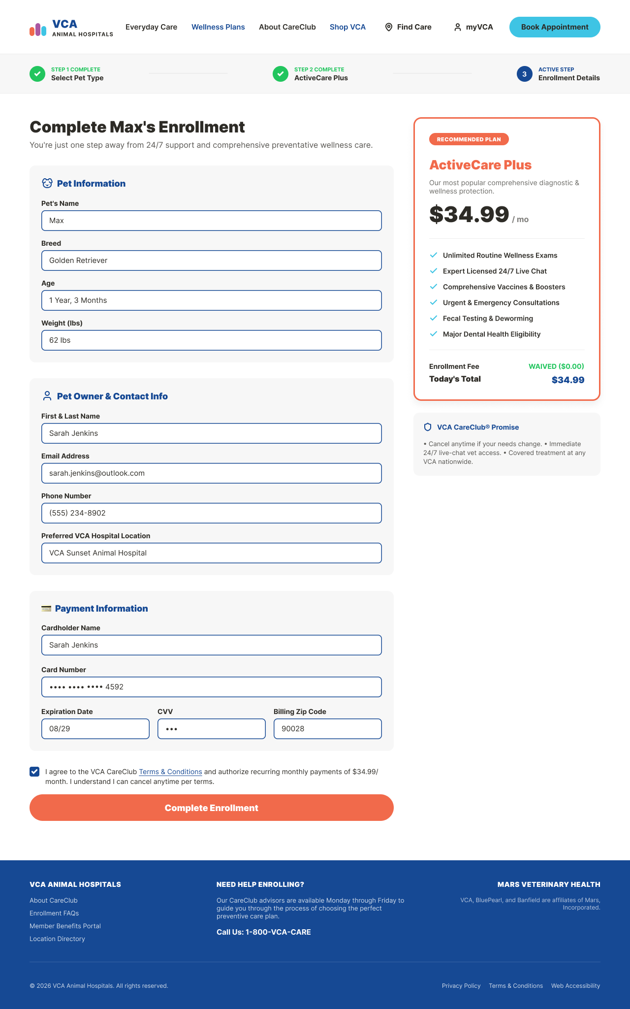
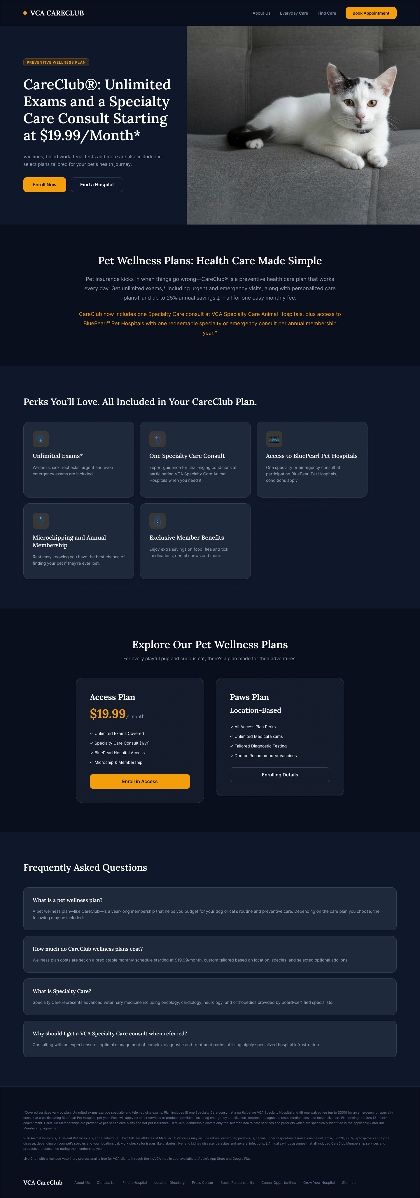
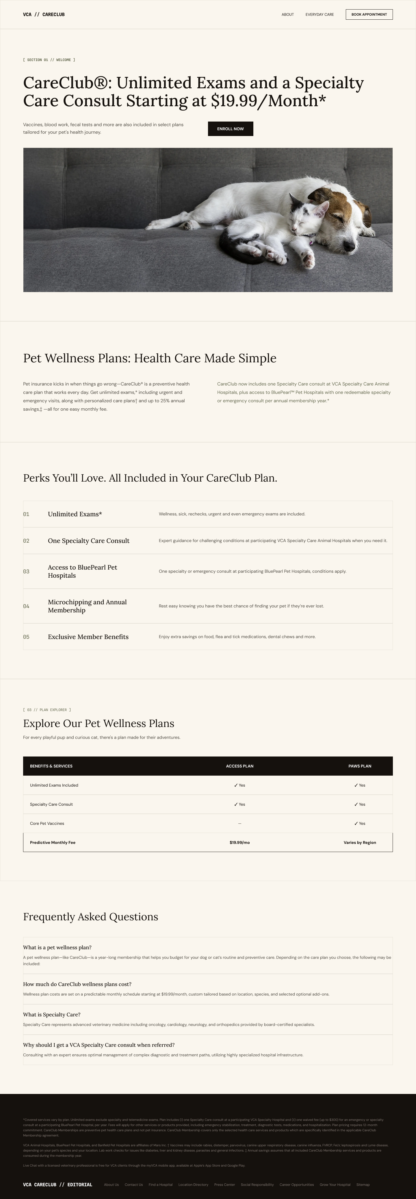
CareClub · Enrollment Flow
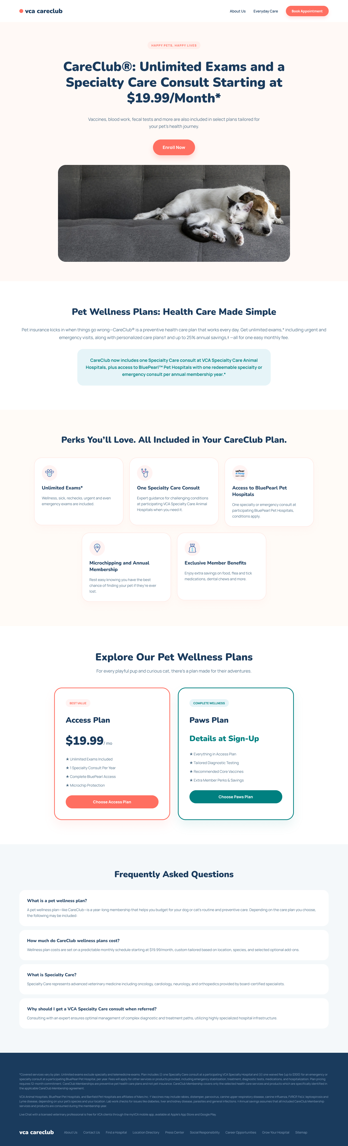
CareClub · Visual Explorations
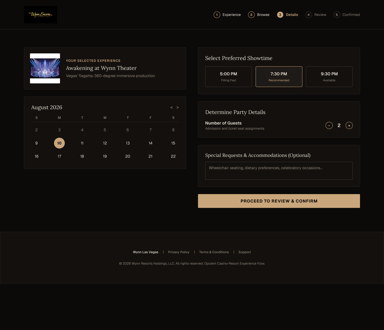
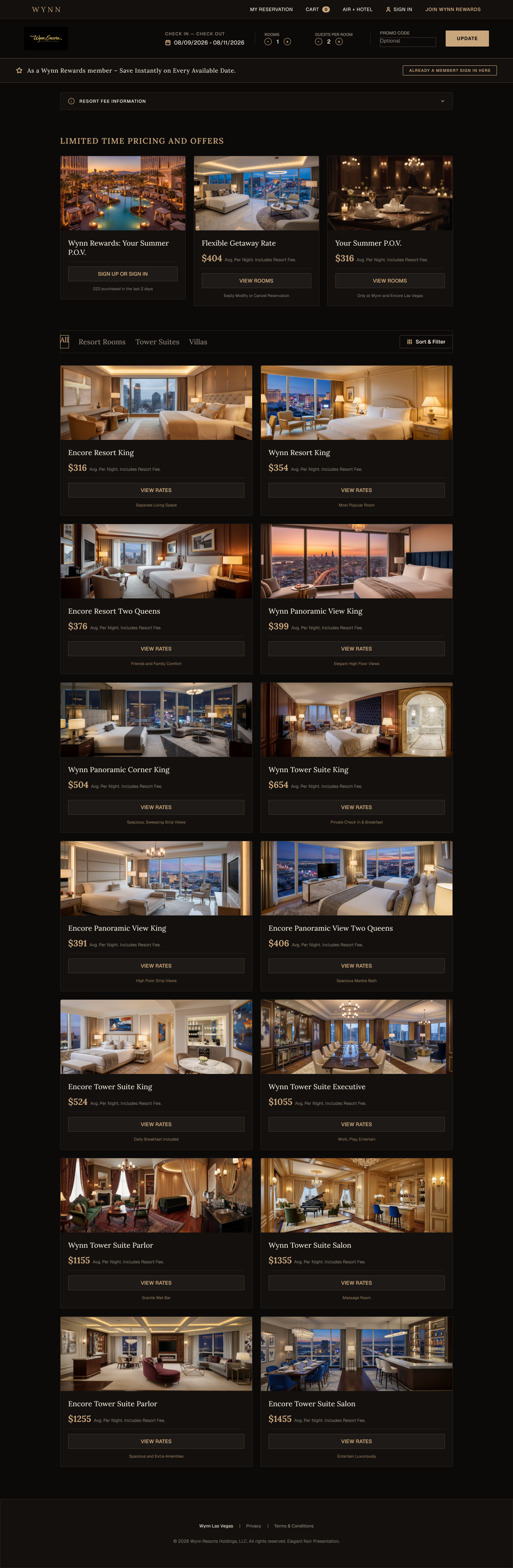
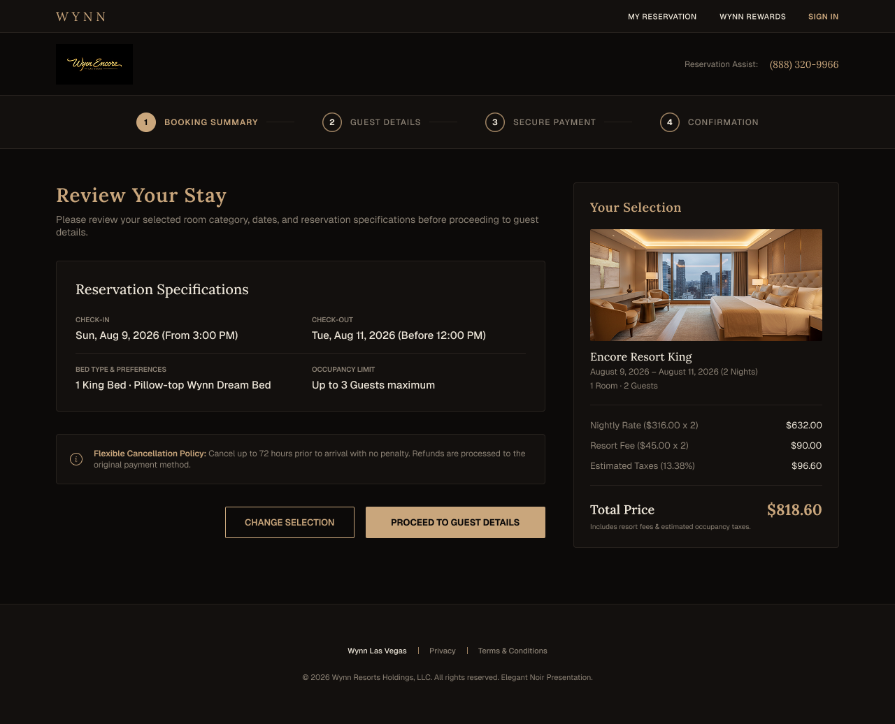
Exploratory concept designs developed alongside persona and journey mapping research for Wynn | Encore Las Vegas. The brief I set for myself: what would the booking and casino experience look like if the visual language actually matched the property's tier? The existing site reads corporate. These explorations push toward something that feels genuinely luxurious, testing richer typography, deeper color palettes, editorial-style photography layouts, and hierarchy that puts high-value guests and high-value actions first. Nothing here is final. It's directional work meant to open a conversation about what level of craft the brand actually warrants.
A guest can walk through Wynn's lobby past hand-blown glass sculptures and marble flooring, then sit down at their phone to book a room through a digital experience that feels like a mid-tier hotel chain. The physical environment communicates one tier. The digital environment communicates another. That gap is a brand problem, a trust problem, and a conversion problem, and these explorations are an attempt to close it.
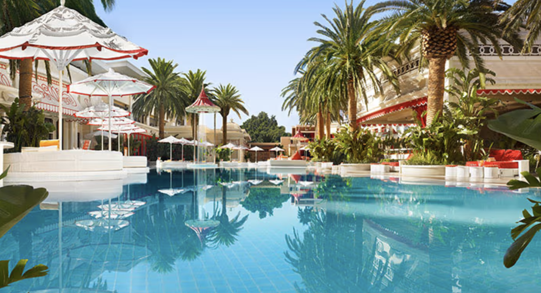
Note: all photography used in these mockups is placeholder imagery. Room photos, casino floors, and lifestyle images are not actual Wynn property assets.
Read: Wynn negative review themes and UX strategyWhat Makes a Digital Experience Feel Luxurious
Color & Tone
Near-black (#0A0A0A), warm ivory (#F5F0E8), and champagne gold as the single accent. Saturation kept low everywhere except the one element you want the guest to notice. Color does not shout. It selects.
Typography
Large editorial headlines in a high-contrast serif signal craft before any content is read. Body copy in a refined sans-serif at generous line heights. Tight tracking on labels adds formality. If the type looks tight or busy, it isn't luxurious yet.
Editorial Layout
Full-bleed imagery, asymmetric text placements, and generous white space communicate that this wasn't templated. Editorial layouts slow the guest down. Slowing the guest down is the point: Wynn sells anticipation as much as it sells rooms.
Video & Motion
A slow cinematic loop of the casino floor or pool at dusk sets atmosphere faster than any headline. Micro-animations on hover reinforce craft without drawing attention to themselves. The motion should feel inevitable, not decorative.
Copy & Voice
Luxury copy never sells features, it sells feelings. CTAs don't say "Book Now." They say "Reserve Your Stay." Language conveys that the guest is making a considered choice, not completing a transaction.
White Space & Restraint
Mass-market sites fill every pixel. Luxury sites know what to leave out. A single striking image with a short headline and generous negative space outperforms a grid of eight offers every time.
Personalization
A returning Wynn Rewards member should see different content than a first-time visitor. Recognition, remembered preferences, and tailored offers signal that the property sees the guest as an individual. Table stakes next to competitors like Bellagio and Four Seasons.
Imagery & Photography Direction
Warm, film-toned, and human: people experiencing the property, not just the property itself. Tightly art-directed, color-graded consistently. A single off-brand stock photo breaks the spell. Photography is the primary emotional argument for why this property costs more.
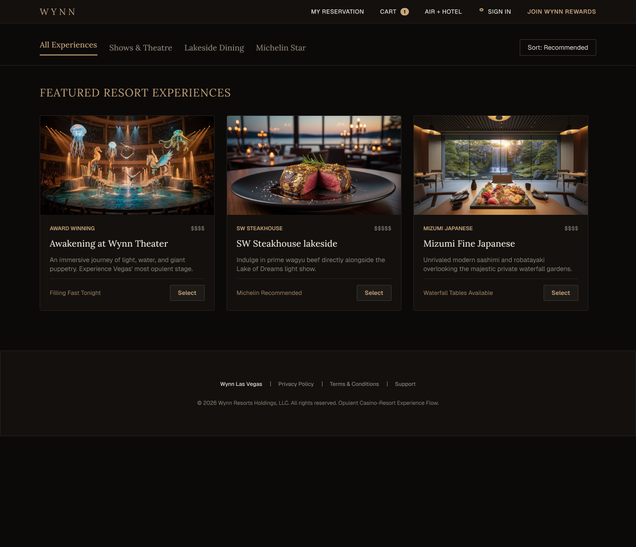
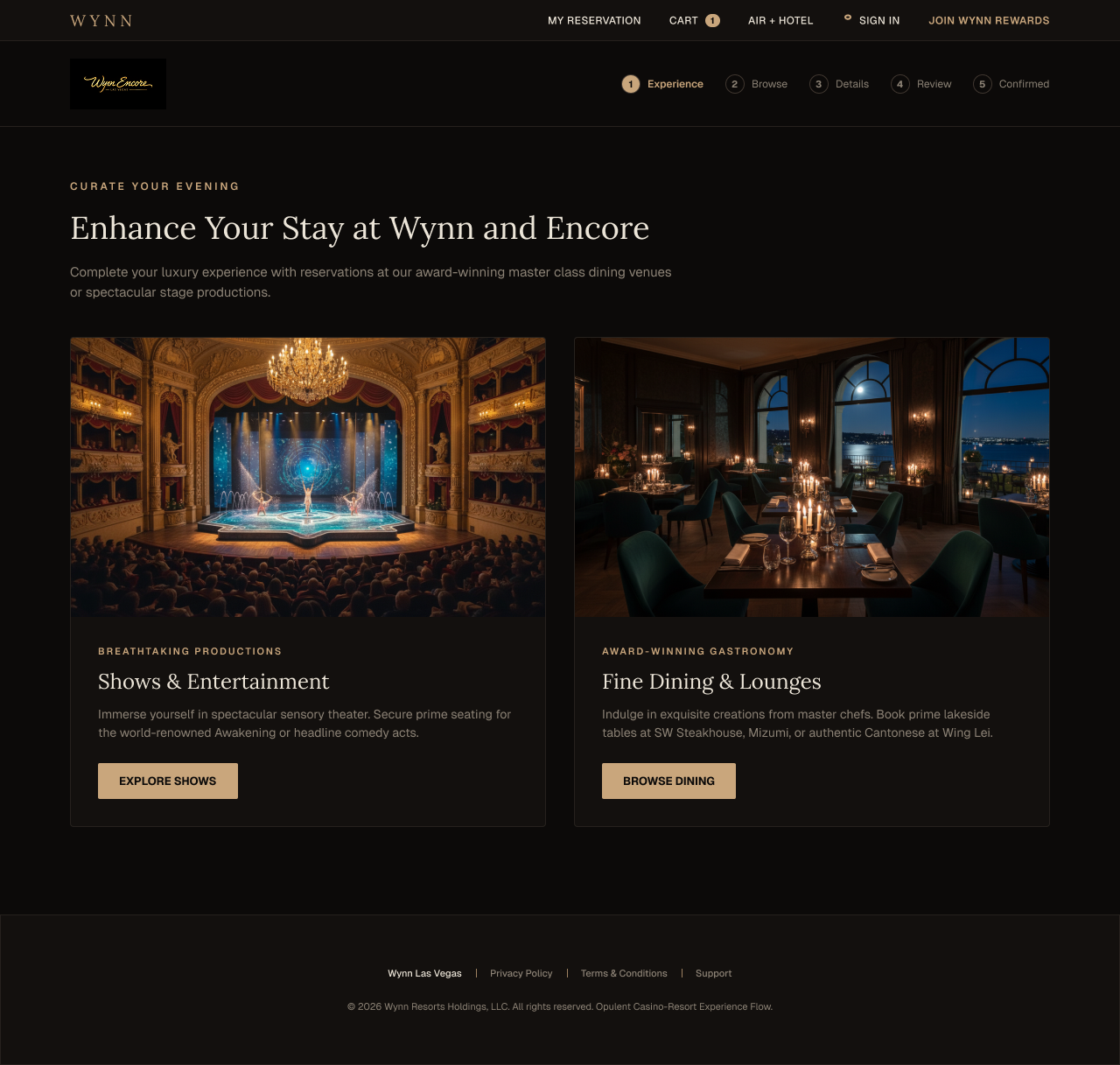
Homepage · Exploratory Redesign
A full homepage concept applying the luxury principles above to the entry point of wynnlasvegas.com. Deep charcoal backgrounds, gold accents, full-bleed editorial photography, and a room-by-room browsing experience that lets the property speak before asking the guest to book. This is directional work, not a finished spec.
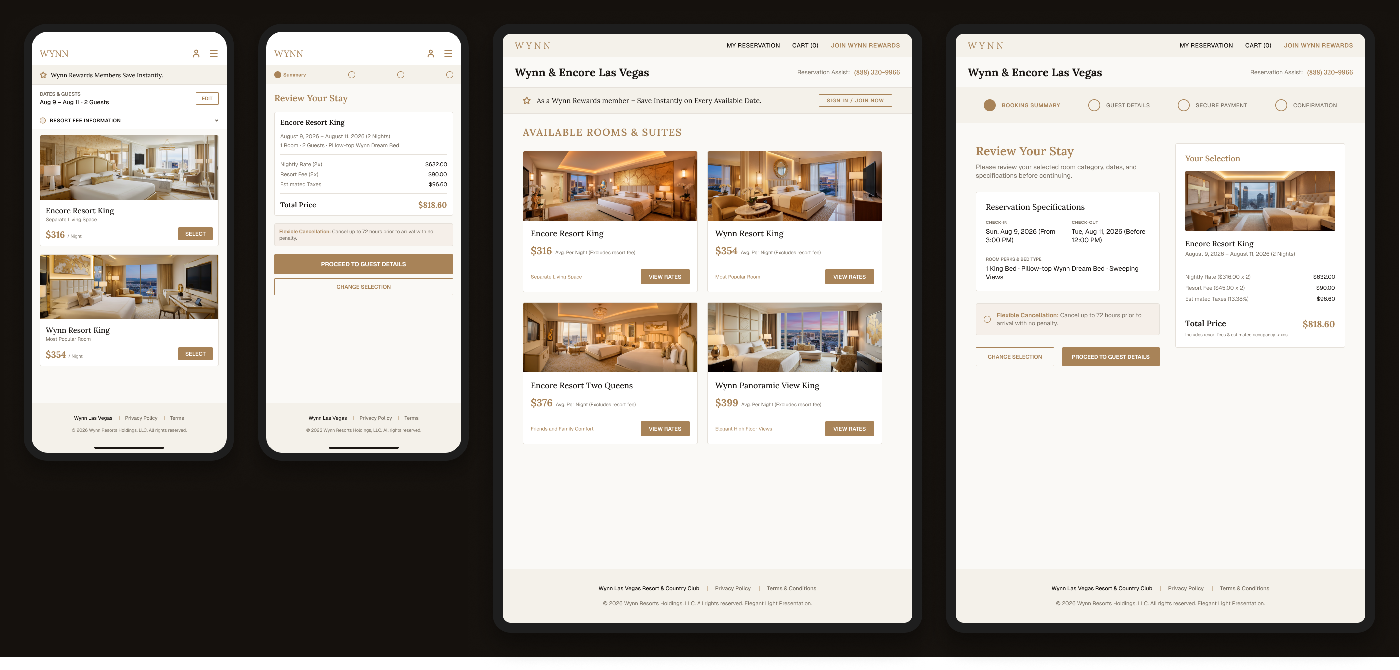
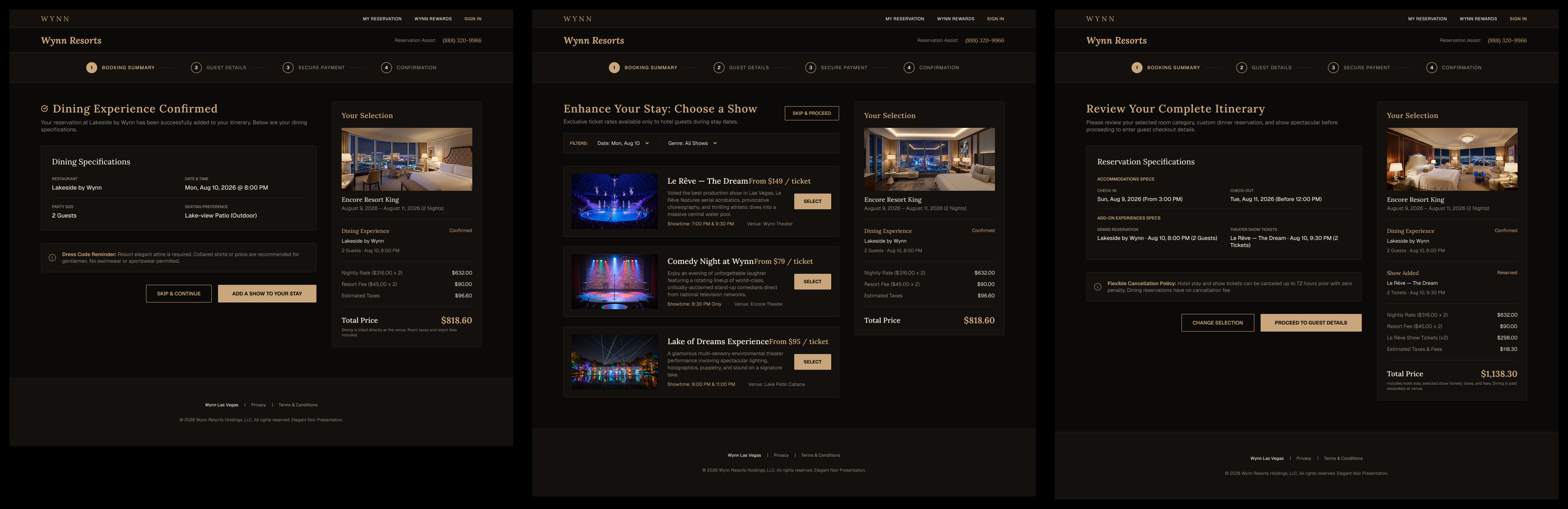
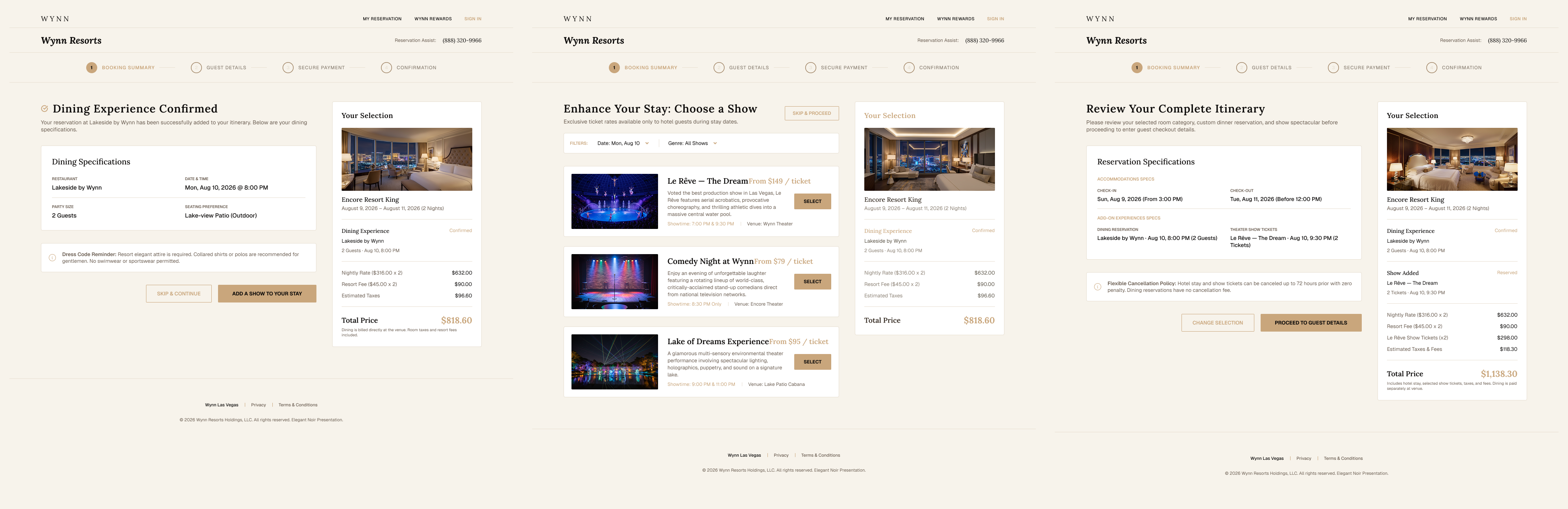
Booking Flow · Overview
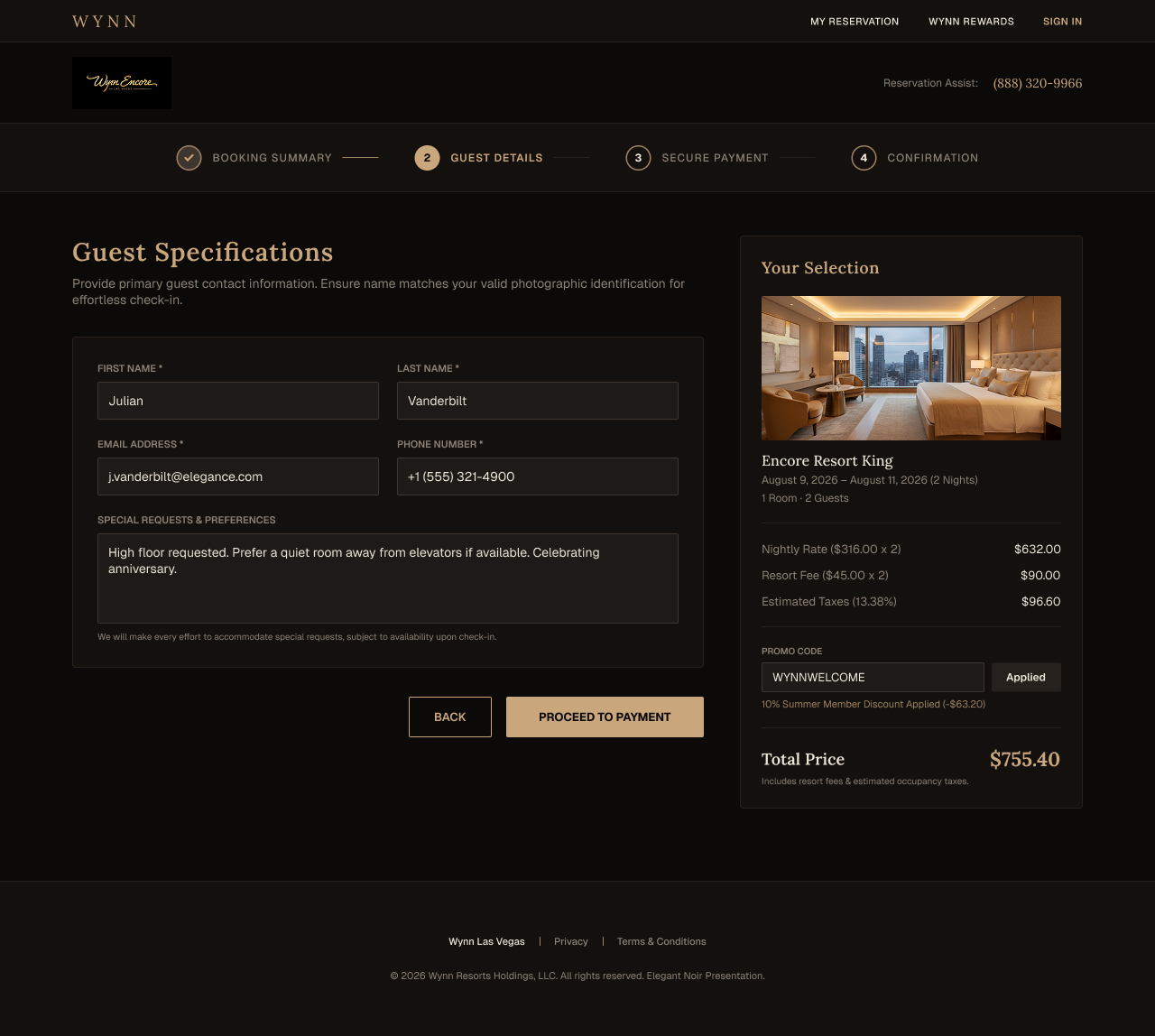
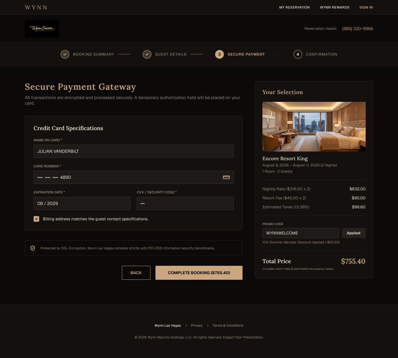
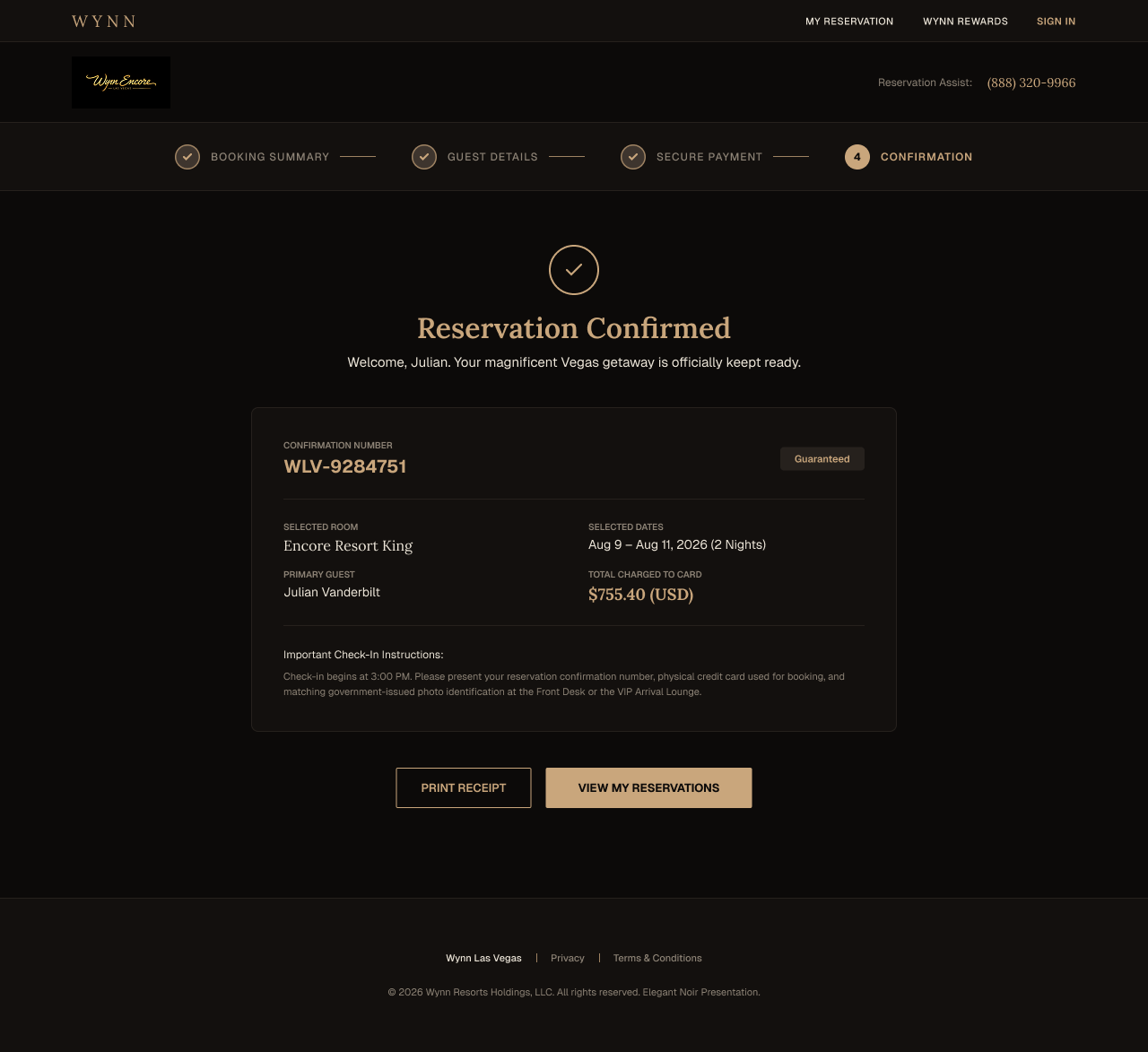
Booking Flow · Screen Details
Dark vs. light theme
I explored both a dark and a light color theme across the booking flow. The dark theme came first, consistent with the brand's casino and nightlife identity. It photographs beautifully and signals luxury immediately, but dark UIs carry a usability cost in transactional contexts: form fields, pricing, and fine print all require more contrast discipline to stay legible, and guests booking on a phone in daylight can struggle with readability.
The light theme trades atmosphere for clarity. It reduces cognitive load during the decision-heavy steps, makes pricing and room details easier to scan, and performs better across a wider range of screen brightness and ambient lighting conditions. My recommendation would be to lead with the dark theme for discovery and inspiration, then shift to the light theme once a guest enters the booking funnel where task completion matters more than mood.
UX best practices applied
Progress indicator across all steps. Abandonment spikes when guests lose track of where they are. A persistent step bar (Booking Summary, Guest Details, Payment, Confirmation) keeps them oriented.
Total price shown before payment. Hidden fees are the top trust killer in hotel booking. The booking summary surfaces nightly rate, resort fee, and taxes upfront.
Room cards built for comparison. Structured cards surface view, bed type, and inclusions at a glance so guests don't have to open each room individually to decide.
Cancellation terms at point of commitment. Guests are most anxious about cancellation right before payment. Terms appear inline on the booking summary rather than buried in a policy link.
Mobile-first layout with large touch targets. A significant share of luxury hotel bookings happen on mobile. The flow is designed for thumb reach first, desktop second.
Filters for amenities, view, and bed type. Limited filtering forces guests to scroll through all options. Adding targeted filters lets high-intent guests narrow to what they actually care about faster.
Flexible date search with availability context. Guests often have some flexibility. Surfacing availability across nearby dates reduces the friction of hitting a sold-out result and starting over.
Saved selections across interruptions. Guests rarely complete a luxury booking in one sitting. Persisting selections (room, dates, add-ons) means they return to progress, not a blank form.
Accessibility built in, not retrofitted. Sufficient color contrast, clear focus states, and readable type sizes are applied across both themes to meet WCAG 2.2 AA standards.
Upsells at the right moment, not every moment. The "Enhance Your Stay" screen (show add-ons, dining) appears after room selection, when the guest has already committed to a direction and is more receptive to additions.
Checkout Flow
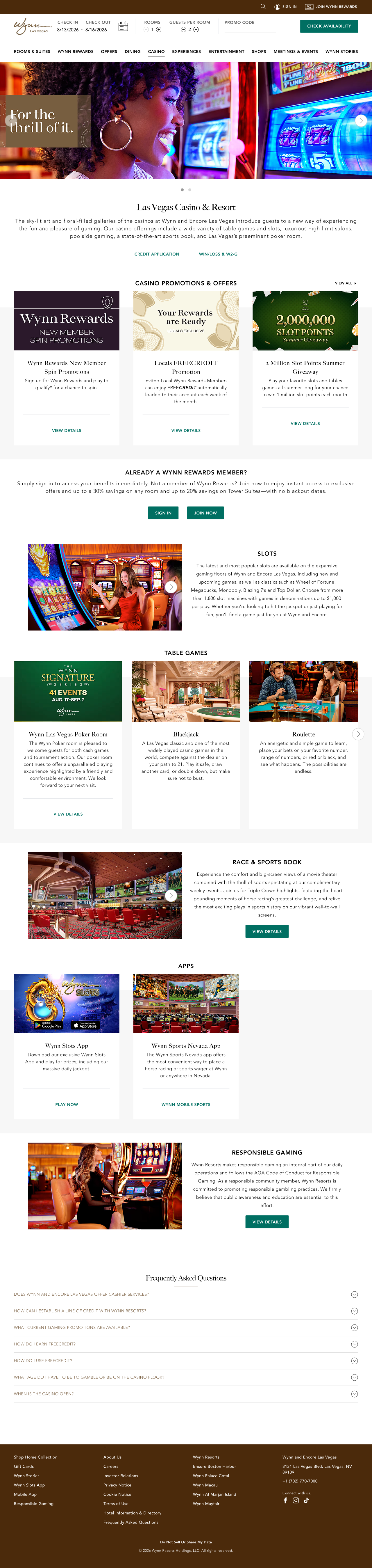
Casino Experience · Original Design
Casino Experience · Direction Explorations
Why these directions are stronger
The current Wynn casino page gives every guest the same experience: a wall of promotions with no clear hierarchy. The most important actions, like requesting a casino host or enrolling in player development, are buried. A high-value VIP guest has to hunt for them.
Both redesign directions fix this by leading with intent. The editorial direction uses photography to set the tone immediately, signaling luxury before the guest reads a single word. The alternate direction leads with the guest's role, putting "Exclusive VIP Gaming" and the Casino Host Request front and center for the people who need them.
Both directions also bring structure the existing page is missing. Promotions are paired with imagery instead of appearing as plain text blocks. Table game categories are clearly labeled so guests can orient quickly. And loyalty sign-in is placed where guests are most motivated to act, not hidden in the footer.
What to test in usability
The most important question to answer first: does the editorial hero read as luxury casino or nightclub? A 5-second test with real guests will settle it quickly. If it lands wrong, the alternate direction's lighter hero is the lower-risk choice. Beyond that, a first-click test on the alternate direction's hero with a VIP guest proxy will show whether Casino Host Request and Player Development register as distinct actions. For the promotions grid, the test is whether guests with Wynn Rewards status can identify a relevant promotion and self-qualify without clicking through. Finally, test wayfinding between game categories, specifically whether someone can find Baccarat without using search, to determine whether section labels and visual separation are doing enough work.
View the full persona & journey mapping case studyPersonalization + VIP Layer
The next layer
The first two explorations elevate the experience for every guest. This one asks what happens when the site knows who you are.
A returning Wynn Rewards member should not see the same homepage as a first-time visitor. The logged-in experience responds to the guest: their tier, their preferences, their host's name. High-value actions like speaking directly to a casino host are not buried in a contact form. They are surfaced at the moment the right guest needs them, one tap away. This exploration shows what that layer looks like in practice.
Logged-In Homepage
The homepage adapts when a member is signed in. Their name, their tier, their relevant offers. The hero is no longer a generic invitation to discover Wynn. It is a personal welcome back. Content that applies to their profile comes forward. Content that does not steps aside.
Member Recognition
Returning guests should feel recognized before they ask to be. Preferred room type, dining history, past stays: these inform what the site shows. Wynn already does this through its hosts in person. The digital experience should do the same.
Speak to Your Host
For qualifying guests, direct access to a casino host is one of the most valuable things Wynn offers. It should not require a phone call or a buried contact page. A persistent, tasteful CTA in the right context puts the connection one tap away for the guests who have it.
Tier-Aware Content
A Red Card member and a Black Card member are not the same guest. The site should not treat them the same. Offers, room recommendations, and featured experiences should reflect the guest's tier without making the hierarchy feel transactional.
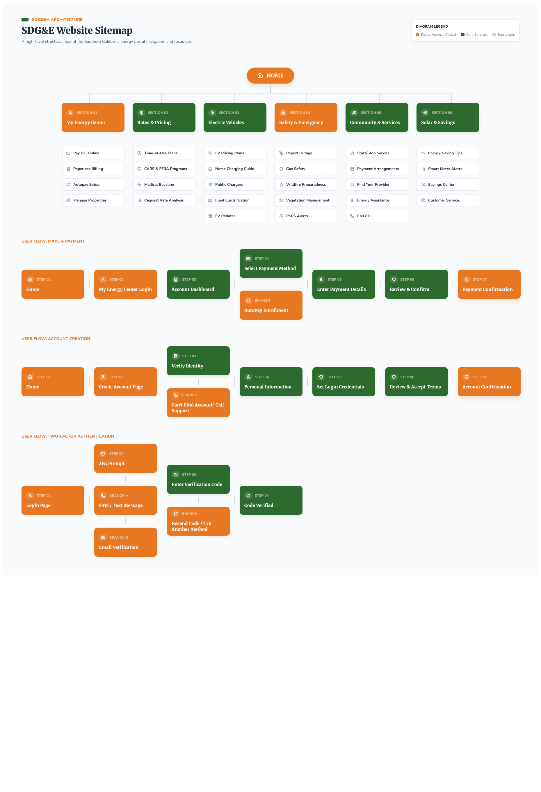
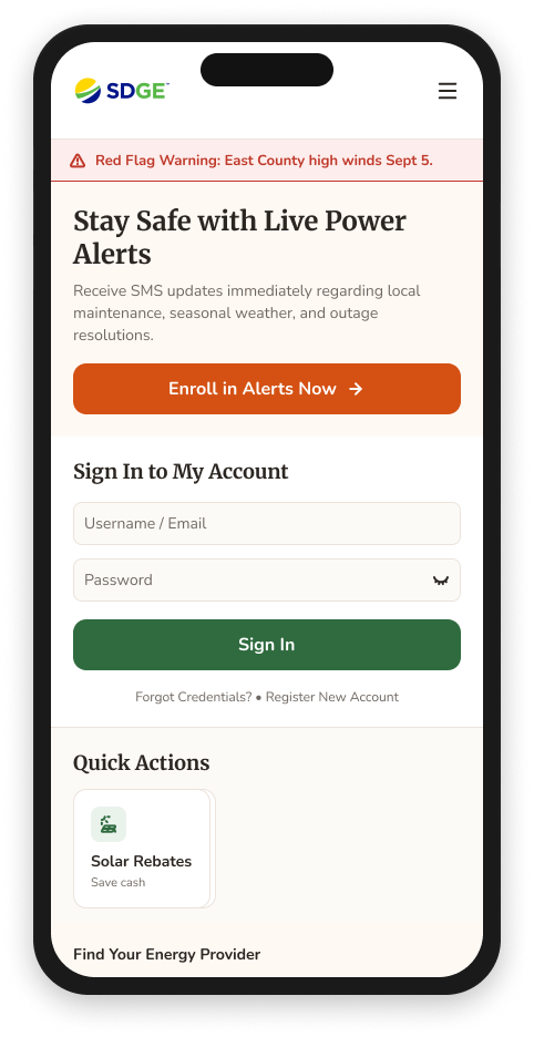
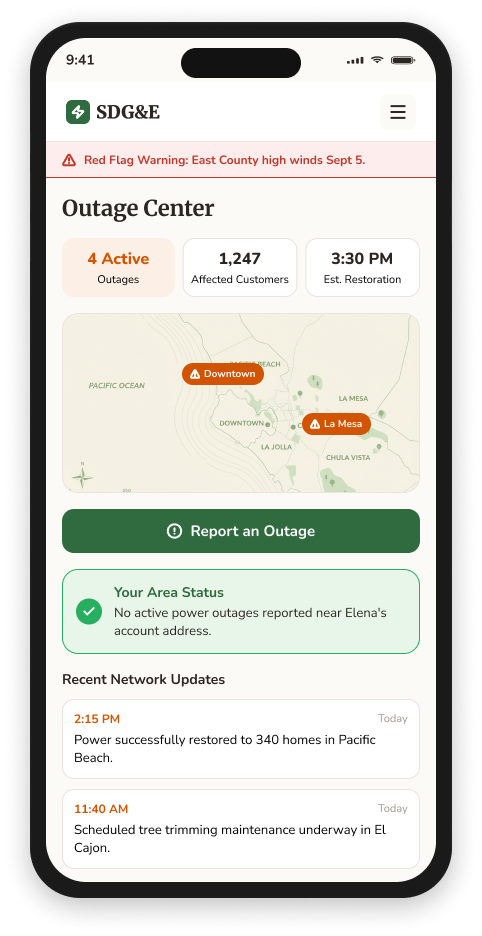
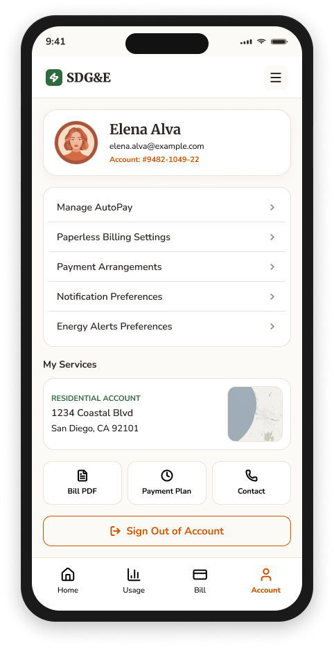
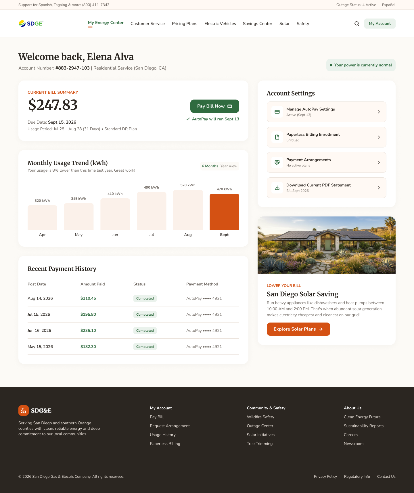
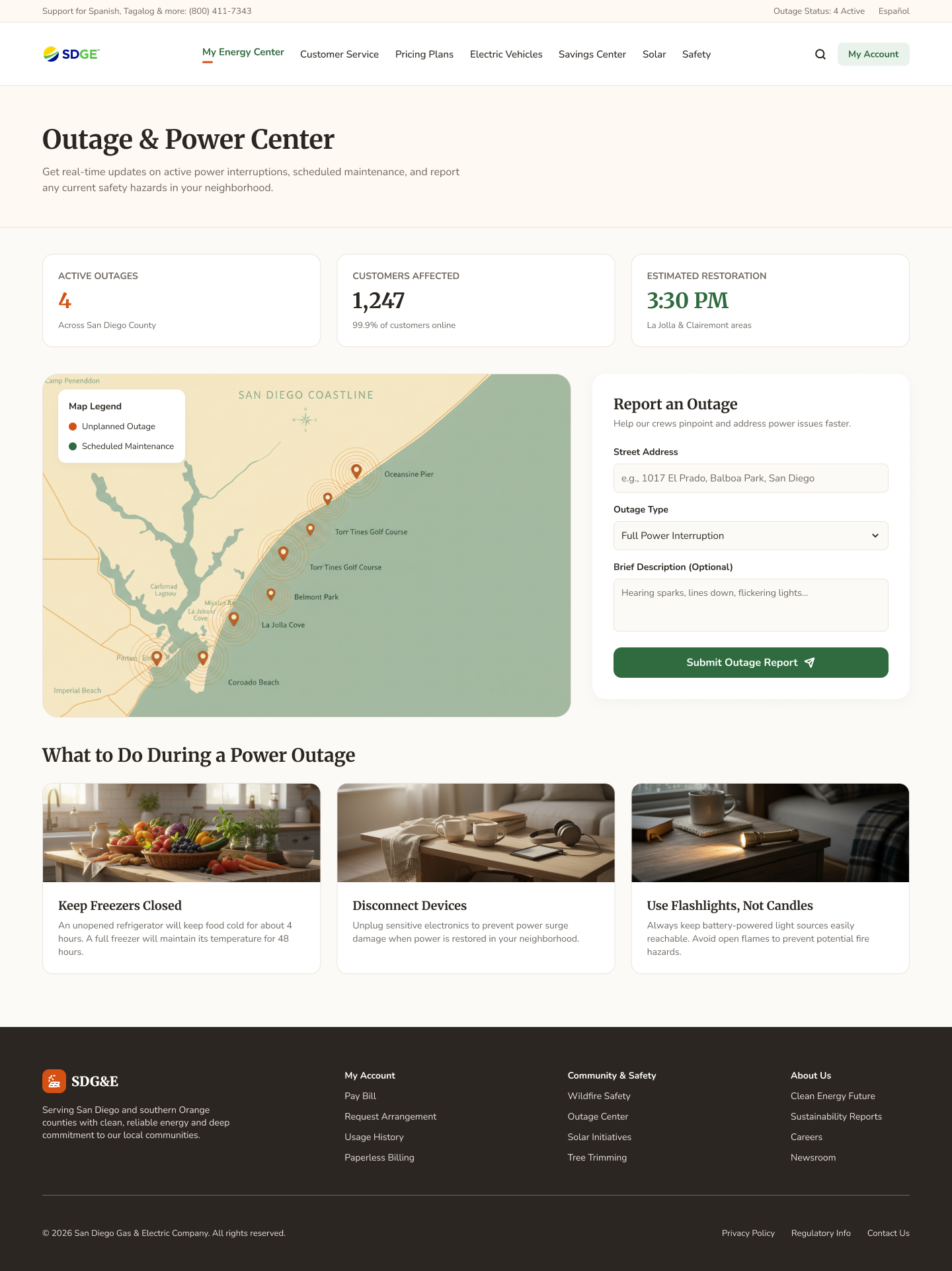
A responsive redesign of San Diego Gas & Electric's customer-facing digital experience. I led research and UI design across five core account flows: homepage, bill pay, energy usage dashboard, outage center, and account profile.
SDG&E was not a UI project that happened to include some research. It was an end-to-end UX engagement run by a two-person team: me and one other UI designer. Together we owned the work from discovery through delivery. Research, requirements, IA, UX and UI design, usability testing, accessibility, and executive presentation all ran through us.
I led the research and requirements phase rather than receiving a spec and producing screens. That meant user interviews to understand how customers actually used the product, surveys and an analytics audit to identify where they were dropping off, and card sorting to map the mental models they brought to account management. The existing IA was organized around SDG&E's internal departments, not around what customers came to do. Research made that visible and gave us a foundation to restructure around customer goals rather than organizational ones.
Before we could test whether a design worked, we needed to understand what problem it was actually solving. That's why we ran a focus group before any usability testing. The focus group was generative: eight residential customers who had both gas and electric service, all responsible for paying the household utility bill. The goal was to understand how they thought about energy, not evaluate a design. Usability testing came later, once we had something to test, and answered a different question: does this interface work?
Five themes came out of the sessions. Customers wanted explanation, not just data. The question they were really asking when they looked at their bill was not "how much did I use?" but "why is it this high?" They thought about gas and electric as one household expense, even though the bill separated them. High bills triggered investigation, which meant SDG&E had an opportunity to explain unusual changes proactively rather than making customers hunt for answers. Customers wanted actionable recommendations, with enough context to trust them. And trust itself was the constraint: recommendations landed when customers could see the reasoning behind them, not just the conclusion.
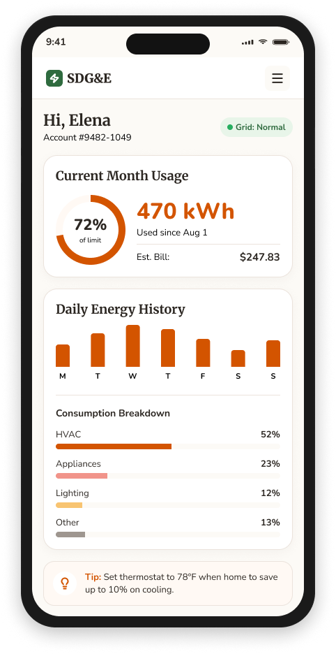
Those five themes became the design criteria. The bill redesign prioritized explanation over reporting. The energy dashboard unified gas and electric into a single household view. The recommendation UI led with what to do and why, not just what the data showed.
Research findings shaped every design decision. Pain points from interviews drove flow prioritization. Card sort results restructured the navigation. Usability test feedback at wireframe stage caught structural problems before visual design locked them in. The process moved from evidence to decision at each stage, rather than from stakeholder preference to design.
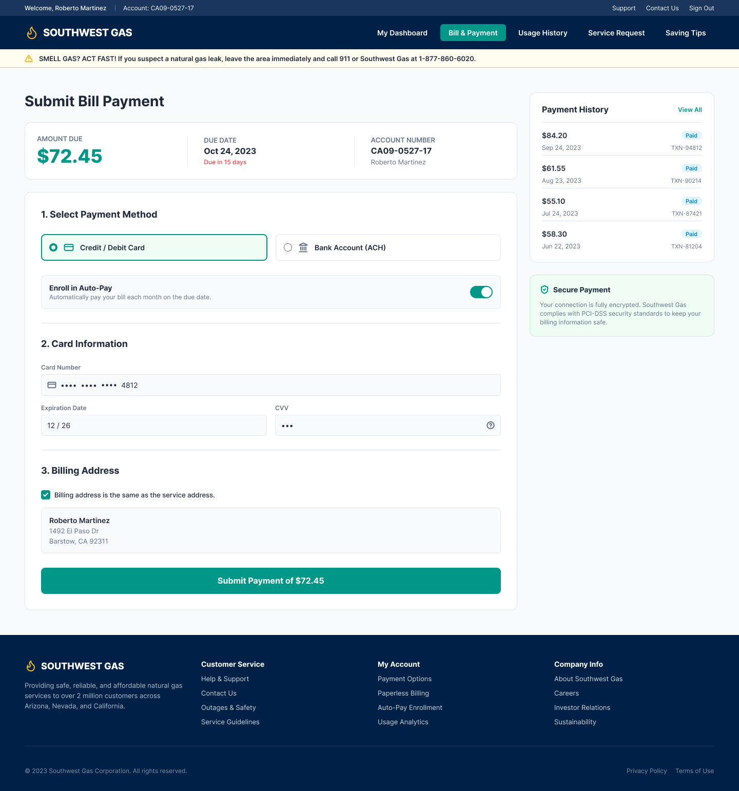
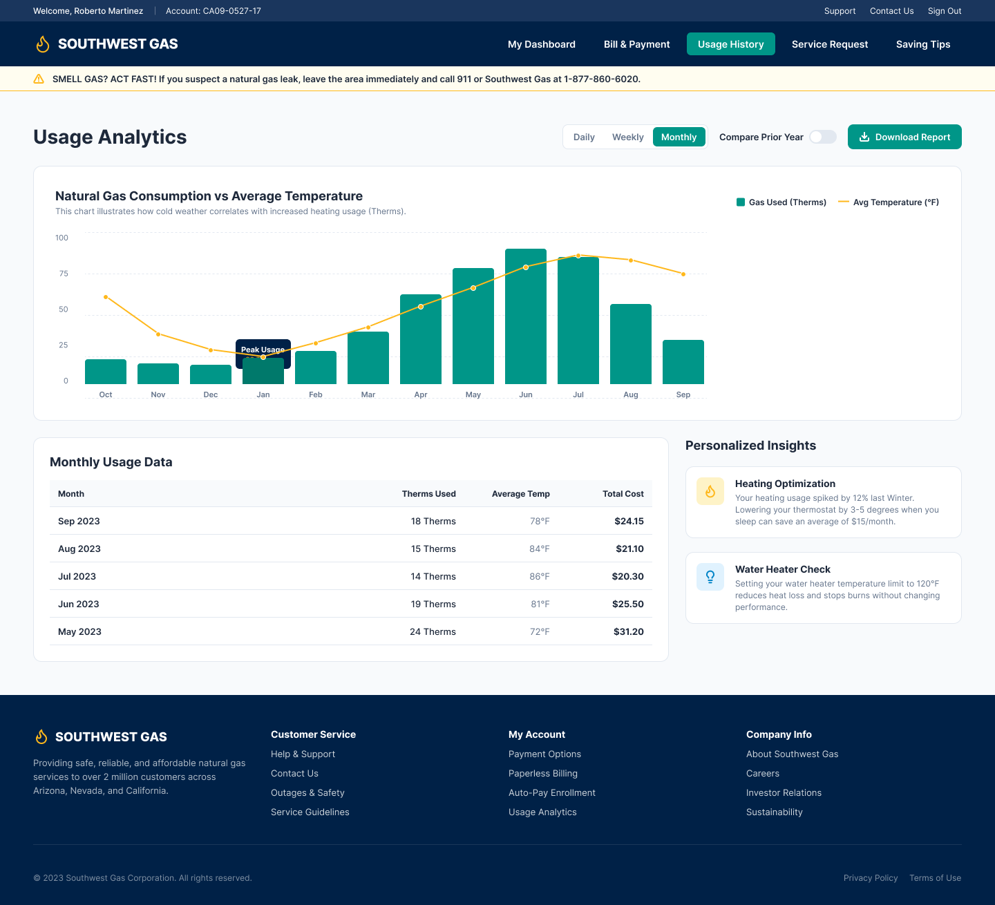
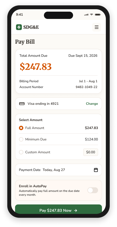
I designed mobile-first, starting with the flows that generated the most friction: bill pay and outage information. Bill pay consolidated a multi-page flow into a single scrollable screen with a persistent payment summary. The energy dashboard gave customers a clear view of usage trends without requiring them to interpret raw data. The outage center prioritized status and affected area above everything else, because customers landing there are already stressed and need answers fast.
For the payment flows inside the logged-in MyAccount area, we ran several rounds of Design Thinking workshops with stakeholders and customers. These weren't presentation sessions. They were working sessions where participants mapped their own understanding of the payment process, identified where it broke down, and helped us pressure-test early concepts before any screens were built. The payment flow is where most customer frustration concentrated, and the workshops gave us a shared understanding of why that was before we started solving it.
Usability testing ran at wireframe fidelity first, which kept feedback focused on structure and content hierarchy rather than aesthetics. Testing at hi-fi stage confirmed that improvements held under realistic conditions. Results from both rounds produced specific, actionable findings rather than general impressions.
Accessibility testing against WCAG 2.1 AA ran in parallel with design rather than after it. That meant findings could shape decisions rather than just document failures at the end of the project.
The work went in front of the CEO, which required translating UX findings and design rationale into business language: connecting research insights to outcomes an executive audience would act on. I was also involved before delivery. I helped pitch the initial engagement, which meant explaining the value of a research-led UX process to a client who was still deciding whether to buy it.
SDG&E reinforced something I've come to believe about UX at its best: it's a decision-making process, not a production process. Research establishes what the problem actually is. Requirements define what needs to be solved. Design explores solutions. Testing provides evidence about whether the solution is moving in the right direction. When those steps are connected and running on the same evidence base, the work produces something you can defend. When they're separate, design becomes opinion.
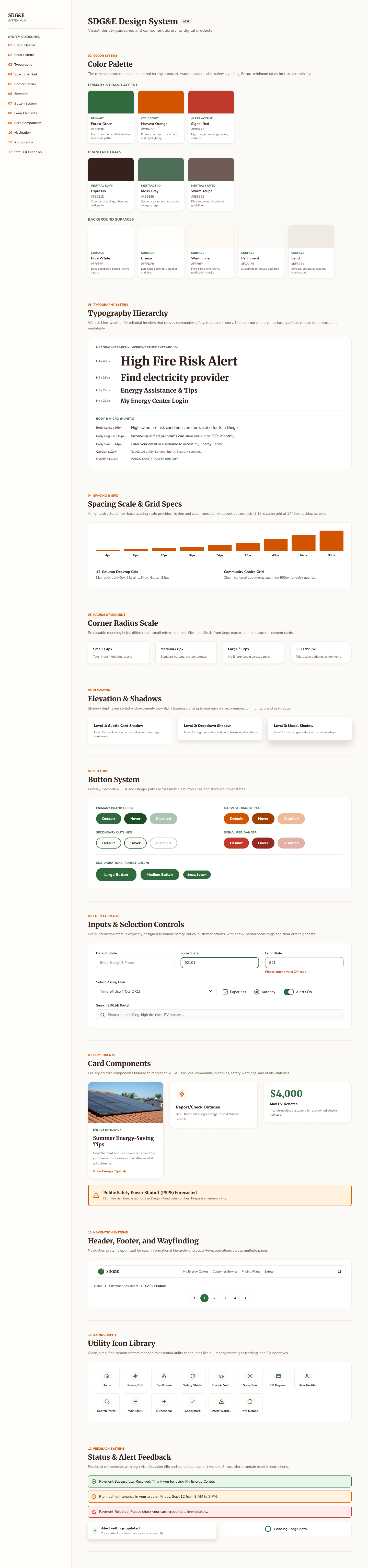
Design System
Site Architecture & User Flows
Mobile · Hi-Fidelity Screens
Additional Screens
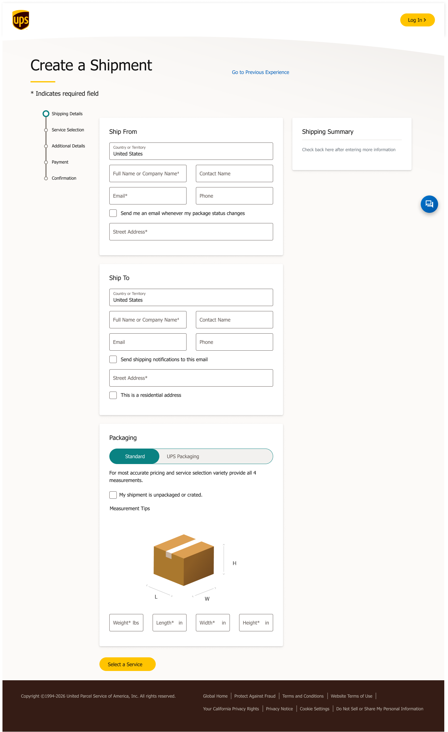
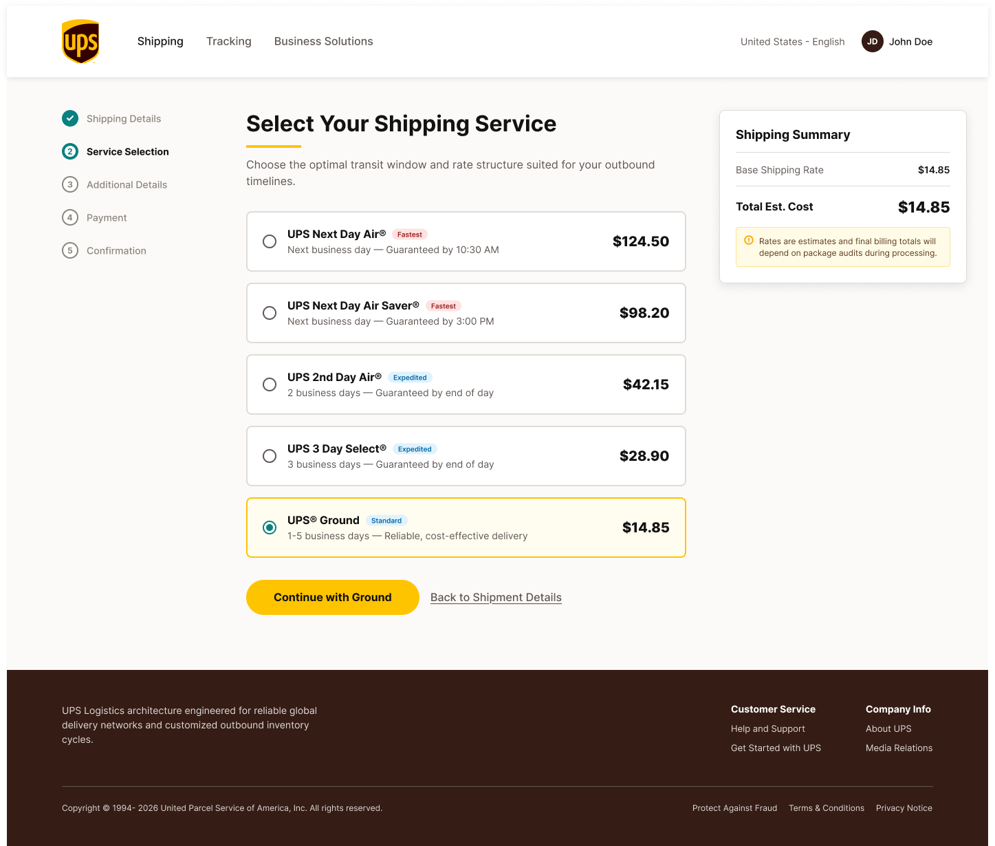
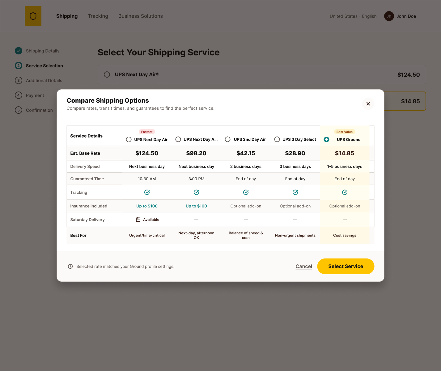
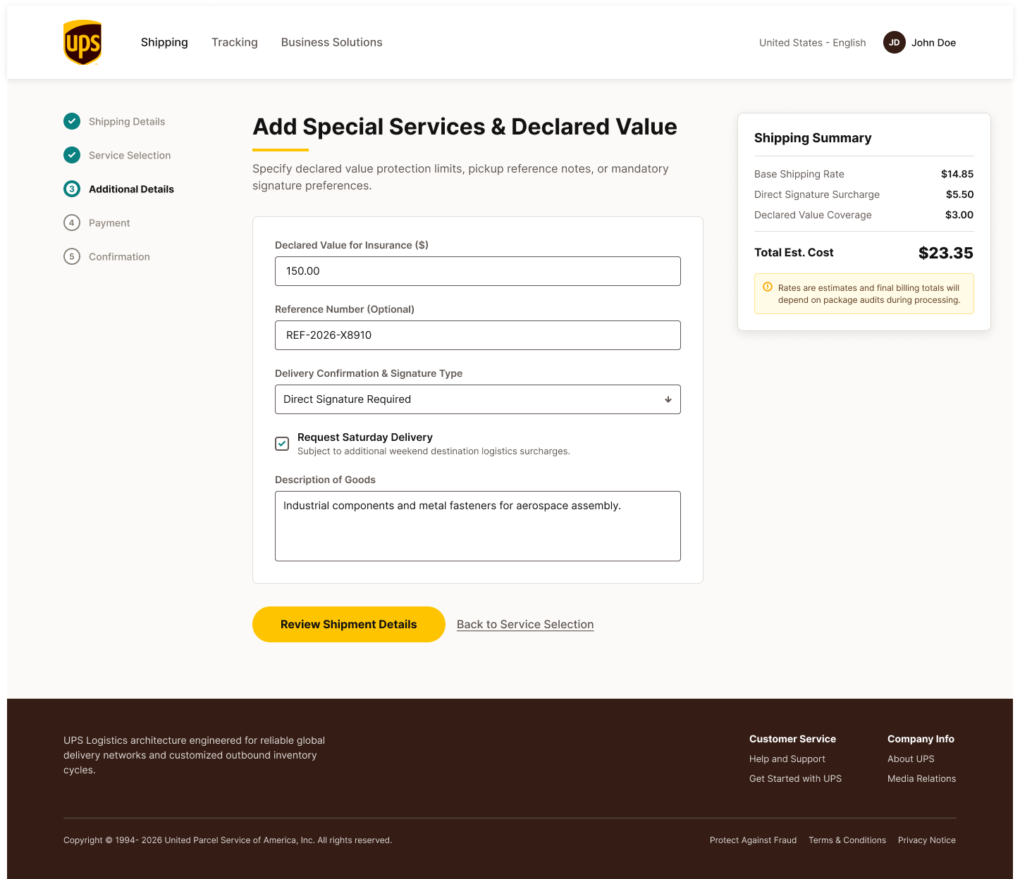
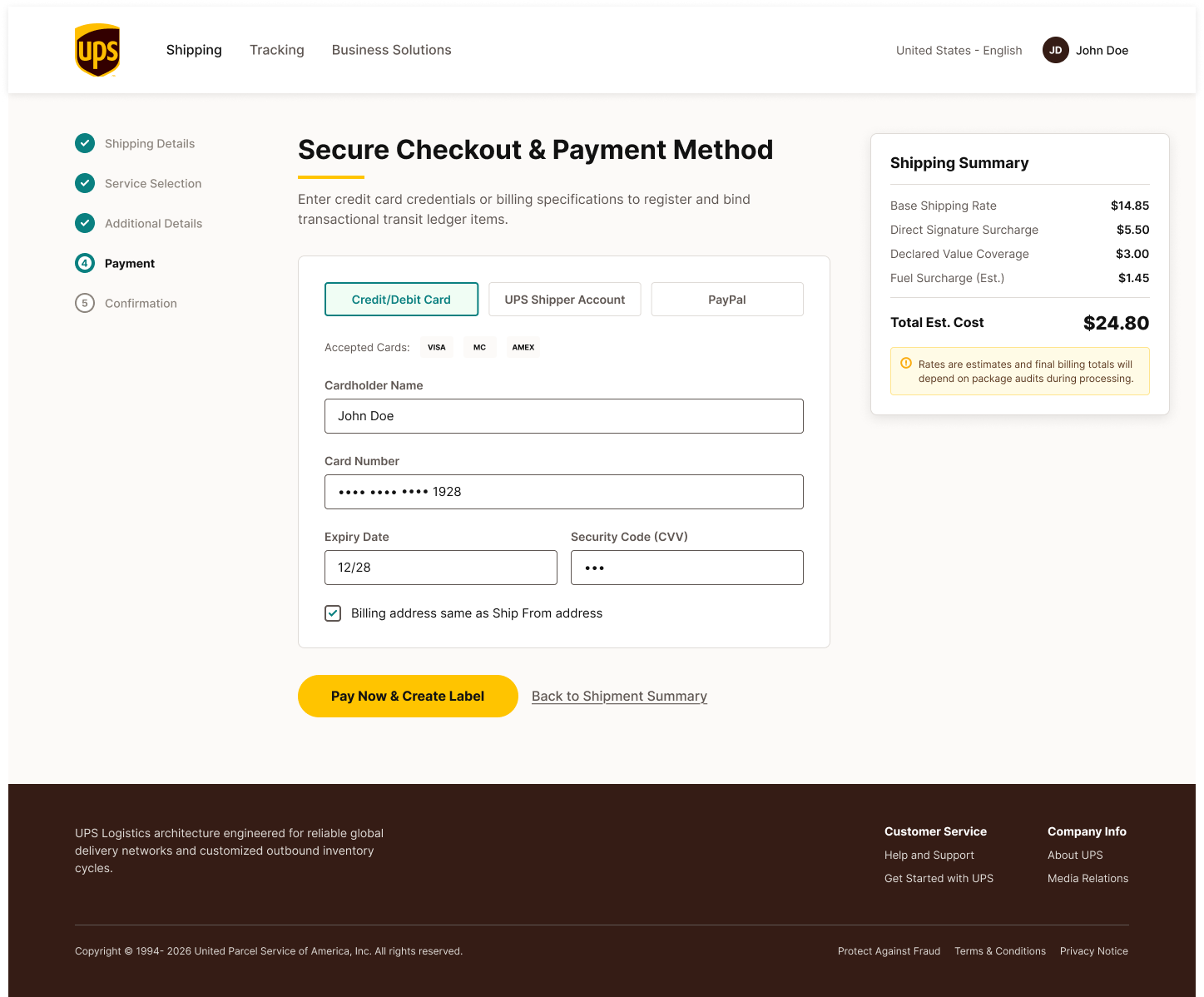
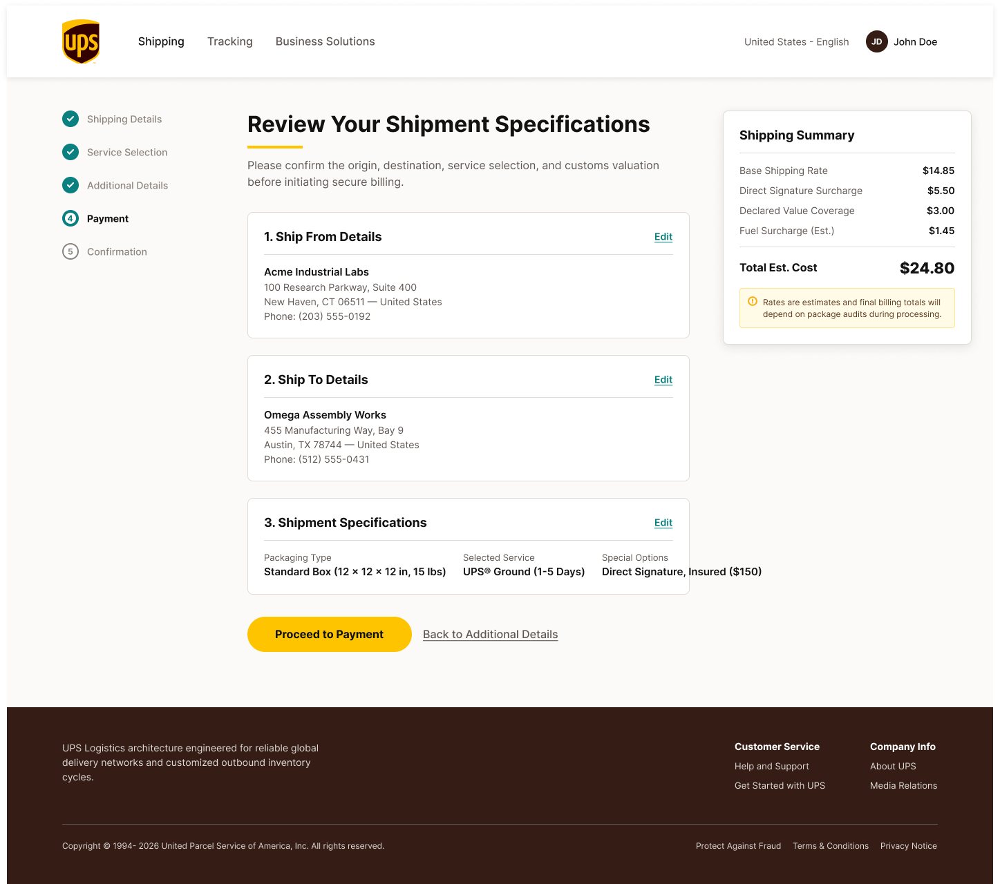
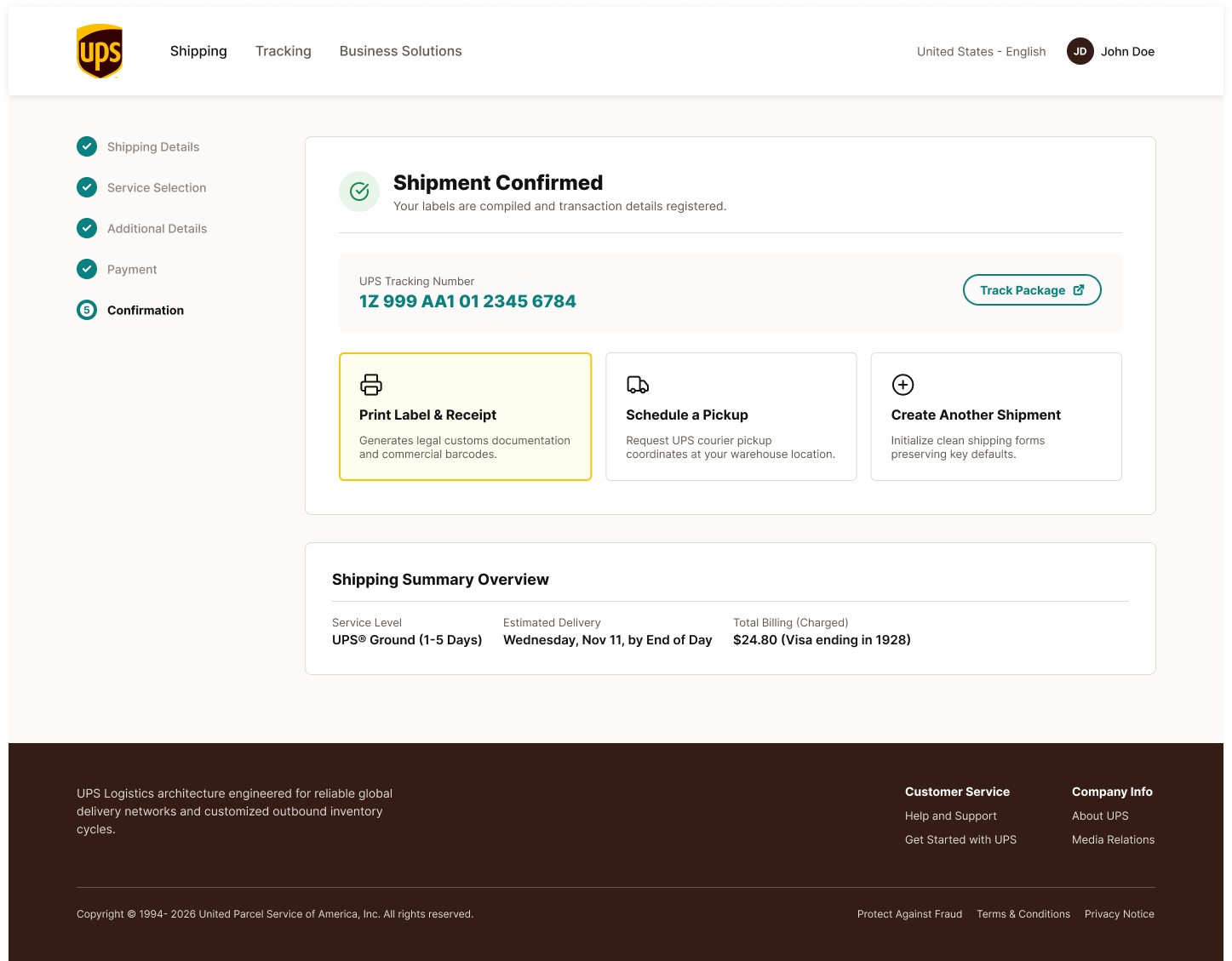
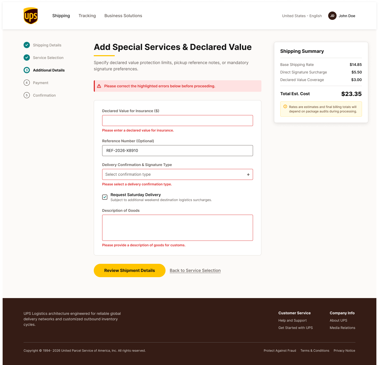
UI design across the UPS shipping and pickup flows. I led a team of six designers through the engagement, providing strategic direction, dividing the work, and running design alignment sessions throughout. The screens shown here are the ones I designed personally.
Six designers on this engagement, and I was leading all of them. Five had come from business analyst backgrounds and were making the transition into UX design. Only one had formal UX/UI education. For most of them, this was their first time working through a structured design process from discovery through delivery. My job was two things running in parallel: get the work done, and build their practice while we were doing it.
I set the strategic direction, defined the design approach, and divided the scope by flow. Each designer owned a section of the experience. I took a set of screens myself while the team worked in parallel. That meant I wasn't just directing from a distance. I was in the files, making the same kinds of decisions I was asking them to make, which made the critique sessions more honest.
We ran regular alignment sessions where I reviewed work in progress and pushed the team to defend their decisions. Not just show screens. The sessions were structured as critiques: here's what you decided, here's the constraint you were working against, here's what the design needs to communicate. For a team coming from BA work, that framing was new. BAs are trained to document decisions, not design them. Learning to explain why a layout choice serves the user took practice, and the sessions were where that practice happened.
The BA background was actually an advantage in some ways. They understood the business rules, the edge cases, and the operational constraints better than most designers would going in. The gap was methodology: how to frame a problem visually, how to handle competing constraints in a layout, how to give and receive critique without making it personal. By the end of the engagement, the team was running critique sessions themselves. That's the outcome I was most proud of.
Shipping Flow · Wireframes
Shipping Flow
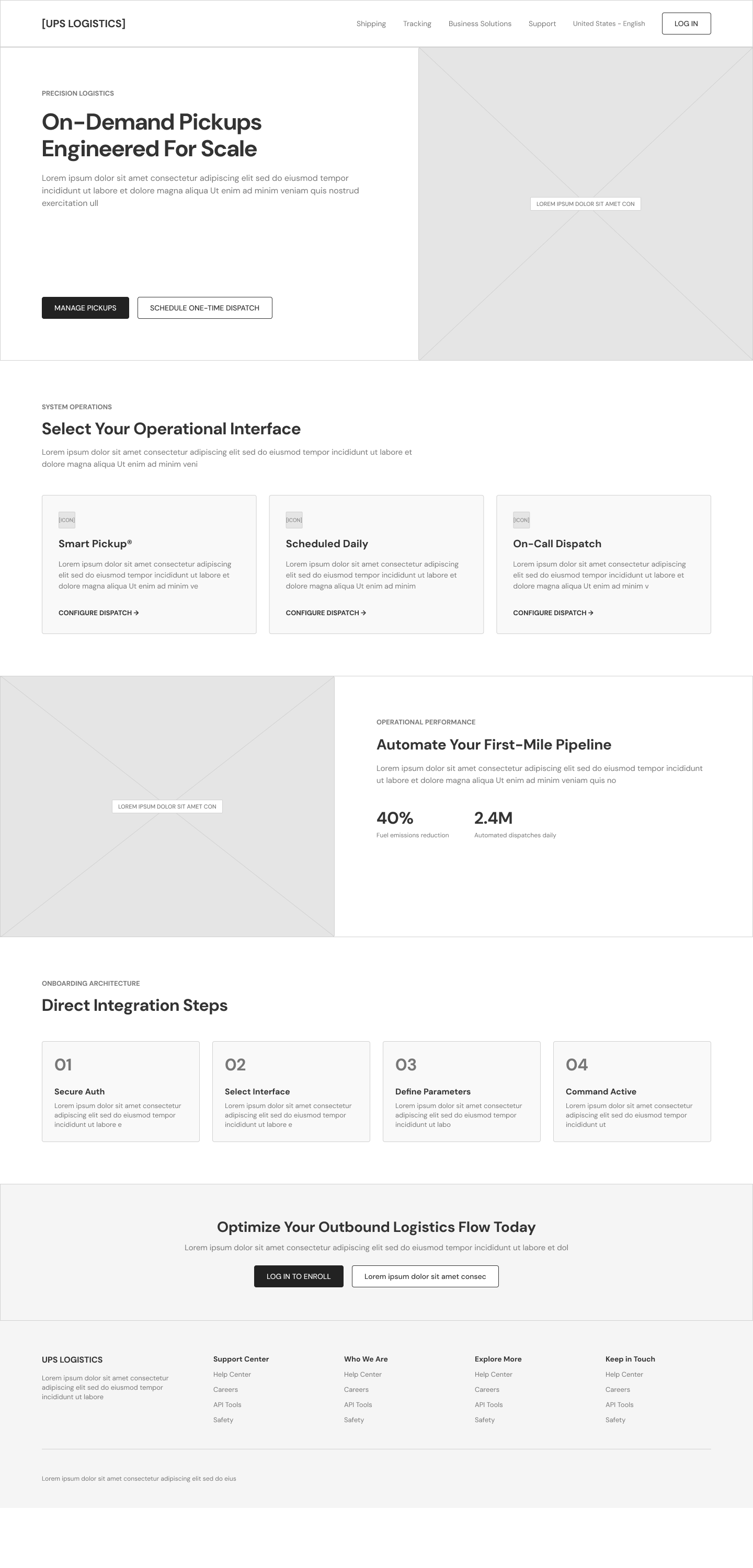
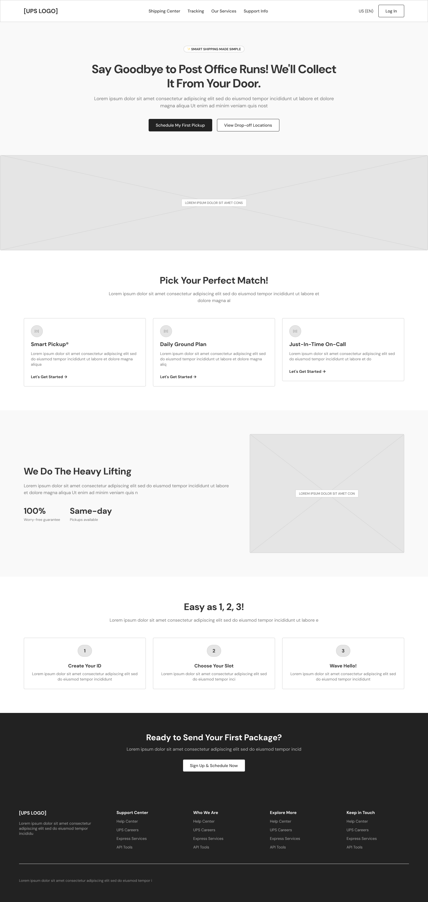
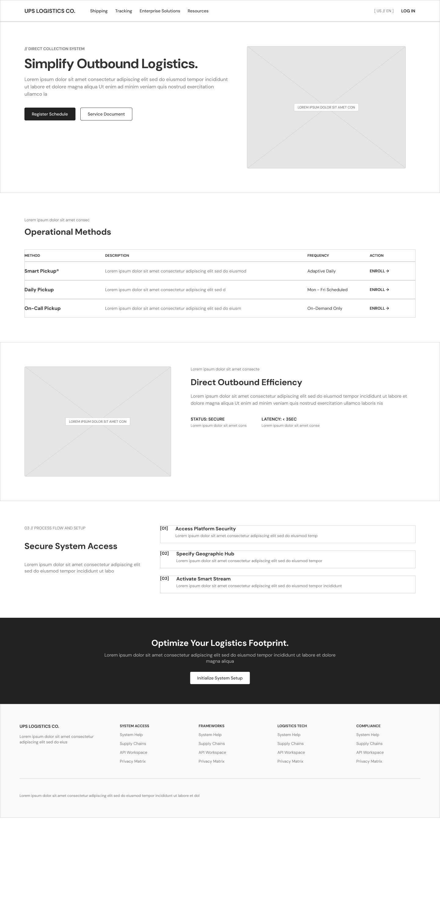
Pickup · Wireframes
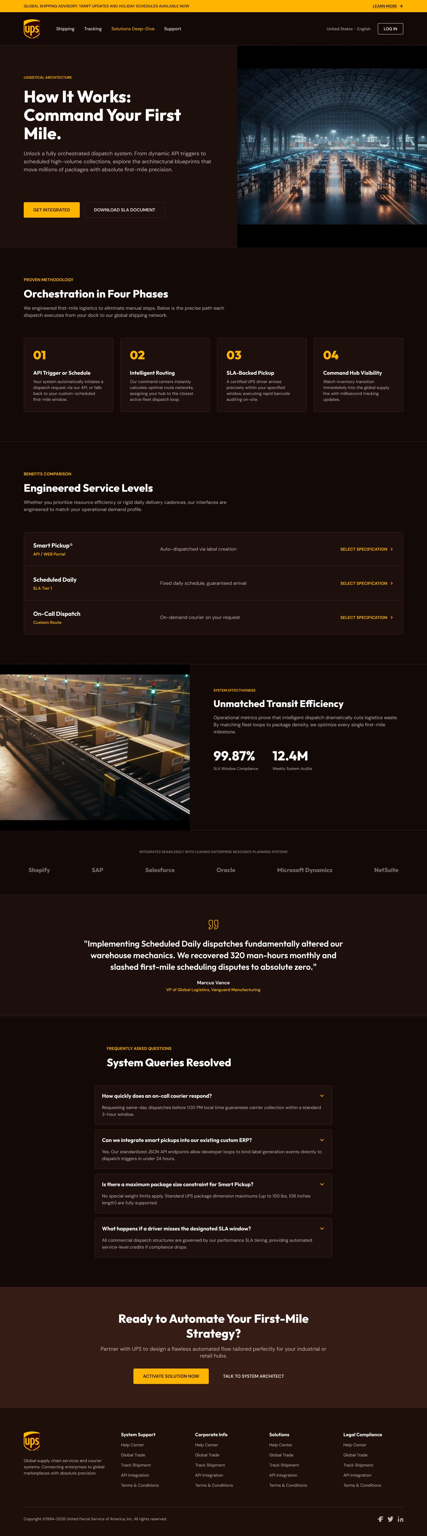
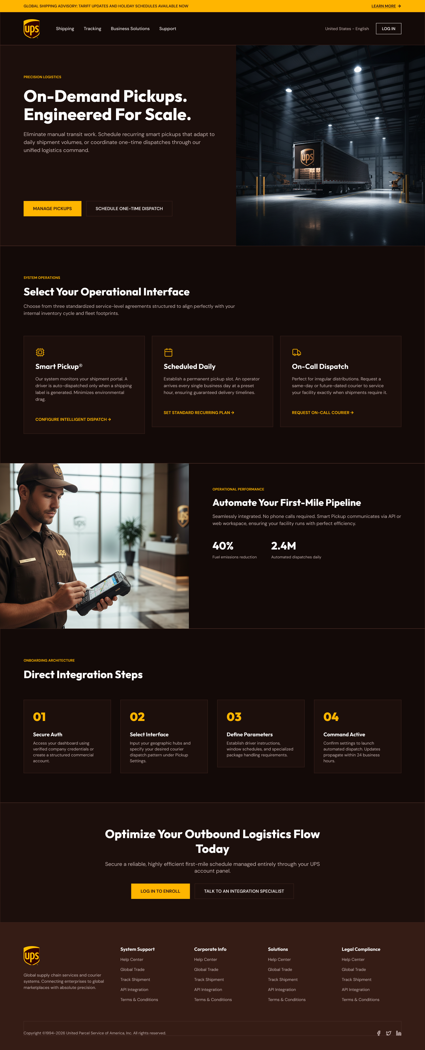
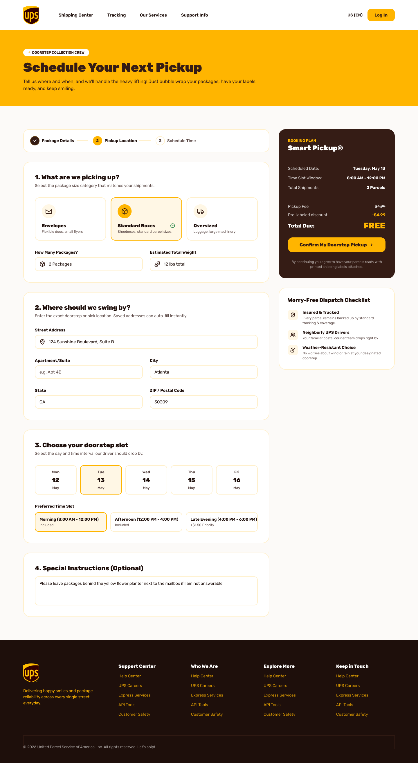
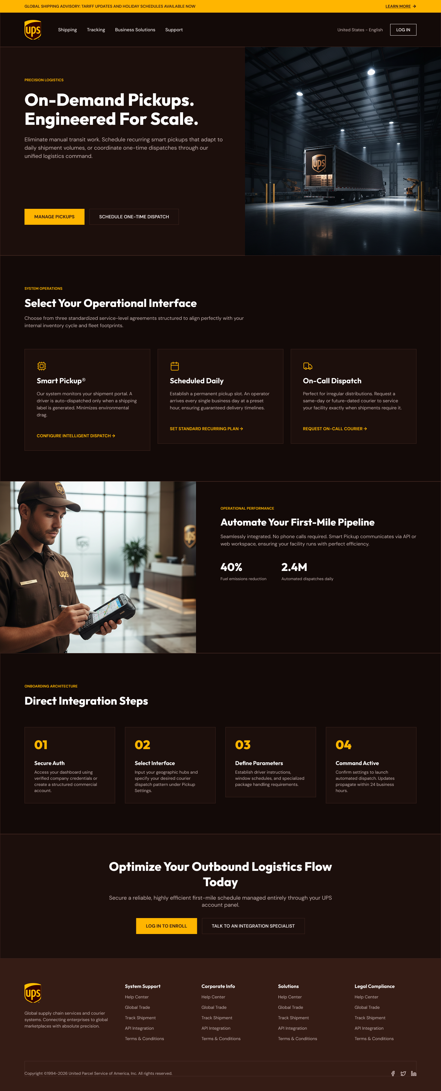
Pickup · Design Explorations
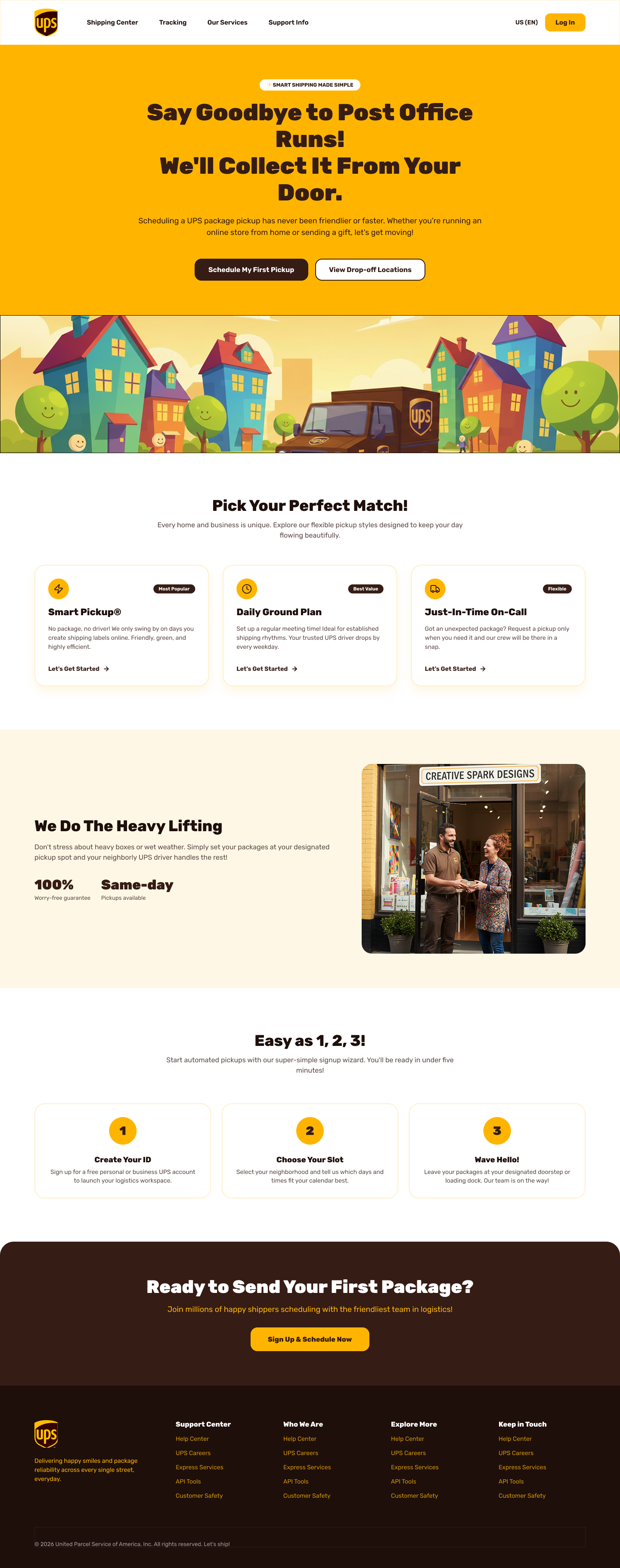
Consumer-first. Warm yellows, illustration, and friendly copy position UPS as a neighborhood service rather than a logistics operator. Designed to reduce the friction of first-time pickup scheduling by making the experience feel approachable and low-stakes.
Approach
The audience is residential users and small business owners who find scheduling a pickup either unfamiliar or mildly intimidating. The strategy was to remove every signal that this is a logistics product and replace it with language and visuals that feel like a helpful neighbor. Illustration in the hero rather than photography keeps the tone light and non-corporate. The illustrated UPS truck in a neighborhood setting communicates the same promise as the headline ("We'll Collect It From Your Door") without requiring the user to read anything.
Content Strategy
All jargon stripped out: no "dispatch," "transit," or "logistics." Instead, "post office runs," "your door," "your neighborhood driver." Service tiers are framed as personality matches ("Pick Your Perfect Match") rather than operational configurations, which lowers decision anxiety. The social proof section uses real photography and stat callouts to re-establish trust after the playful hero. The page follows a natural conversion arc: promise, options, proof, how it works, sign up. Copy stays in second person throughout, with UPS doing the work rather than the user having to figure it out.
Content Stack & UX Rationale
The page answers five questions a hesitant new user asks in sequence. "Is this for me?" The headline answers immediately with language about post office runs and front doors, not warehouses. "What are my options?" Service tiers follow, framed as personality matches to reduce decision paralysis. "Can I trust this?" Real photography and stat callouts (100% guarantee, same-day pickups) re-anchor credibility before the user commits. "How does it actually work?" The numbered 1-2-3 section makes the process feel short and predictable. "Should I sign up?" The final CTA arrives only after all four preceding questions have been answered. Each section earns the right to the next one.
Mazda builds some of the most design-forward vehicles in the mainstream automotive market. Their website didn't reflect that. The digital experience lagged behind the brand: generic layouts, inconsistent hierarchy, and a visual language that could have belonged to any competitor. This was a concept exploration to close that gap.
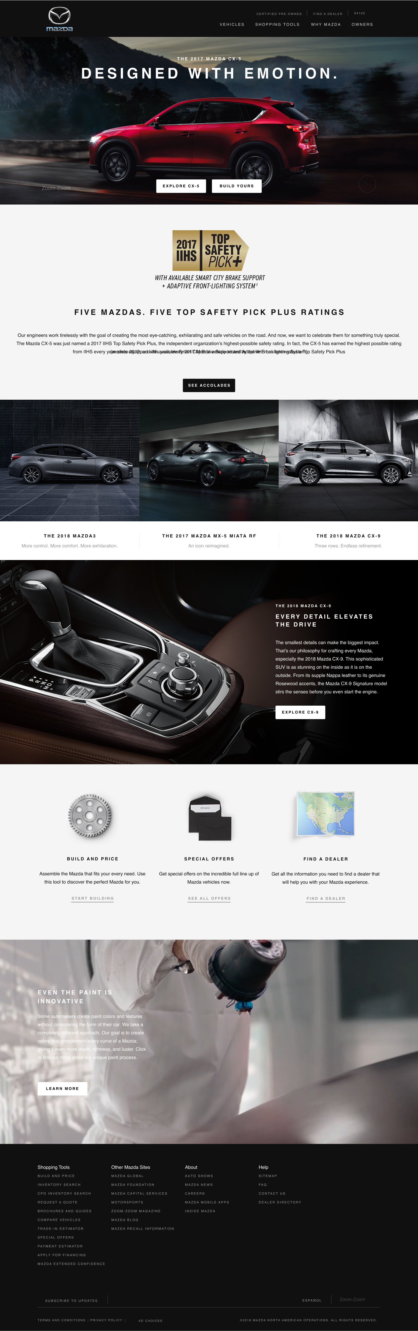
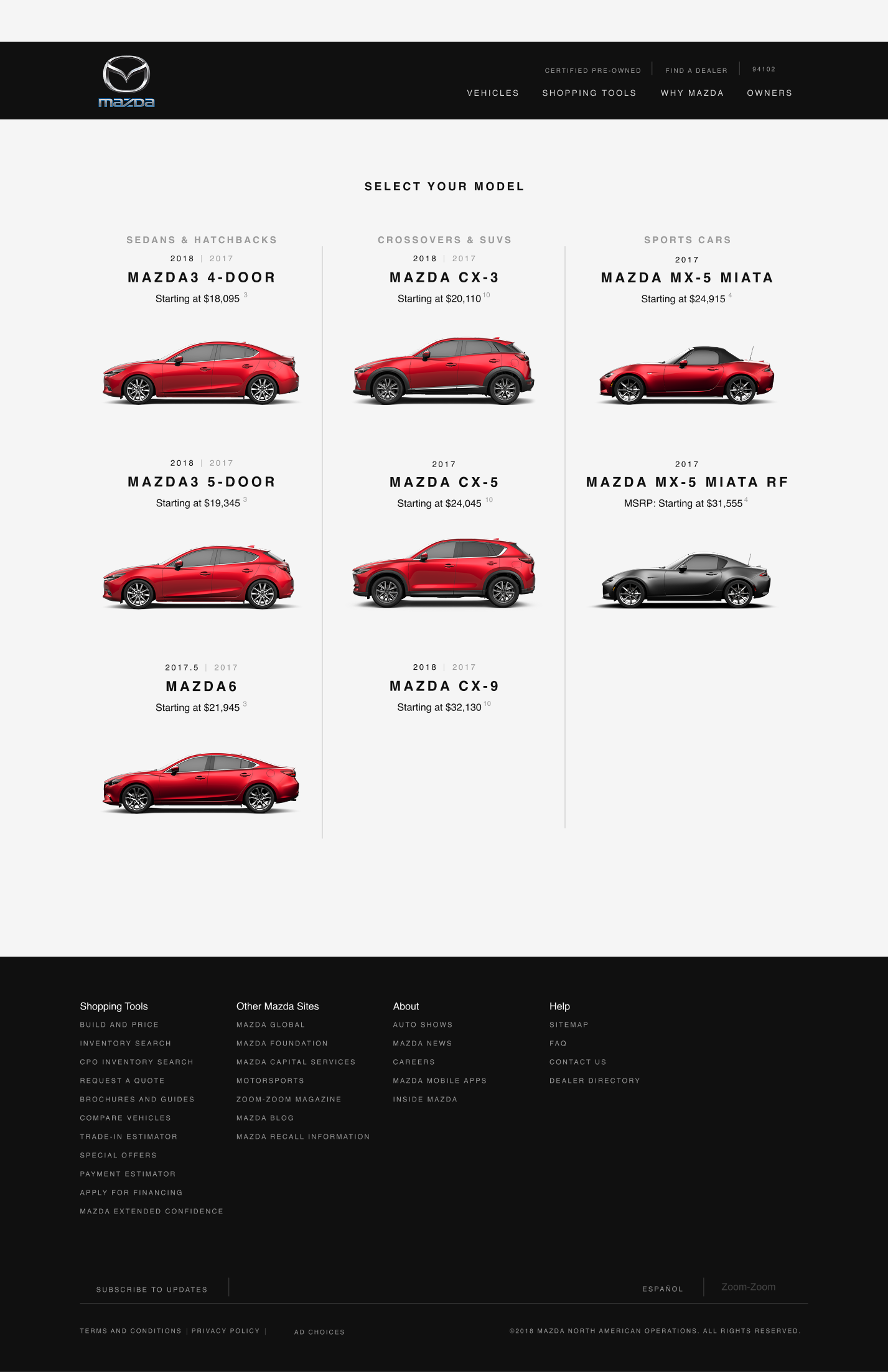
The current MazdaUSA.com homepage leads with a rotating banner and a shopping tool that pushes users to select a model before they've had a chance to feel the brand. The Build & Price experience is functional but cold. Nothing about the site communicates that Mazda is a brand built around driving pleasure and craft. It reads like a transaction, not an invitation.
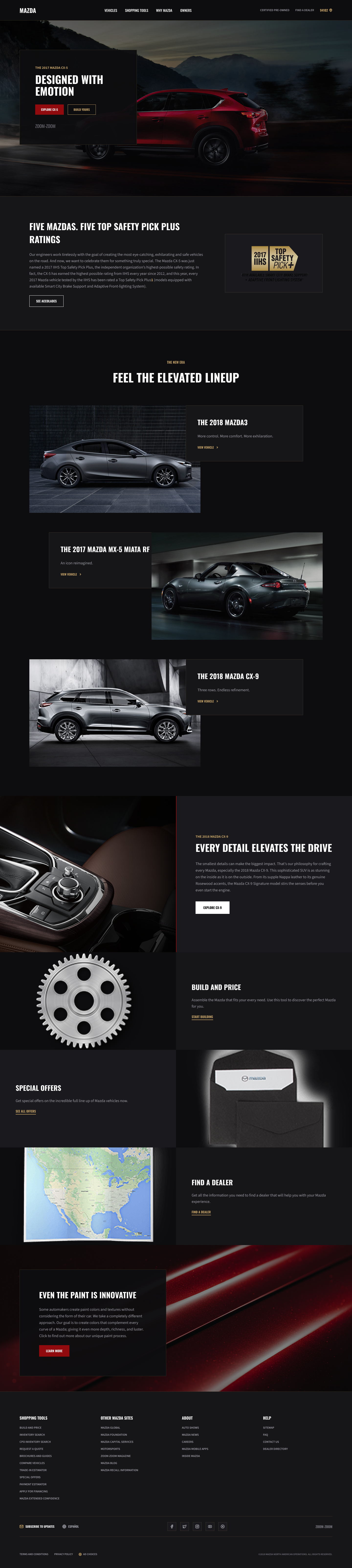
I started with a full IA audit of the existing site: 60+ nodes across four primary navigation sections, mapping where content was buried, duplicated, or missing entirely. From there, I explored a new visual direction that treats the vehicle as the hero. Large-format photography, a restrained typographic system, and a dark editorial palette that signals premium without mimicking luxury competitors directly.
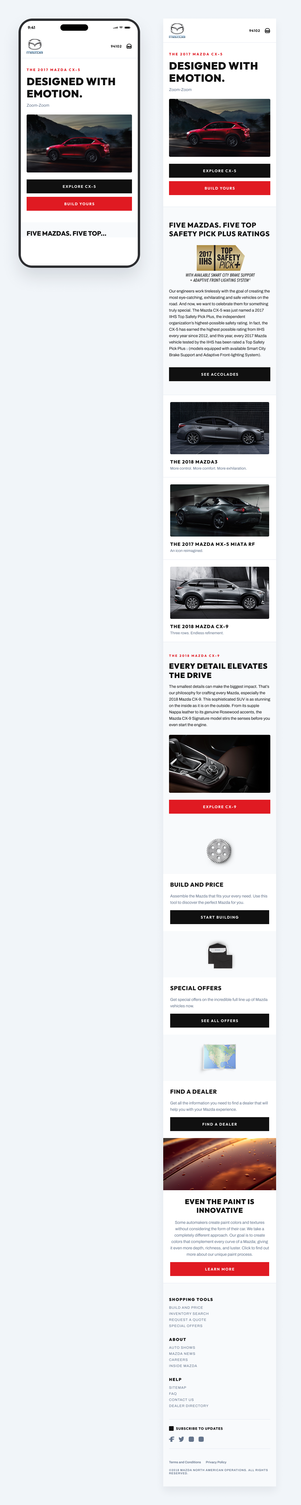
The redesign concept pulls the vehicle forward on every page, reduces chrome, and gives Mazda's design language room to breathe. The mobile experience was a priority from the start: simplified navigation, full-bleed imagery, and a Build & Price flow that doesn't require a desktop to use comfortably.
Current Design · Reference
Redesign · Editorial Direction
Whether you're rethinking a flagship product, scaling a research practice, or trying to make sense of complex user behavior, I'd love to talk.