What we were really up against.
HCA was pushing thousands of clinical data submissions through every year, spread across a tangle of registries, facilities, and aging systems. A lot of it was still being done by hand. I came on as UX Director to lead research, design, and strategy for a new abstraction platform. On paper the brief was about error rates and throughput. In practice, the job was simpler to describe and harder to do: give abstractors one place to work so they weren't hopping between five other ones to get through a single case.
Research-driven, but I designed the thing myself.
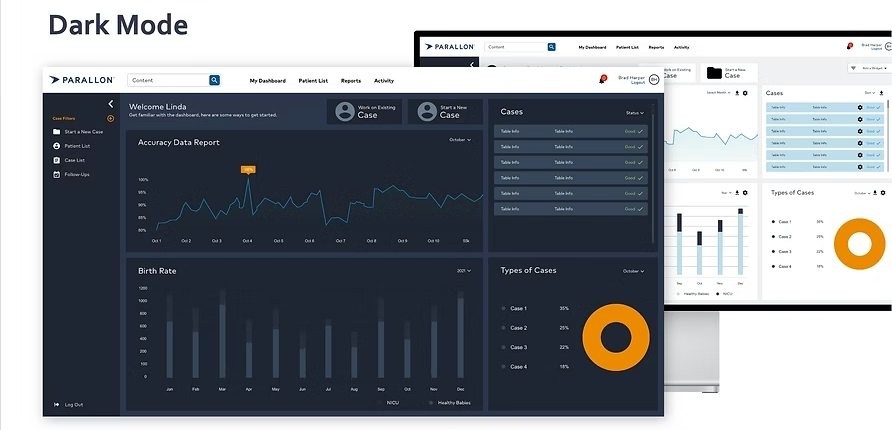
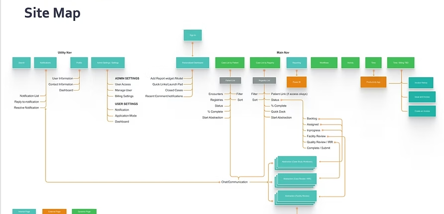
I served as UX Director on this engagement, and I stayed hands-on through every phase rather than handing design off to someone else. I ran the foundational and generative research myself, then translated it directly into the workflow design, journey maps, and information architecture. I designed and built the prototypes for every core flow (case initiation, extraction, review, submission), ran the usability testing rounds myself, and iterated the UI through provenance indicators, inline guidance, and the dashboard design based on what testing showed us.
What abstractors actually do all day.
I went out to hospital sites, sat with abstractors during real cases, and interviewed registry ops leads. I walked the full workflow myself, end to end. We dug into compliance timelines, the legacy tools still in daily rotation, and how teams actually got things done versus how the process was supposed to work on paper. One number stuck with me: 40+ context switches per case. The tools were getting in the way more than helping, and the abstractors had quietly built workarounds to survive them.
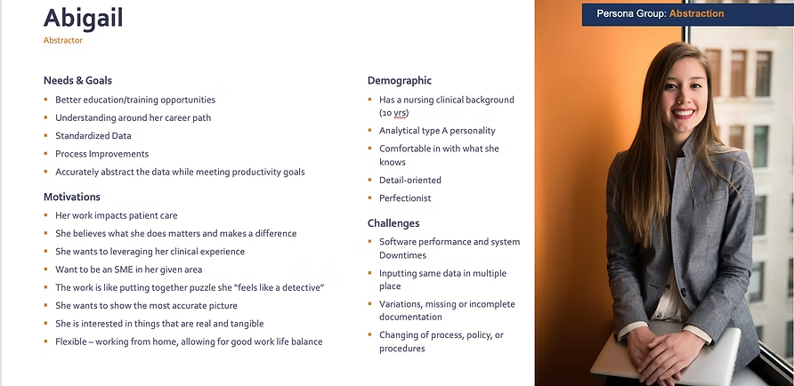
Nobody was anti-automation. They just wouldn't sign off on a number they couldn't trace back to its source.
Designing the workflow with the people who'd live in it.
I pulled clinical, data science, product, and compliance into the same room for working sessions. We built personas together and walked the workflow as a group. Journey maps and storyboards gave us something concrete to point at when we wanted to argue about where the friction lived. What came out of that was a dual-mode workflow. The system pulls what it can, the abstractor reviews and overrides anything that looks off, and every step leaves an audit trail behind it.
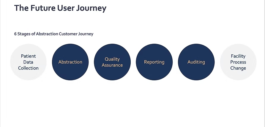
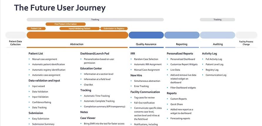
Full automation was never what we were after. Showing confidence scores, making overrides one click, and letting people see what the system did and why. That earned more trust than hiding the machinery ever would.
Prototyping and testing.
We prototyped the main flows (case initiation, extraction, review, submission) and I ran several rounds of moderated testing with abstractors, reviewers, and clinical leads. One concern came up over and over: losing control. So we built in undo, inline guidance, and provenance indicators that showed exactly where each piece of data came from. I tracked task success, time on task, and satisfaction across rounds, so we could tell whether the changes were actually helping or just shifting the problem around.
What moved.
- Task time: roughly ~25% faster on average through the pilot
- Rework: reviewer logs showed fewer flagged corrections coming back
- Rollout: 12+ pilot hospitals up and running inside six months
- Feedback: abstractors kept calling out clarity and override control by name
Clarity beat speed every time. If people could see what the system did and back out of it when they needed to, they'd actually use it.
From abstractors.
"I like that it shows me what it found and lets me decide. This isn't taking my job away, it's helping me do it better."
"Before, I'd have to dig through three systems to verify. Now it's right there, with the source doc."
What we watched after launch.
Once we shipped, I worked with product and data to keep eyes on throughput, submission timing, and how the workload was actually distributed across clinicians. I dropped in intercept feedback at the moments that mattered and tracked rework and escalations. What we learned in those first months fed straight back into dashboard tuning, confidence indicators, and registry-specific flow adjustments.
- Registry submission readiness moved about 30% faster in pilot regions
- Abstractors spent more of the day on clinical judgment and less on data wrangling
- The platform held up across several different registry types without bending
- Audit remediation time dropped meaningfully in the test hospitals
What I took away.
Healthcare doesn't reward shortcuts, and this project reminded me of that more than once. The biggest unlocks came from sitting next to abstractors long enough to understand why they did things the way they did, including the small workarounds they'd built into their day, and then designing around those instead of flattening them out. The "automation" headline mattered less than I expected. What mattered was giving people a clear view of the work and a real way to push back on it.
Where it goes next.
- Bringing more registries and subspecialties onto the platform
- ML-assisted tagging to sharpen the system's suggestions over time
- Workflows that flex around role, specialty, and document type
- More configurable dashboards with smarter priority signals
- Quarterly research cycles wired directly into the roadmap
- Tying abstraction performance back to patient outcome data