Designing role-based visibility for ClearWellness.
ClearWellness had no shared way to see how members were doing, from a single facility up to the president's office. Over a 13-month engagement, I served as UX Director designing a connected system of four dashboards, coach manager, agency, corporate, and an individual member view, all built around one shared way of measuring wellness.
Senior care, spread across systems.
ClearWellness operates a network of senior care agencies, each tracking member (resident) wellness across metrics like weight, hydration, sleep, activity, falls, hospitalizations, and ER visits. That data needed to serve very different audiences at once: a coach manager watching over a handful of members at one facility, an agency director running that facility day to day, and corporate leadership overseeing performance across the entire network. Family caregivers, meanwhile, had no direct visibility into any of it.
Three separate systems, no shared picture.
Wellness information lived in three separate systems that had never been designed to talk to each other. Nobody above a single facility had a current, reliable view of how members were actually doing, and putting together a report for leadership meant pulling data by hand and reassembling it from scratch every time.
- Coach managers, agency directors, and corporate leadership each needed a different slice of the same information, with no shared source of truth
- Wellness data was scattered across three separate systems that had never been connected
- Reporting for leadership was manual: pulling data, double-checking it, and reformatting it by hand
- There was no consistent definition of "at risk" that meant the same thing at the coach, agency, and corporate level
- Family caregivers had no direct visibility into a loved one's day-to-day wellness at all
UX Director for the whole hierarchy, not one screen.
I served as UX Director for the 13-month engagement, designing not a single dashboard but a connected system of four: an individual Member Details view, a Coach Manager dashboard, an Agency dashboard, and a Corporate/Executive dashboard. Each one was built for a different role, but they all shared the same underlying information and the same design language. I worked directly on the requirements, the overall structure, and the day-to-day design across every tier, partnering closely with product, engineering, and security throughout.
Five roles, one shared system.
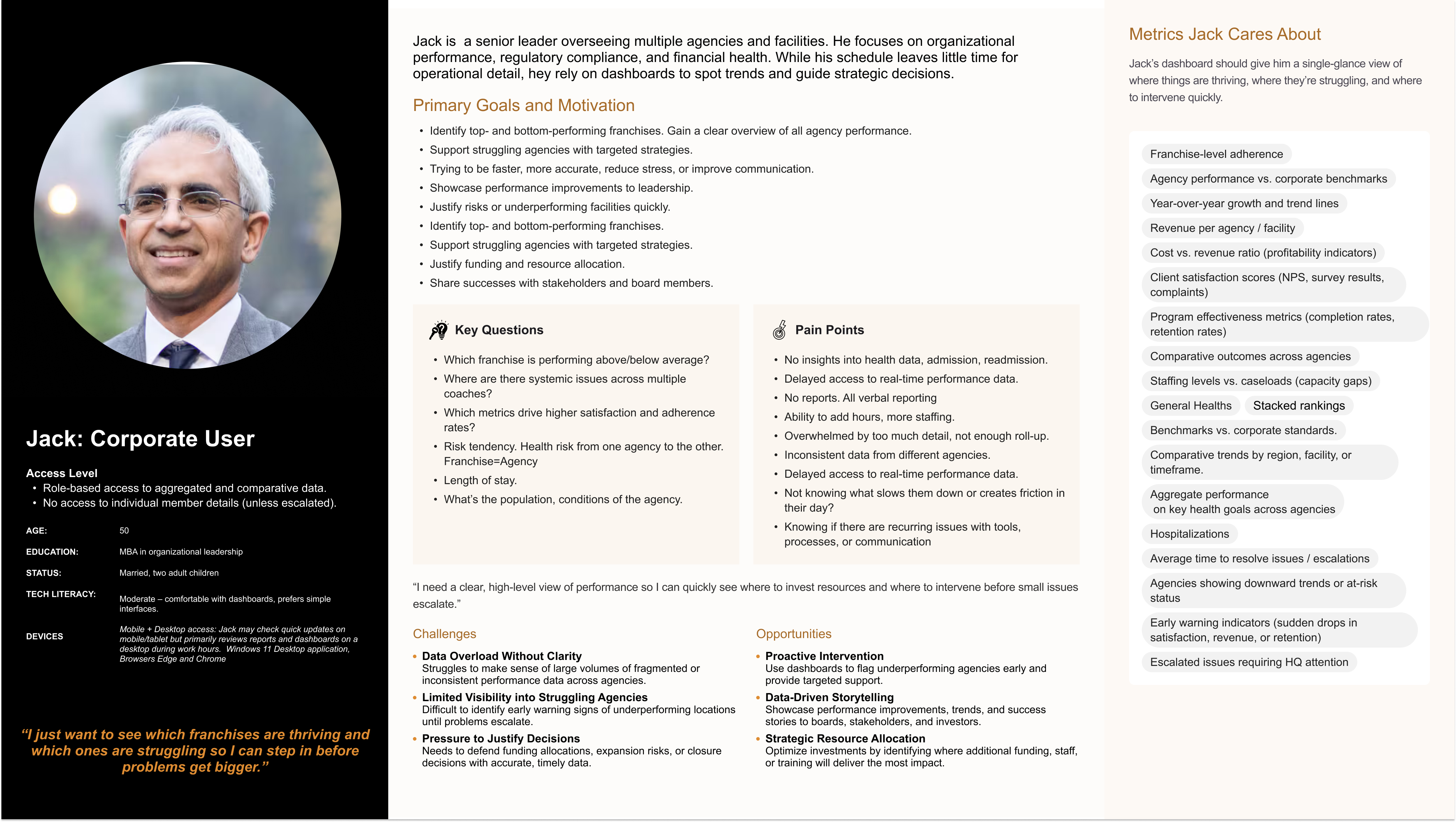
I built personas across the full hierarchy the platform needed to serve: Gary, a President with a view across the whole company; Jack, a Corporate User watching performance across agencies; Lynn, an Agency Director running a single facility; Erica, a Coach Manager working hands-on with staff and members; and Lucy, a family caregiver checking in on a parent's care from the outside. Jack's persona, below, shows the level of depth I built out for each one.
Walking a day in each role's shoes.
For every persona, I mapped out their journey step by step: what they're doing, thinking, and feeling at each stage, where things broke down, and where there was room to make things better. Use the tabs below to move between Gary, Jack, Lynn, and Lucy's journeys.
Gary, President Journey
Scanning at altitude
Switching context between levels
Wants the full story fast
Weighing reputation and financial exposure
Once the picture is clear
Metrics are clean and aligned
If growth isn't being aggressively pursued
Gary's journey is defined by altitude changes: zooming out to see the whole enterprise, then zooming in the moment something looks off. The product's job is to make that zoom instant and keep the story consistent no matter which level he's looking from.
One way of measuring wellness, everywhere.
The connective tissue across all four dashboards was a single wellness score for each member, built from eight simple things: how well someone can manage daily activities, their medication needs, any ongoing health conditions, hospital and ER visits, falls, and how often a caregiver wasn't available to help. I worked with clinical and data stakeholders to define what counted as low, moderate, or high risk, and used the same colors and language everywhere, so "at risk" meant the same thing whether a coach was looking at one member or the president was looking at the whole network.
From individual member to network-wide view.
For the President and Corporate Users, this dashboard gave leadership a single place to scan all twelve agencies at once: an overview, trend charts, a full agency list, business metrics, and a view just for corporate that ranked agencies from top performers to those needing help. Every agency was shown against the company average, alongside its wellness risk level and how consistently members were using their wearable devices.
The same picture, scoped to one facility.
For Agency Directors like Lynn, I scaled the same information down to a single facility, with a member list that led straight into each person's individual details, and a clear "Back to Corporate Dashboard" link so the connection between views was obvious rather than something people had to figure out on their own. The dashboard also explained what a number actually meant: a rising number of falls over a few months, for example, prompted a note to review that member's care plan, instead of leaving Lynn to guess.
Surfacing who needs attention first.
For Erica, hands-on with both coaches and members day to day, I designed a simple alert count: one point added for every metric that fell into the red, wellness score, sleep, hydration, heart rate, or weight goals. Both her coach list and member list sorted the most concerning cases to the top by default, so she'd see who needed her first without having to hunt for them. Her center's overall wellness average was based on each coach's average, not a single average across every member, a deliberate choice so the number reflected how the team was doing, not just who happened to be on their caseload.
One drill-down, four audiences.
The individual Member Details view brought weight, sleep, activity, vital signs, hydration, hospital visits, and falls together in one place, and showed how each person compared to the network average. Rather than build a separate version of this for coaches, agency directors, and corporate users, I designed it once and made it reachable from any list in the system. Coaches used it to manage day-to-day care; agency and corporate users opened the exact same view to check in on an individual case without ever leaving their own dashboard.
"I just want peace of mind knowing my mom is being looked after properly." - Lucy, Family Caregiver
A shared system, replacing manual reporting.
Manual, by-hand reporting was replaced with a self-service view that worked for coaches, agencies, and corporate leadership in the same system. For the first time, everyone from a coach manager to the president was working from the same definition of what "at risk" means. Four previously separate views were connected into one, with clear links between them. The platform shipped in phases, with a concrete plan to expand to more care centers over time.
Speed from AI, judgment from the people it's for.
AI tools sped up real parts of this project, drafting dashboard layouts, sketching journey maps, and helping me get from a blank page to something I could react to faster. That's genuinely useful. But a wellness platform for older adults and the people who care for them isn't a place to let a tool make the calls that matter most.
Research was where AI helped most. With four BRDs and dashboards worth of raw notes across coaches, agencies, and corporate, I used it to spot recurring themes and surface insights, like how often "fragmented visibility" showed up in different words across roles, or where a pain point one persona named outright turned out to be the quiet cause of a struggle another persona described differently. I still did the harder work of confirming those patterns held up against the source material and reflected what people meant, not just what phrasing repeated.
A few things I stayed careful about: never letting a suggested layout decide what "at risk" means without a person checking it against how a coach actually thinks. Never letting default copy stay clinical or alarming when the reader might be a stressed family caregiver, not a clinician. Never assuming a draft was accessible just because it looked clean, low vision, lower tech confidence, and high emotional stakes all had to be checked by hand, not assumed. AI is good at giving you options quickly and spotting patterns across a pile of notes. It isn't the one who has to sit with a family member wondering if their mom is okay, so that judgment stayed mine.
What I took away.
The real design work on this project wasn't any single screen, it was making sure everyone in the company was looking at the same truth. A coach, an agency director, and a president each had their own dashboard, but making "at risk" mean the exact same thing on every one of them took more discipline than any individual chart or table. Keeping Lucy's perspective as a family caregiver in view the whole time, even though her own screen wasn't part of this phase, kept the coach- and agency-facing tools honest about what actually reassures a family, rather than what just looks good on a dashboard.
Need research-backed UX leadership on your next engagement?
Whether you're rethinking a flagship product, scaling a research practice, or trying to make sense of complex user behavior, I'd love to talk.