A site that couldn't keep up.
Southwest Gas serves more than 2 million customers across Arizona, Nevada, and California. Their site ran on a legacy CMS that had become the bottleneck for almost everything: editorial work crawled, content was duplicated across pages, and UX improvements kept dying in the backlog. The experience lagged behind peer utilities, and the brand looked inconsistent depending on where you landed. Leadership decided to start over on Oracle WebCenter Sites. I came in as UX Director and owned strategy, research, art direction, and implementation for 15 months.
Four problems that compounded each other.
The legacy site's issues weren't separate line items. They reinforced each other. A dated design made the messaging feel less credible. Unclear messaging made customers distrust the experience. Poor task structure made it harder to find the information that could have rebuilt that trust. Understanding how these things connected was what shaped the redesign strategy.
UX and navigation
The site was organized around Southwest Gas's internal structure, not around what customers were actually trying to do. Starting service, paying a bill, reporting a safety concern, applying for energy assistance: these are the tasks that drive the majority of visits, and none of them were surfaced at the top level. Customers had to know what department owned their problem before they could find help. Navigation labels were company terminology, not customer language. Forms were multi-step with no progress indication, and error handling was sparse enough that a failed submission often left users unsure whether anything had gone through. On mobile, the experience was an afterthought: the desktop site squeezed into a smaller frame rather than a layout designed for touch.
Branding and visual credibility
The old site looked like a utility portal from an earlier decade. Industrial stock photography, inconsistent type hierarchies, and a visual system that varied from section to section depending on when the page was last touched. For customers, the look of a site is a signal. A site that feels dated and inconsistent communicates that the organization behind it is dated and inconsistent. That's a problem for any company. For a utility asking customers to trust them with safety information and billing, it's a real liability. Southwest Gas had invested in the brand in other channels. The site didn't reflect that investment, and the gap was visible.
Propane confusion and unclear messaging
One of the more specific findings from early research: a meaningful number of customers weren't certain they were dealing with a natural gas company. Propane is a familiar fuel, and in markets where Southwest Gas operated, customers sometimes arrived at the site assuming the service was propane-based. The old site didn't do enough to make the distinction clear or to explain what natural gas actually is, how it's delivered, and why it compares favorably on cost, safety, and environmental terms. The result was a messaging gap that created confusion before any transaction could begin. Customers who aren't sure what they're buying aren't ready to trust the company selling it.
Customers who arrived confused about propane vs. natural gas showed lower task completion and higher drop-off on the start-service flow. The messaging problem wasn't cosmetic. It was costing conversions.
Trust and safety communication
Natural gas companies have a specific trust obligation that most industries don't. Customers need to believe the company takes safety seriously, communicates clearly in an emergency, and is easy to reach when something is wrong. The old site buried safety content in secondary navigation. Emergency contact information required multiple clicks to find. The site's tone in safety contexts matched its tone everywhere else: corporate, distant, and written for compliance rather than for a customer who might be worried. That mismatch between the stakes of the content and the register of the language eroded confidence in exactly the moments that mattered most.
How the redesign addressed each one
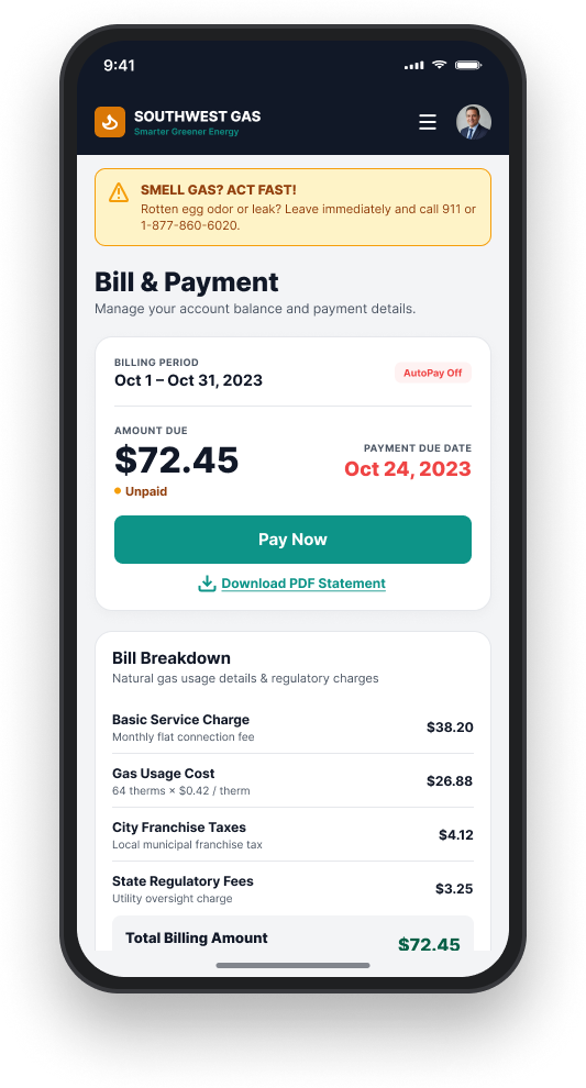
The information architecture was rebuilt around top customer tasks, not org chart logic. Navigation labels came from the language customers used in interviews, not internal department names. The start-service and pay-bill flows were redesigned from scratch with progress indicators, inline validation, and confirmation states that removed ambiguity about what had or hadn't happened.
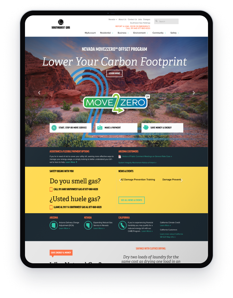
The visual direction replaced industrial photography with lifestyle imagery: real people in real homes, going about their day with natural gas working invisibly in the background. A consistent type hierarchy and tightened color system gave every page the same visual authority. The brand that existed in other channels finally showed up on the site.
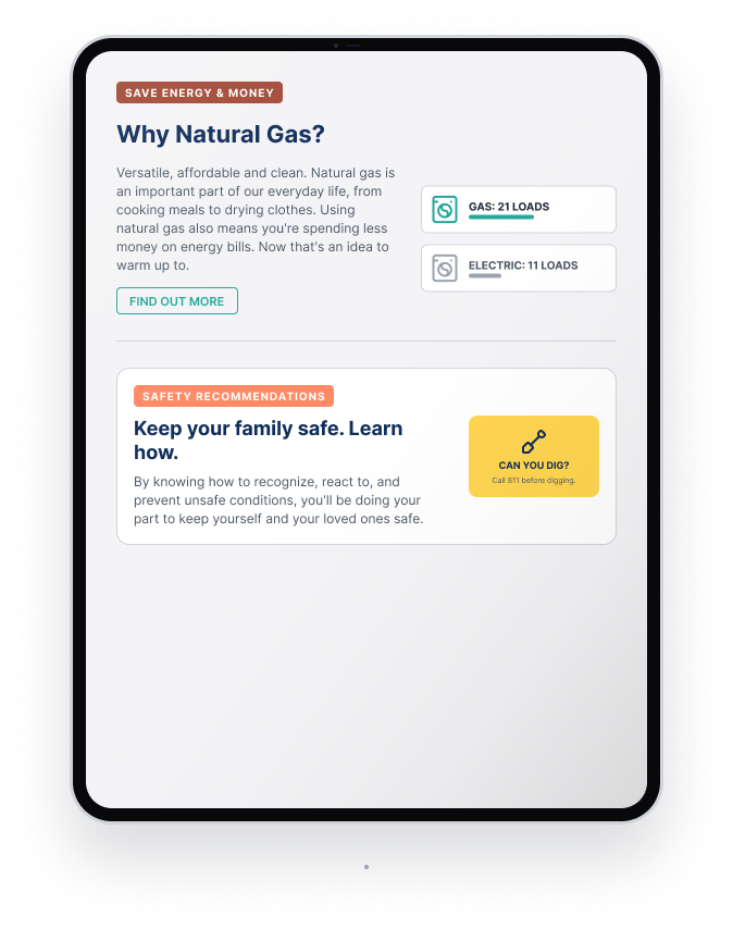
Propane confusion was addressed directly in the content strategy. Natural gas explainer content was elevated, not buried. The distinction between natural gas and propane was made explicit on pages where confused visitors were most likely to land, with plain language that explained what the service was, how it worked, and why it was a better fit for the customer's home. That content didn't exist before. It needed to be created, not just repositioned.
Safety content was elevated to first-level navigation. Emergency contact numbers were visible from the homepage and from any page in the MyAccount portal. The writing tone in safety contexts was rewritten to be direct and clear: short sentences, plain words, and an explicit call to action. When a customer was worried, the site needed to respond like a company that understood the stakes.
Three parallel tracks, one continuous feedback loop.
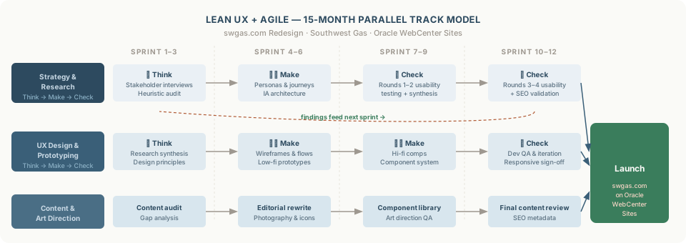
Rather than a 15-month waterfall, I ran the program as three concurrent tracks: UX strategy and research, design and prototyping, and content and art direction. Each track cycled through a Think-Make-Check loop every sprint. Research findings fed design changes the same week. Personas and customer journeys grounded every decision: starting service, paying a bill, reporting a leak, applying for energy assistance. When someone wanted to argue for a feature, we checked it against what customers were actually doing.
Wireframes to sign-off to live pages.
Each template followed the same sequence. Low-fidelity wireframes first, reviewed with product owners and content leads before any visual treatment was applied: structural debates had to happen before a polished comp created attachment. Mid-fidelity mockups with real content and labels came next, used in usability testing rounds two and three so findings were about flow and comprehension, not aesthetics. High-fidelity designs only came after at least one round of testing had validated the structure.
Sign-off was staged to keep momentum. UX and content reviewed the wireframe. Product ownership reviewed the mid-fidelity. Executive sign-off happened at high-fidelity before any build work started. Each review had a clear scope. I logged every change request with a recommendation: implement, modify, or hold with rationale. When stakeholders disagreed on direction, I brought usability data into the room. Customer recordings cut through opinion faster than any design argument.
Once a template had sign-off, I built it myself in WebCenter Sites. Every page in WebCenter is assembled from configurable content types and asset slots, not static HTML. I defined the component model, mapped design zones to WebCenter's architecture, and set authoring rules simultaneously with the design itself. After each build I QA'd against the approved design across desktop, tablet, and mobile before content population began. Issues got fixed in the template configuration, not after the page went live.
Selling natural gas through design, not just copy.
The toughest stakeholder tension on this project was copy direction. Some wanted conservative utility messaging. Others wanted a stronger brand voice. What settled it was the research: customers weren't coming to the site as neutrals. They had opinions about natural gas, shaped in part by broader energy conversations, and the worst thing the site could do was ignore that and lead with pure transaction.
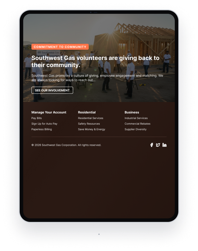
The site had to make a confident, genuine case for natural gas as the affordable and safe choice while speaking to customers in a way that respected where they already were. The design carried that message as much as the words did. Rather than industrial utility photography, we used lifestyle imagery: families at home, children playing, people going about their day in comfort. Natural gas is invisible when it's working. The photography made the life it enables visible. A polished, well-designed site with that imagery signals credibility in a way a dated, templated portal never could, and it made the safety and value messaging land with more weight.
Safety information was elevated into the experience rather than buried in footnotes. Energy savings content was framed around real customer outcomes, not marketing language. When stakeholders pushed back on specific copy choices, I traced the decision back to a research finding. That shifted the conversation from preference to evidence.
Desktop, tablet, and mobile.
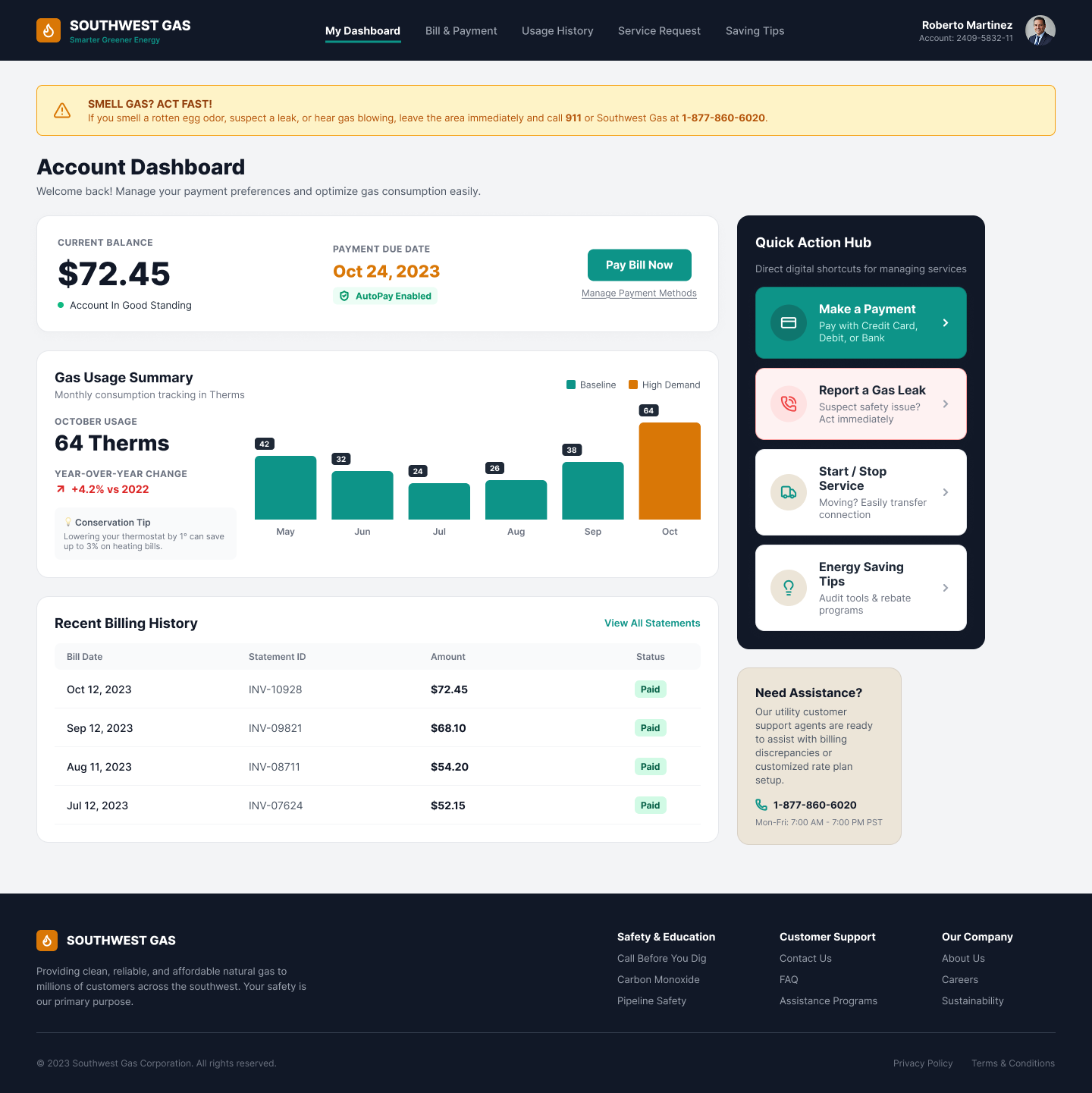
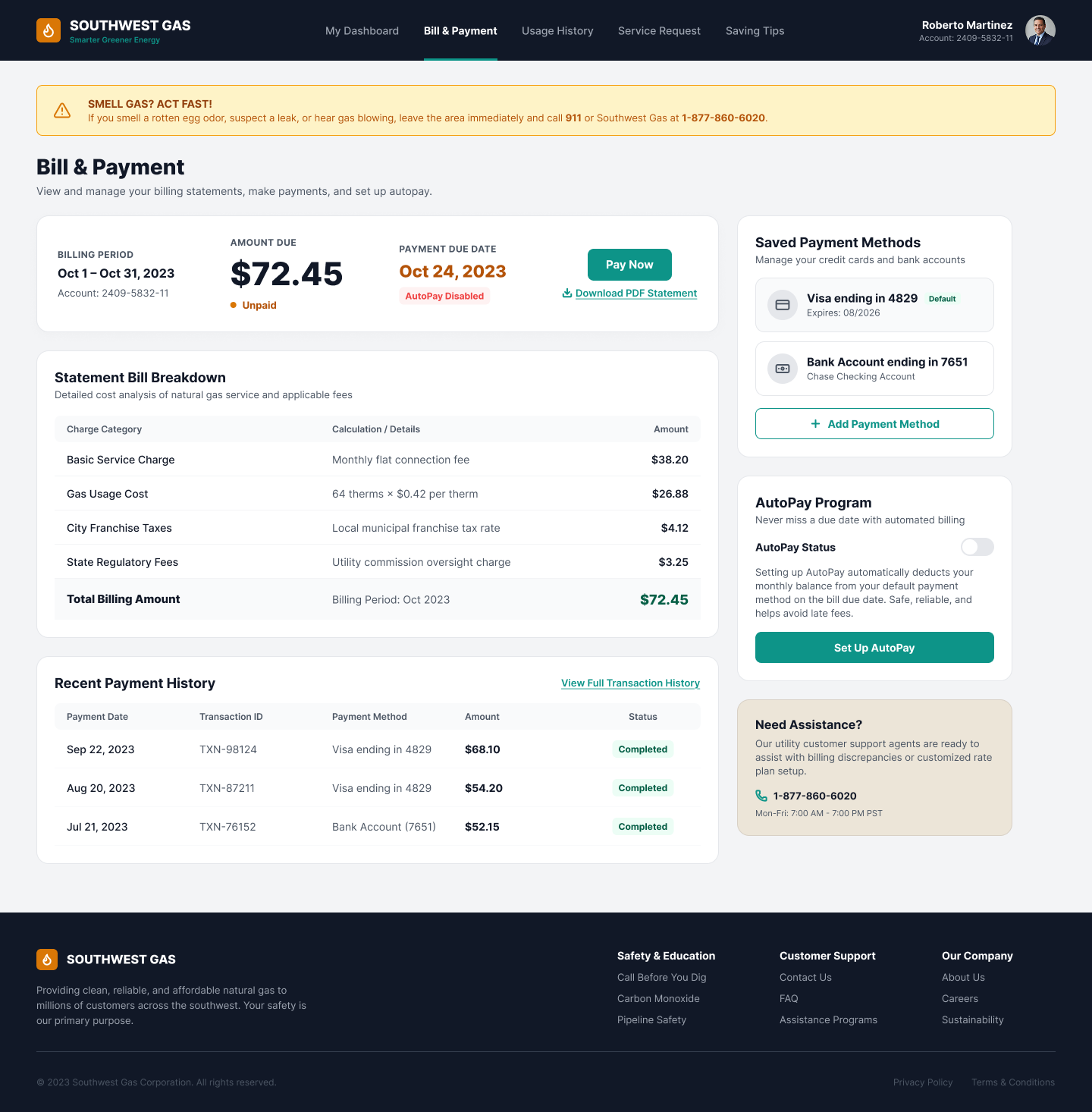
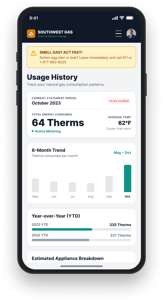
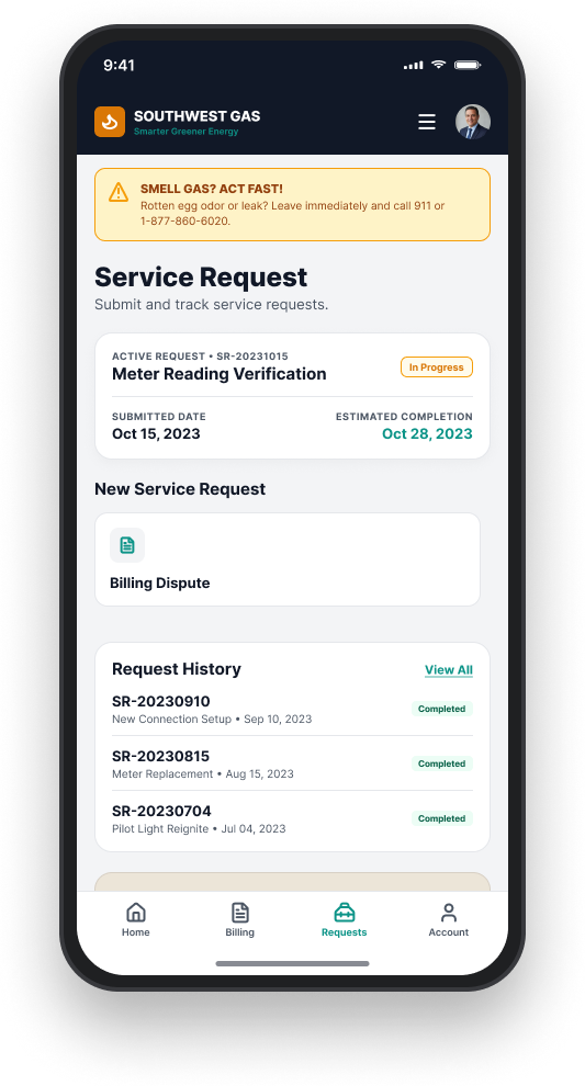
The redesign covered the full experience: the public-facing marketing site, the MyAccount self-service portal, and a companion mobile app. Every surface used the same component system and visual language.
Desktop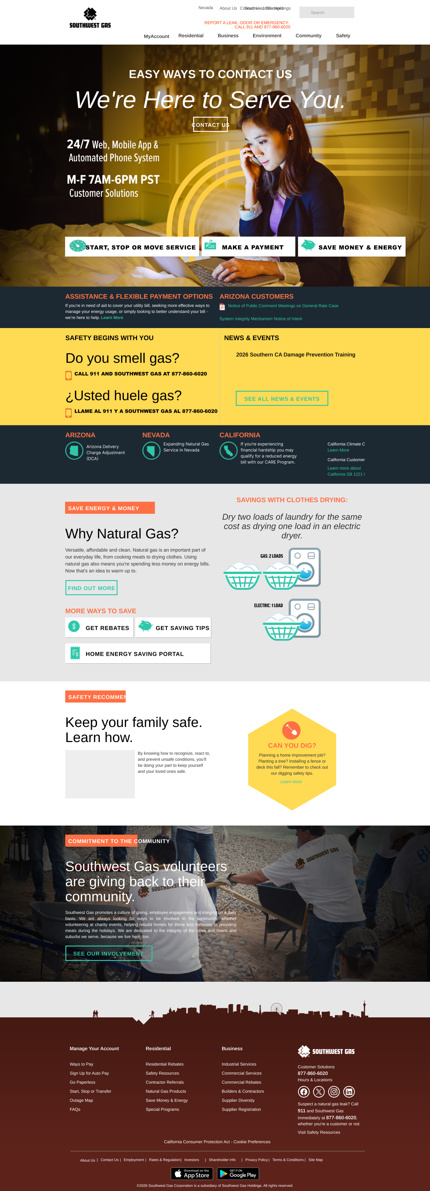
What we shipped.
We launched a redesigned, responsive swgas.com on Oracle WebCenter Sites inside the 15-month window. Editorial time-to-publish dropped through reusable templates and clearer authoring patterns. Usability improved across core customer journeys, validated over four rounds of testing. The new digital asset and content library was tied directly to the visual system, with SEO built into the IA and templates from the start. When I rolled off, the team had a component system they could keep building on without starting over.
What I took away.
Most platform migrations run as engineering programs with a UX pass tacked on near the end. This one worked because UX had a seat at the table from day one. On a regulated utility site, clarity is the most valuable design asset you have. Customers are usually here because something is wrong or because money is involved. They don't want clever. They want to know what to do next.