A three-year vision for how Vegas sells the trip.
The Las Vegas Convention and Visitors Authority (LVCVA) is the driving force behind tourism marketing for the city. This was one of several concept directions I designed as part of a larger initiative to show the LVCVA where their Visit Las Vegas site could go over the next three years: richer hotel discovery, interactive tour video, and booking tools built for how travelers actually decide.
Show what hotel discovery could become.
The brief: show how hotel exploration and booking could evolve for the modern traveler, three years ahead of where the site actually stood. At the time, Visit Las Vegas worked more like a directory than a trip planner. Hotel listings were static, showing little beyond rates and contact info. There was no way to filter by what a traveler actually cared about, no sense of a trip taking shape as they browsed, and no link between finding a place to stay and figuring out what to do once they got there.
That gap mattered more here than it would on a typical hotel chain's site. The LVCVA's job isn't just to fill rooms, it's to sell Las Vegas as a destination. A site that treated hotel search as its own separate transaction was working against that goal. The real question was whether this experience could become something travelers wanted to spend time in: a site people browsed the way they'd browse travel inspiration, not just a directory they'd hit, book, and leave.
A vision piece, not a production spec.
This was part of a larger initiative to show the LVCVA a three-year vision for overhauling their site's content and user experience. The concepts showed how Visit Las Vegas could evolve into a more informative, more immersive experience for travelers trying to find the right hotel, restaurant, or club for them. Enhanced booking tools, interactive tour video, and social sharing were all part of the plan.
I was the designer on this project. It was intentionally exploratory: further out on the horizon than a typical release, meant to give stakeholders something concrete to react to rather than a locked roadmap. The LVCVA ultimately launched with a different direction than what's shown here.
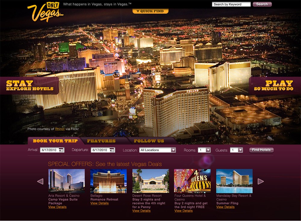
Discovery built around Stay and Play.
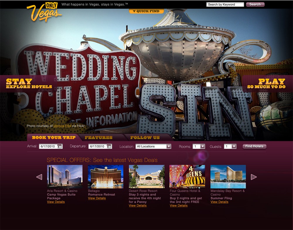
The site organized around two intents travelers actually have: Stay, for finding and booking a hotel, and Play, for figuring out what to do once they'd arrived. A persistent booking bar carried arrival and departure dates, room count, and guests across the whole experience, so a traveler could move from inspiration to a live search without losing their place.
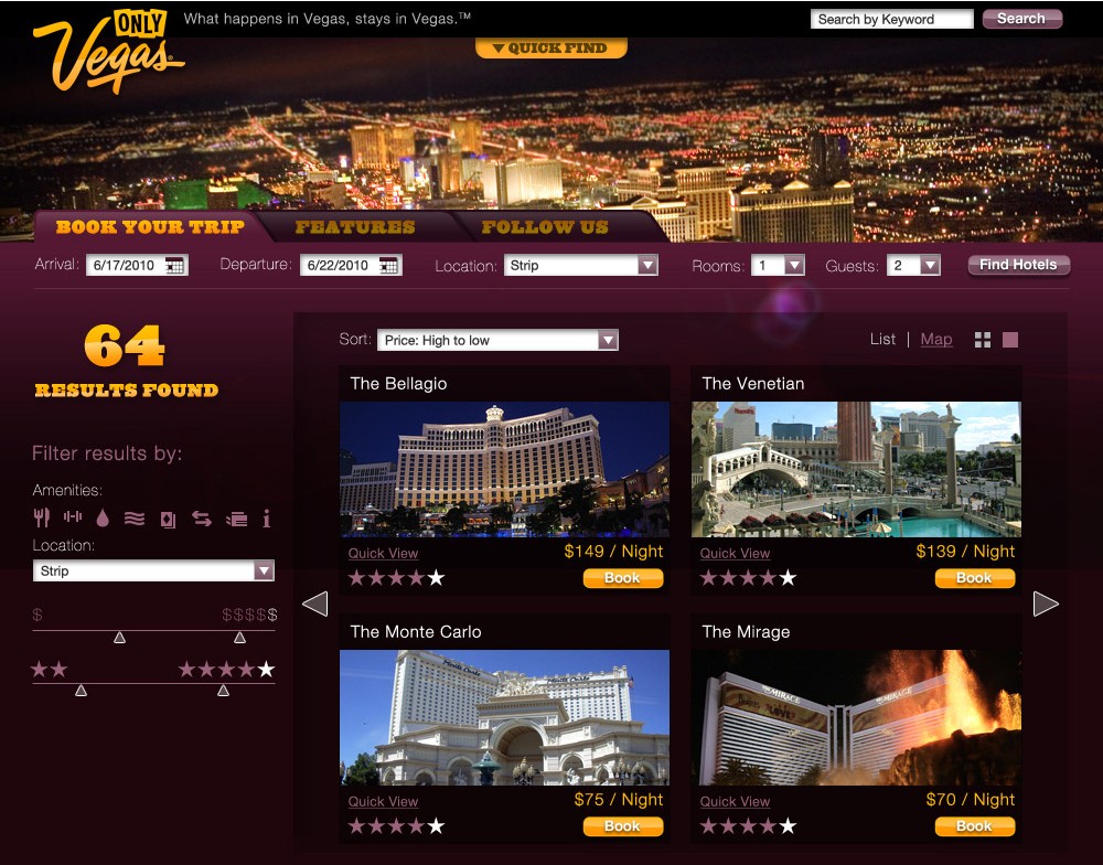
Filtering that matched how people actually choose.
The search results concept let travelers filter by amenities, location, price, and star rating, then flip between a list and a map view. It's a familiar pattern now, but at the time it was a meaningful step up from the directory-style listings the site was built around, and it put comparison front and center instead of burying it.
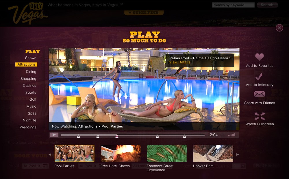
Interactive video for the "what to do" part of the trip.
The Play side of the site leaned on interactive tour video rather than static photography. Travelers could browse categories like Attractions, Shows, Dining, and Nightlife inside a video player, then add what caught their eye to a favorites list or a running itinerary, or share it out directly. The idea was to let the excitement of the destination do more of the persuading than a spec sheet of hotel amenities ever could.
Detail and browsing, side by side.
A quick-view panel surfaced rates, reviews, amenities, and a booking CTA without forcing a full page reload, while a parallel browse view let travelers keep exploring by budget, location, or amenity. Both were built to keep a traveler moving forward instead of losing momentum every time they wanted to compare one more option.
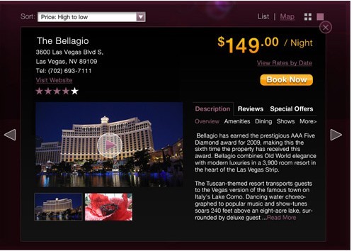
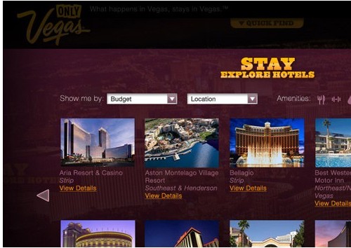
Left: hotel quick-view with rates, description, and booking. Right: the Explore Hotels browse grid, filterable by budget and location.
Room for Vegas to be Vegas.
Not every page needed to be a utility. A few concept templates, like this one built around the city's wedding chapels and its "what happens here" reputation, gave the marketing team a place to lean into the brand's personality without breaking the booking flow underneath it.
What I took away.
Vision work like this earns its keep by giving a stakeholder something to push back on. It's easier to react to a concrete direction than to an abstract brief, and that reaction, even when it lands on a different path, is useful. The LVCVA moved forward with a different direction for Visit Las Vegas than the one shown here, and that's a normal outcome for exploratory work operating three years out from where a team actually is.
What stuck with me was the framing: hotel booking and destination inspiration don't have to be two separate experiences bolted together. The strongest parts of this concept were the ones where a traveler could move between "where should I stay" and "what should I do" without feeling like they'd left one site for another.
Need research-backed UX leadership on your next engagement?
Whether you're rethinking a flagship product, scaling a research practice, or trying to make sense of complex user behavior, I'd love to talk.